Pension Geeks Event Visual Identity
A bespoke design system was created for Pension Geeks, building on elements of their existing visual identity to promote the brand at a key event. The system was designed with flexibility in mind, allowing it to evolve into a potential full rebrand in the future.
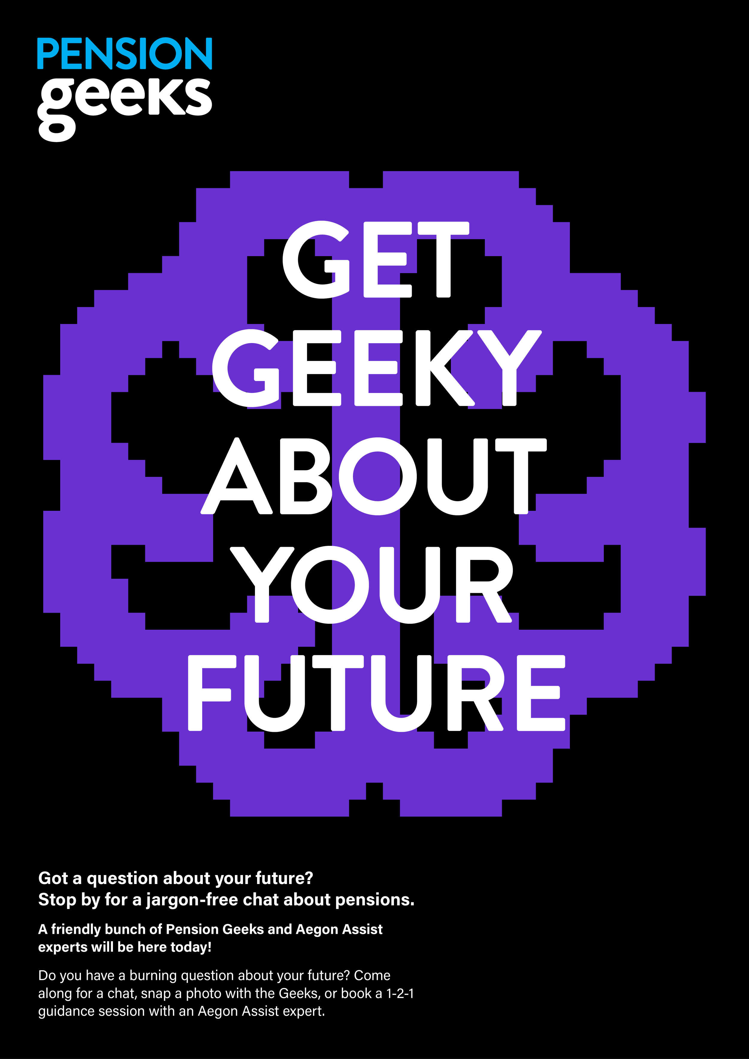
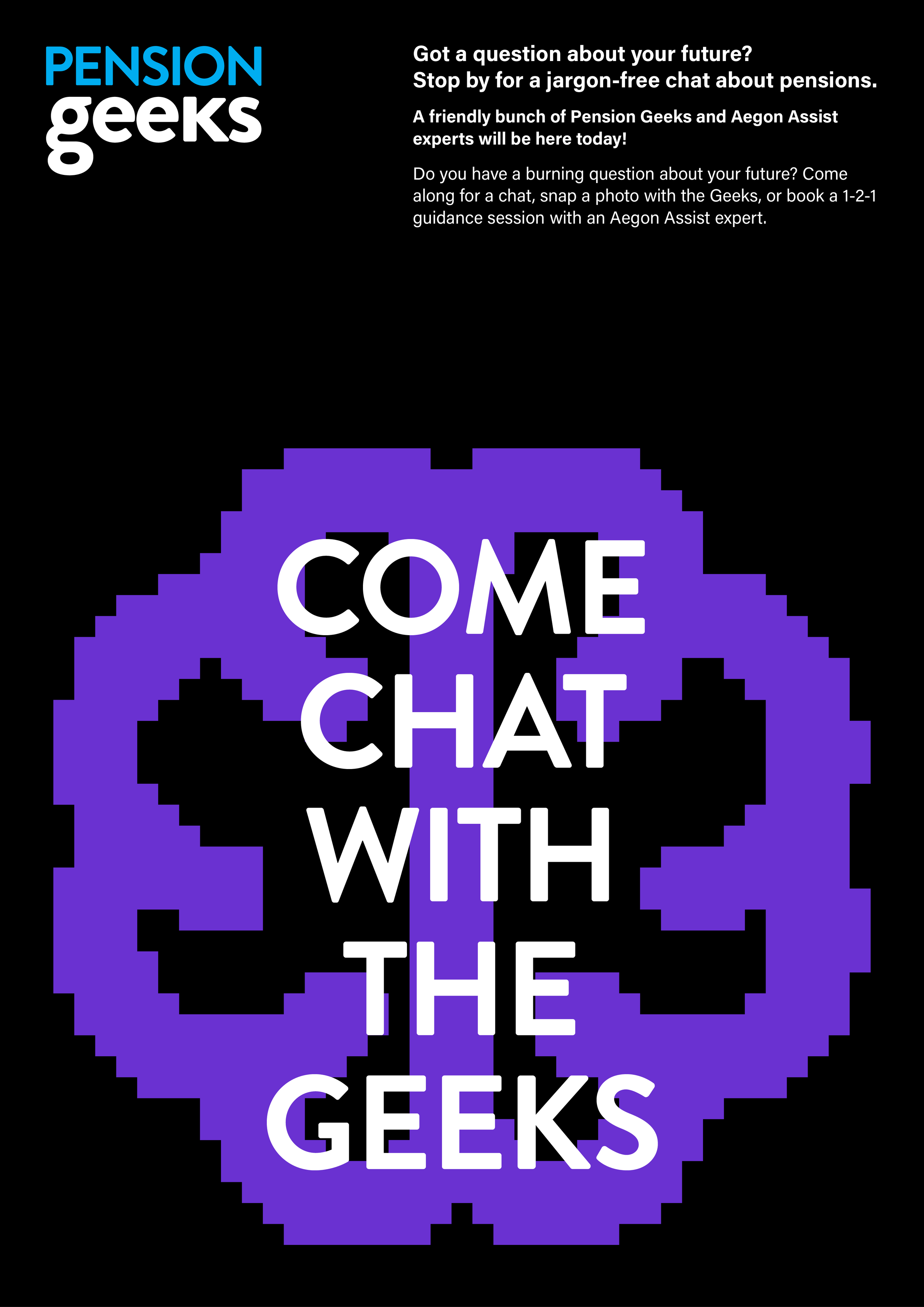
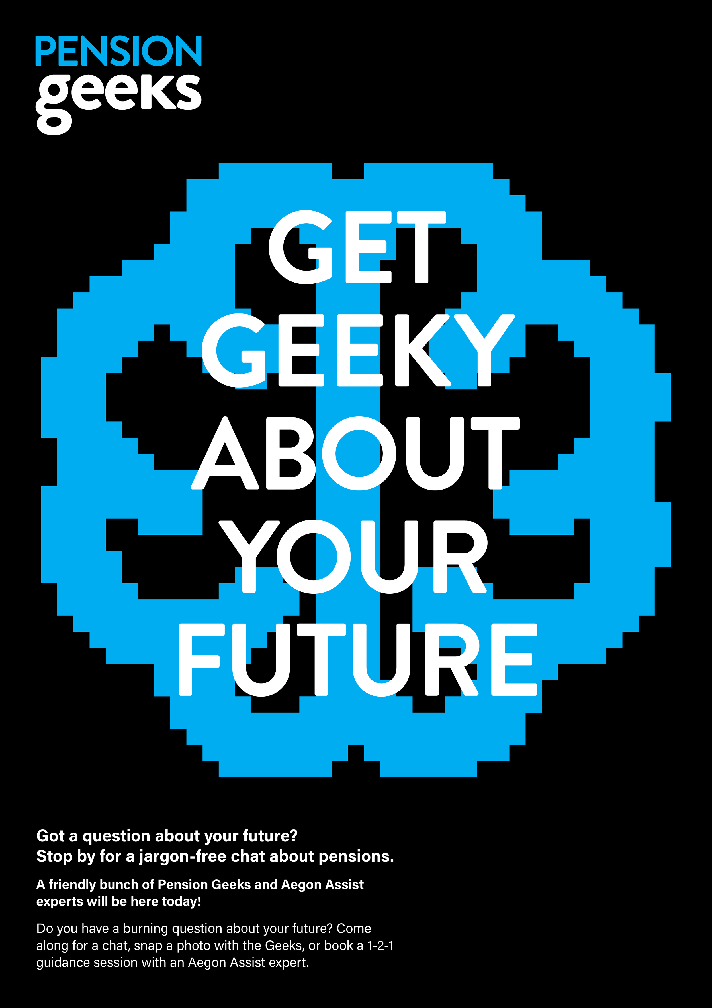
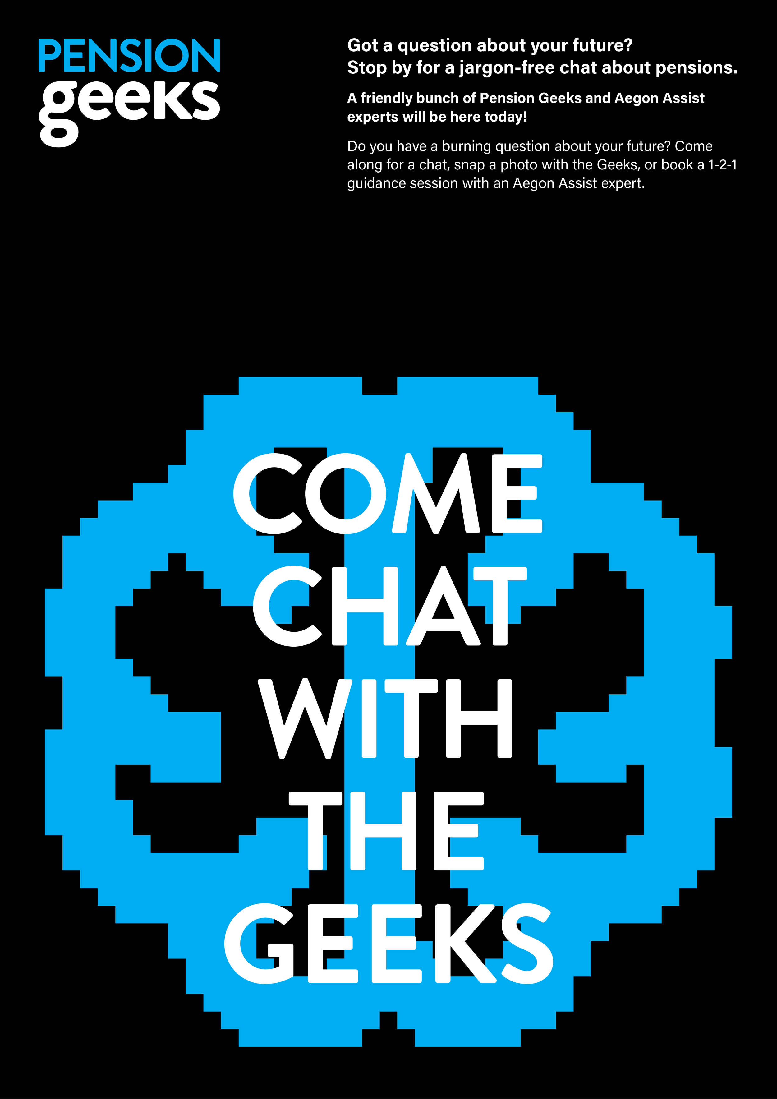
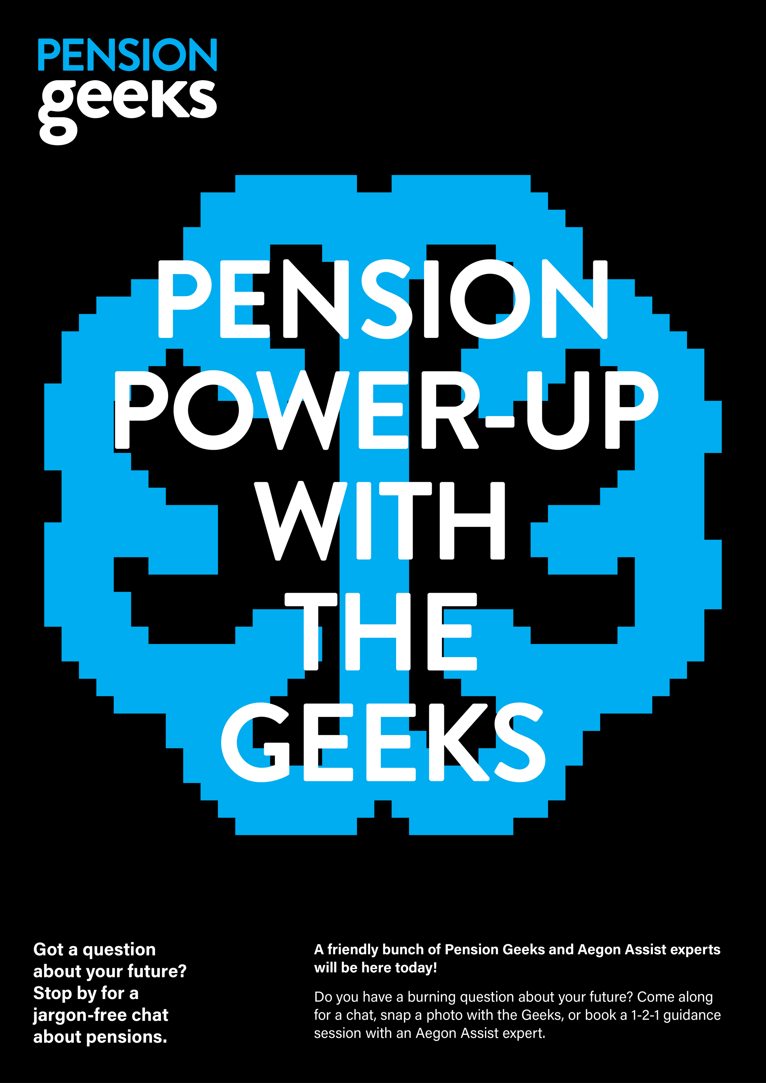
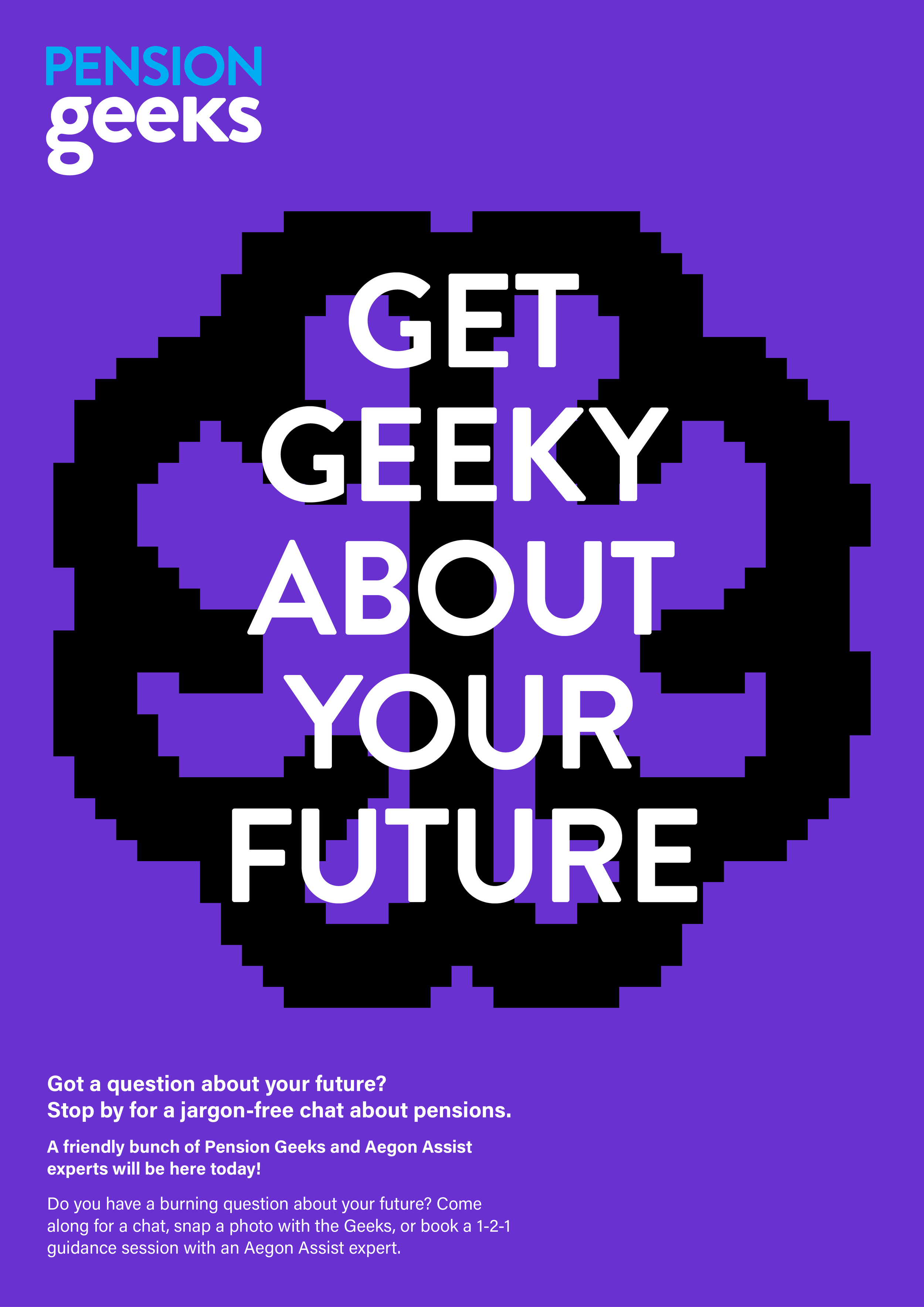
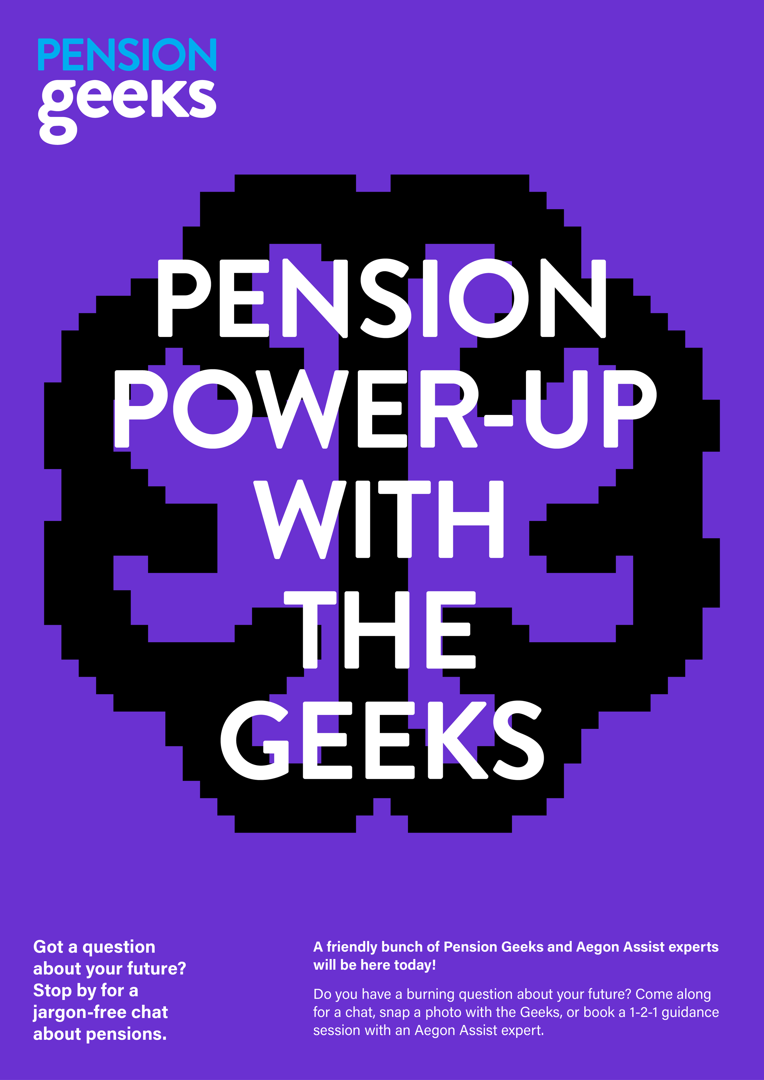
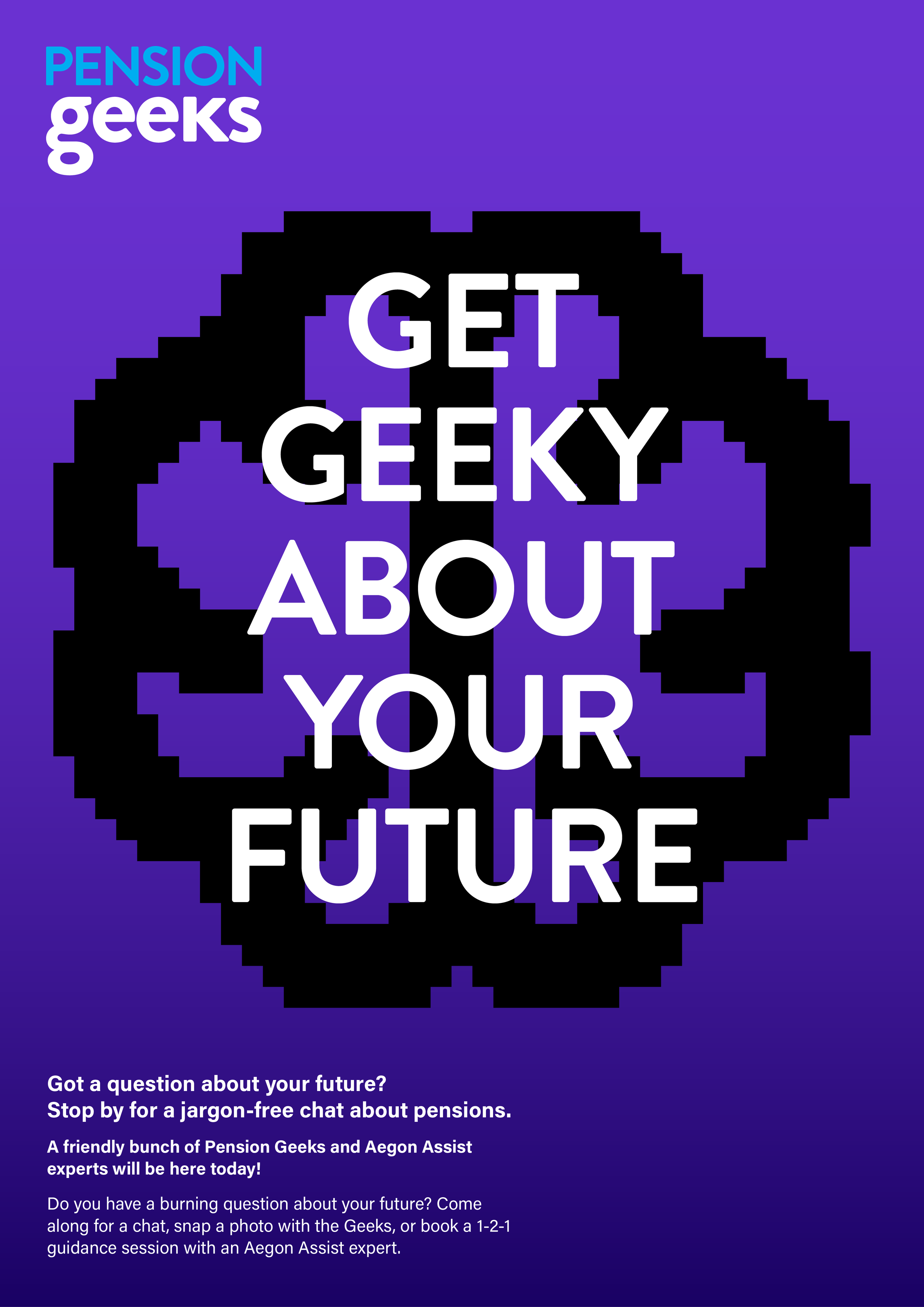
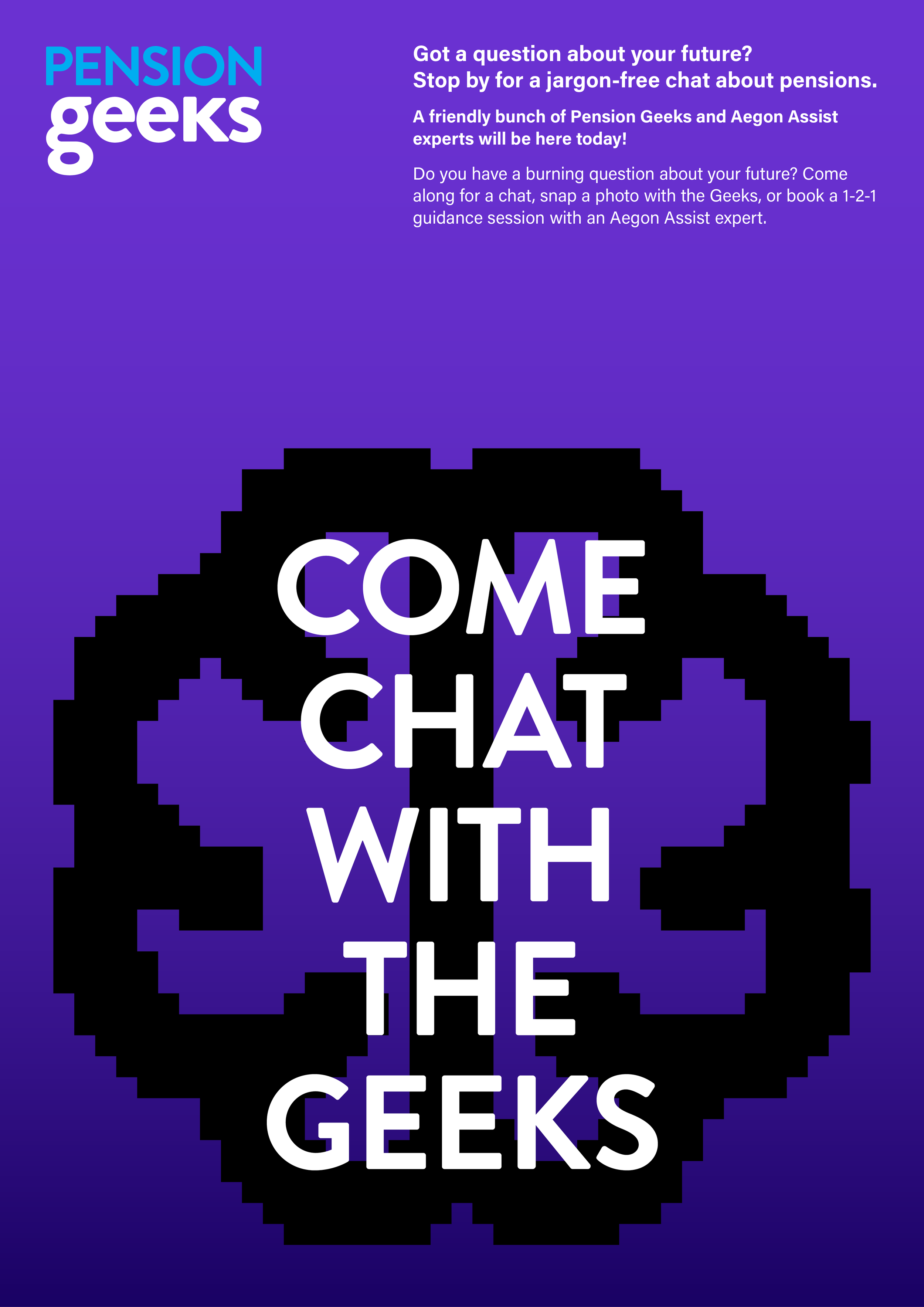
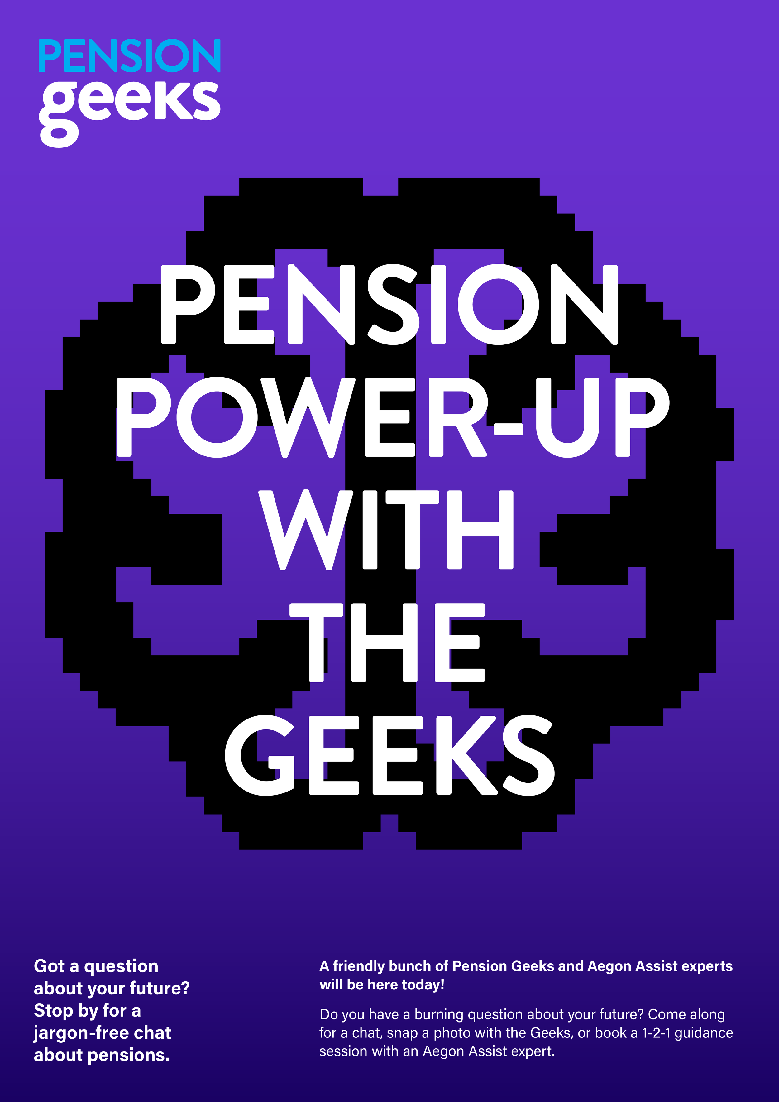
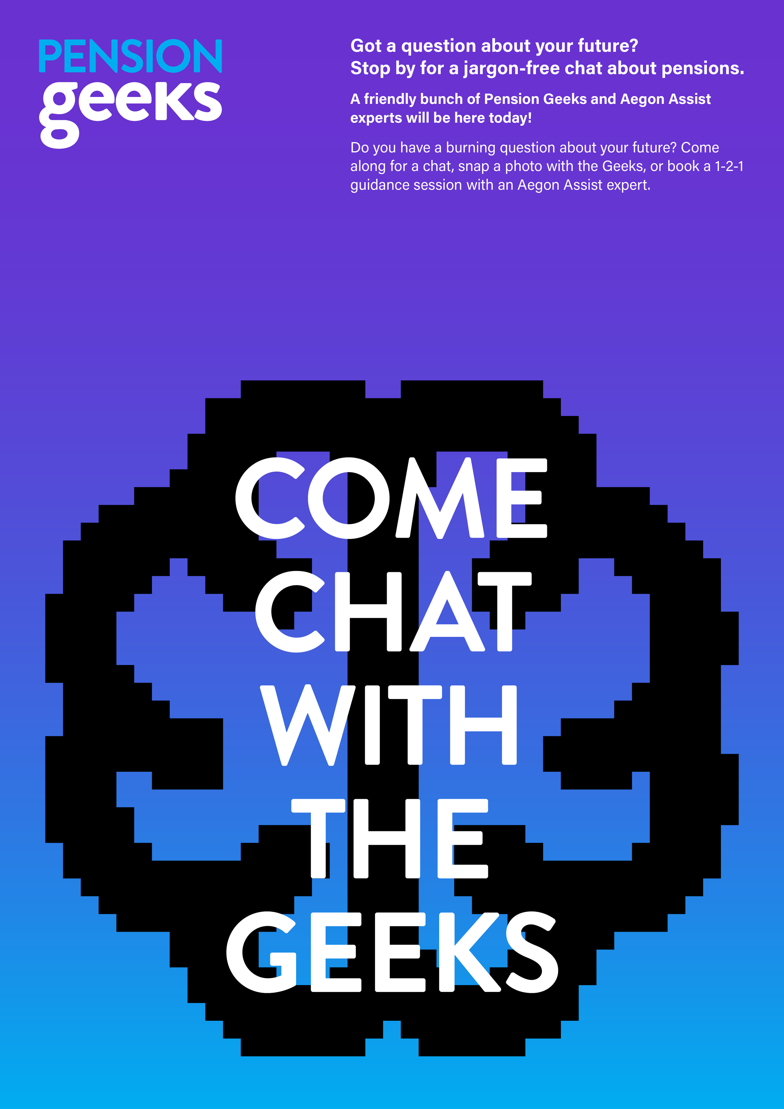
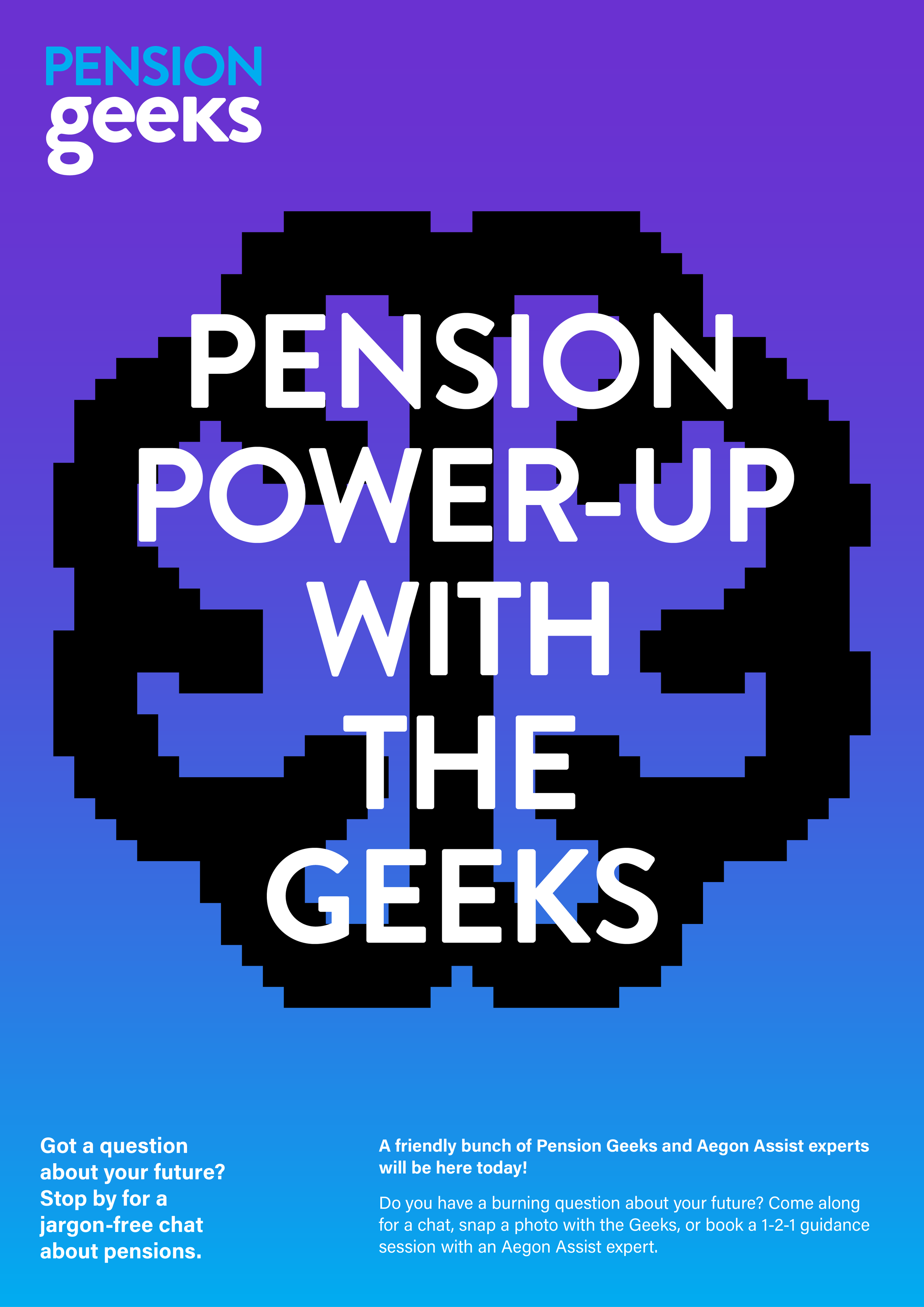
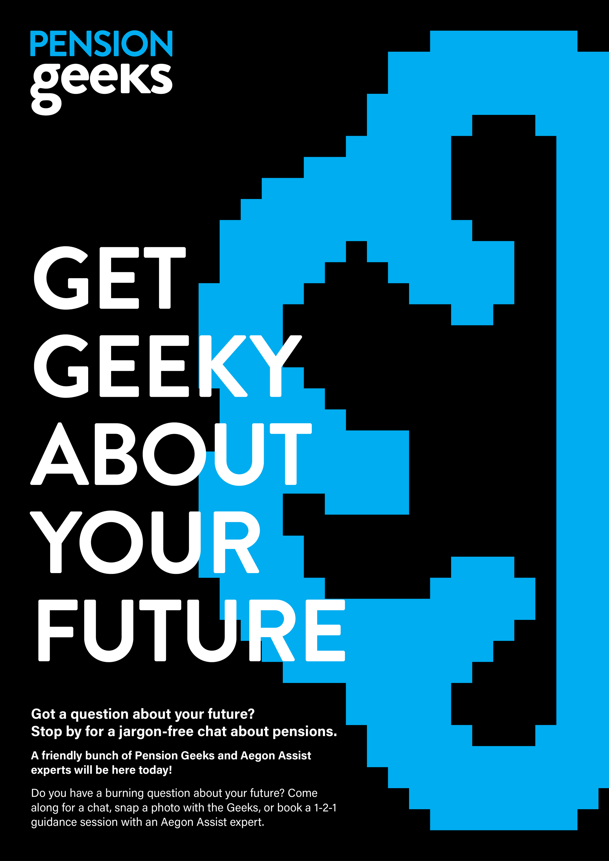
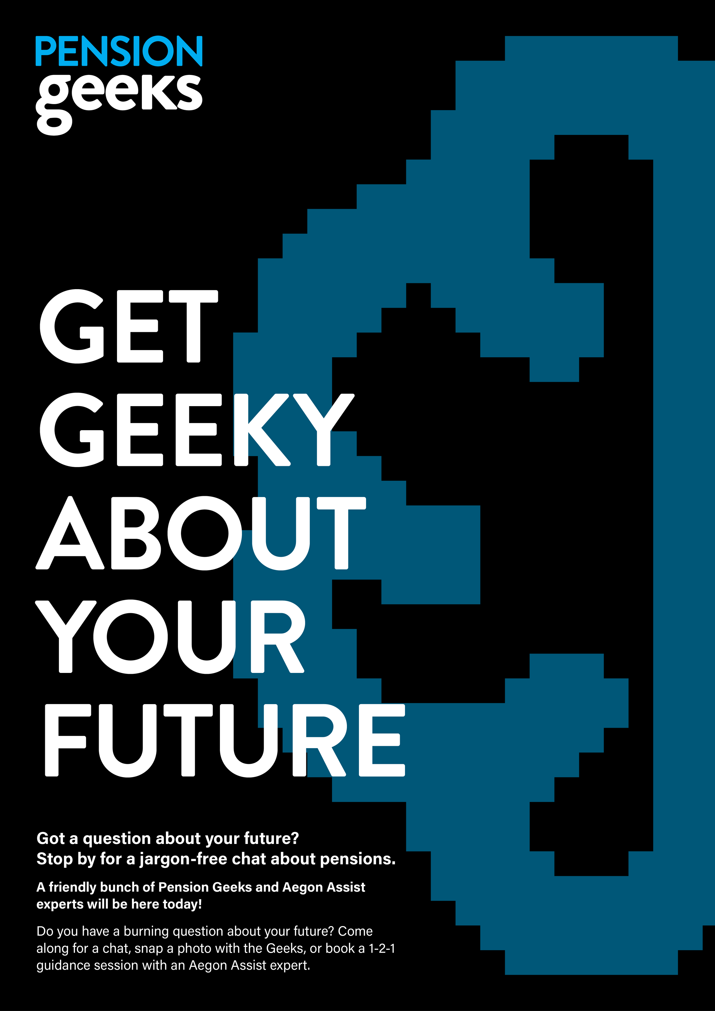
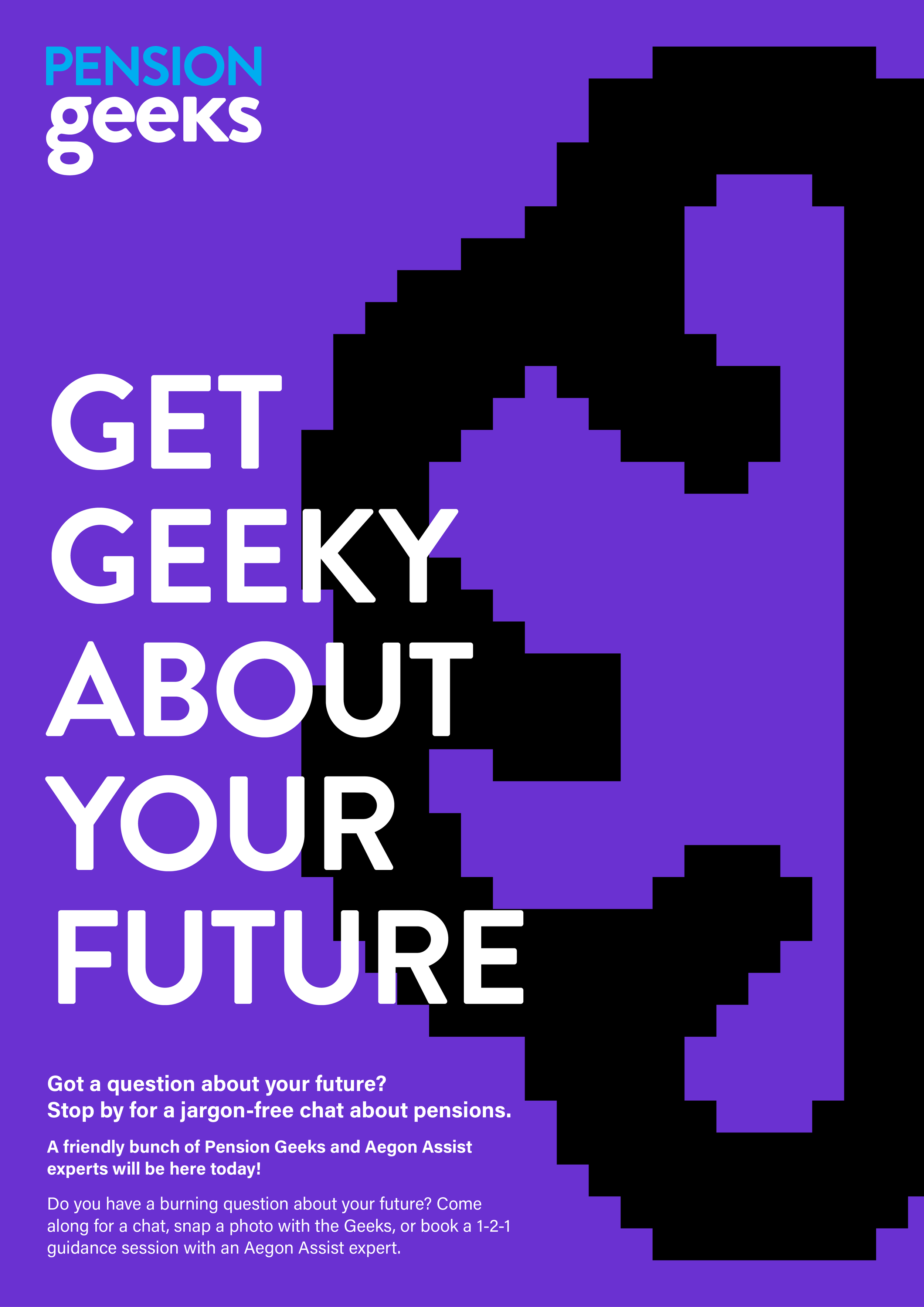
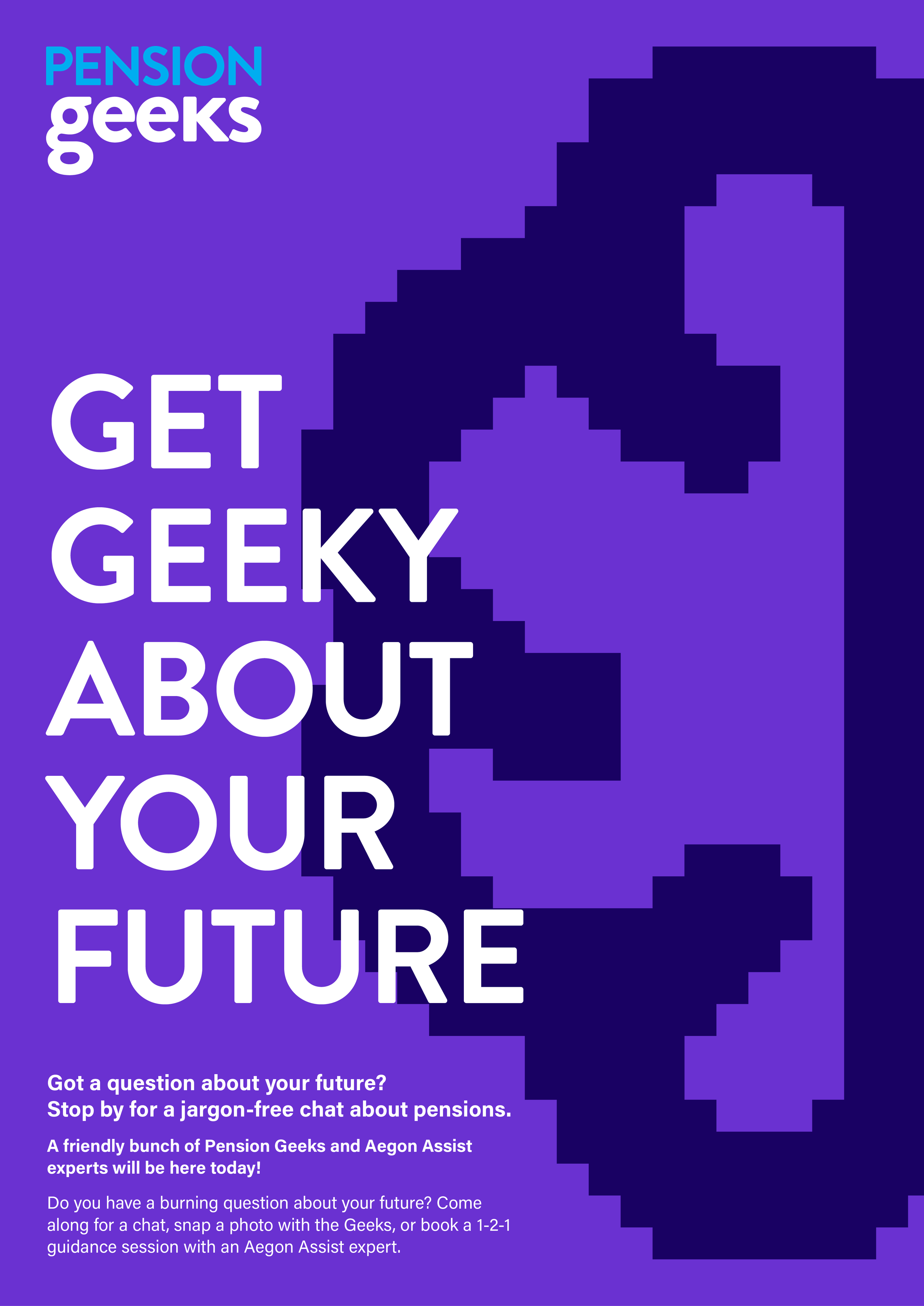
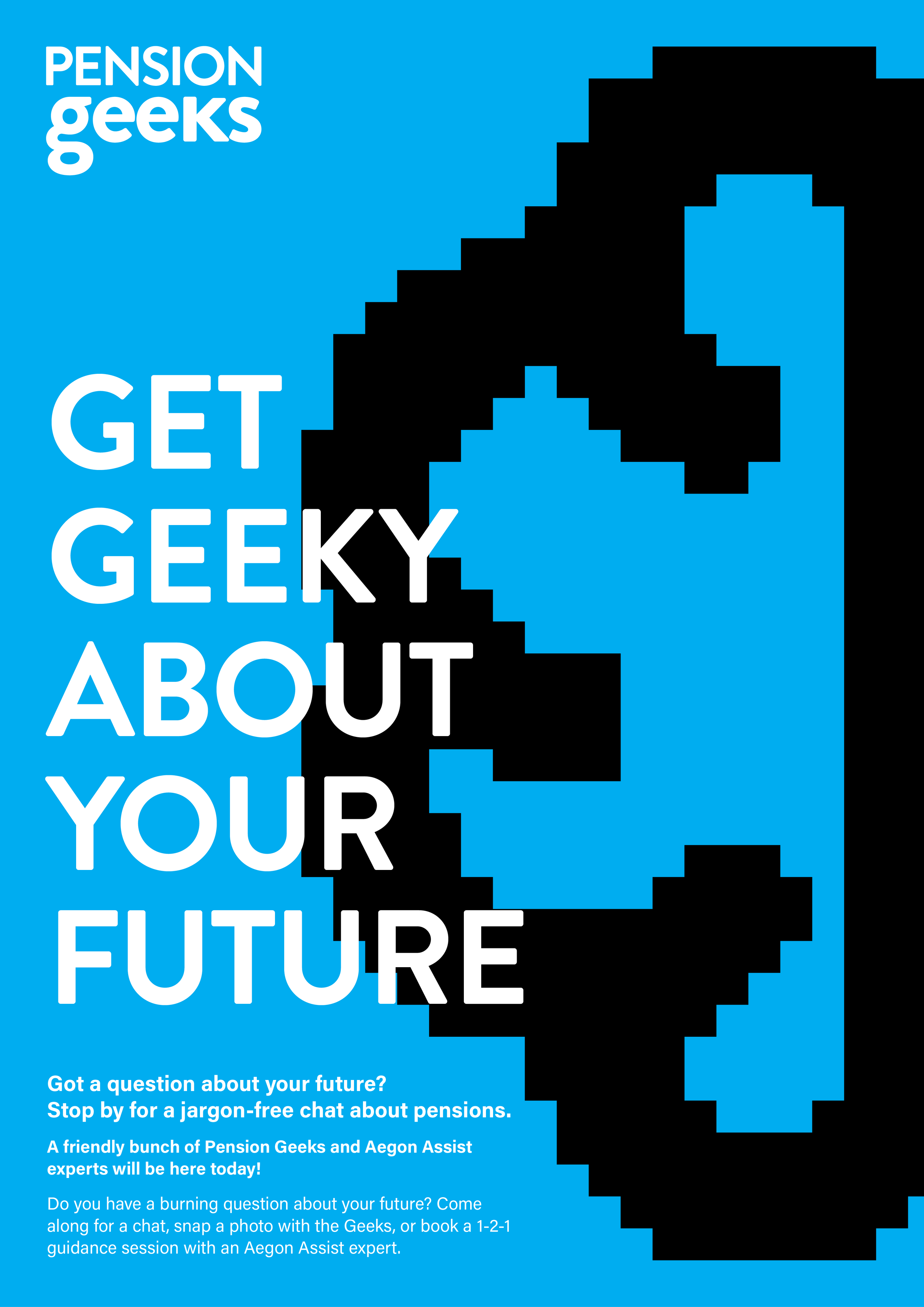
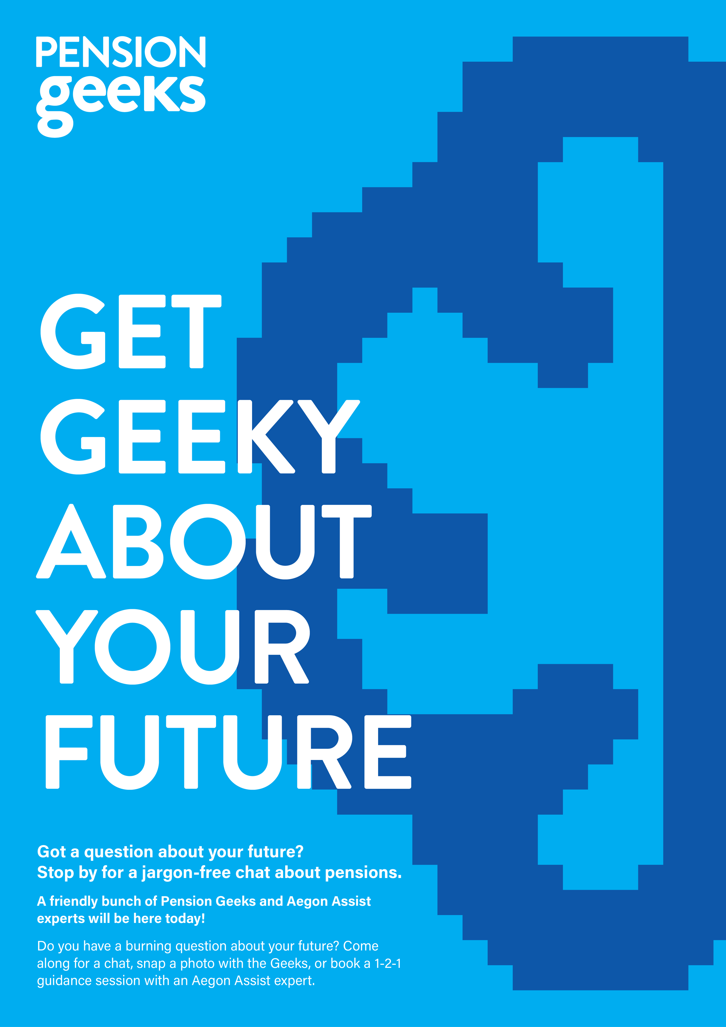
The initial design exploration introduced a retro-gaming inspired visual identity, using bold, block-style pixels, high-contrast colours, and strong typographic hierarchy. The aesthetic was designed to tap into nostalgia for older audiences while using vibrant colour and graphic simplicity to appeal to a younger demographic, creating a visually striking and inclusive event presence.


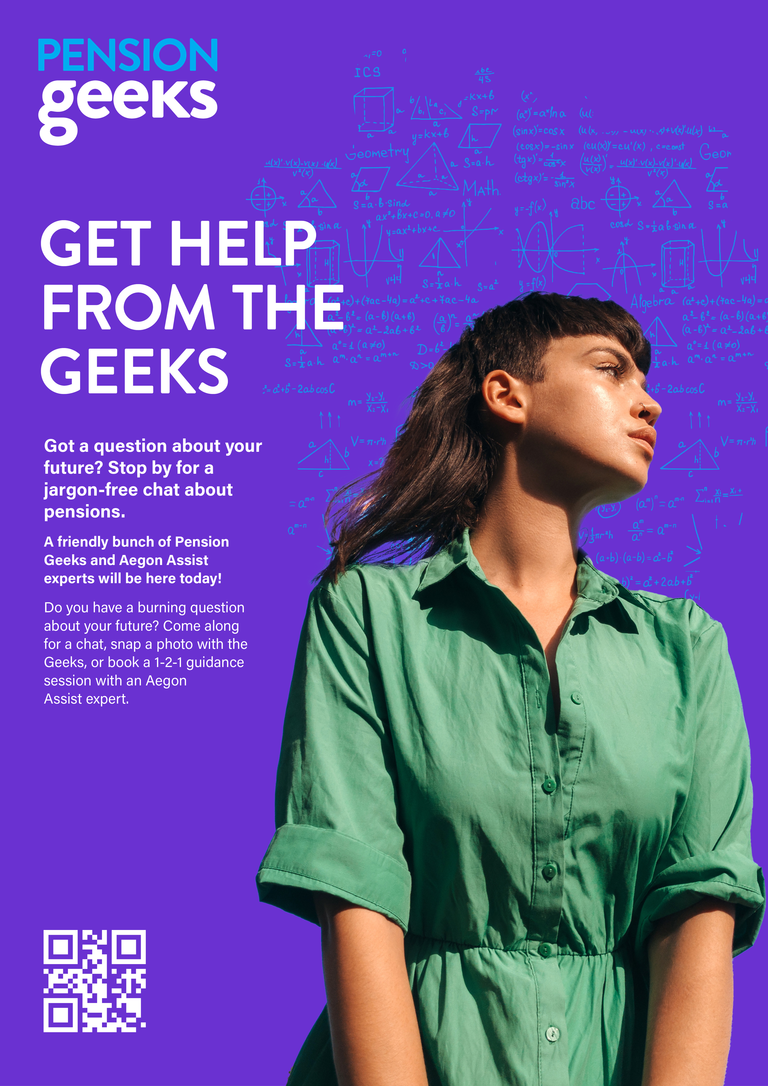
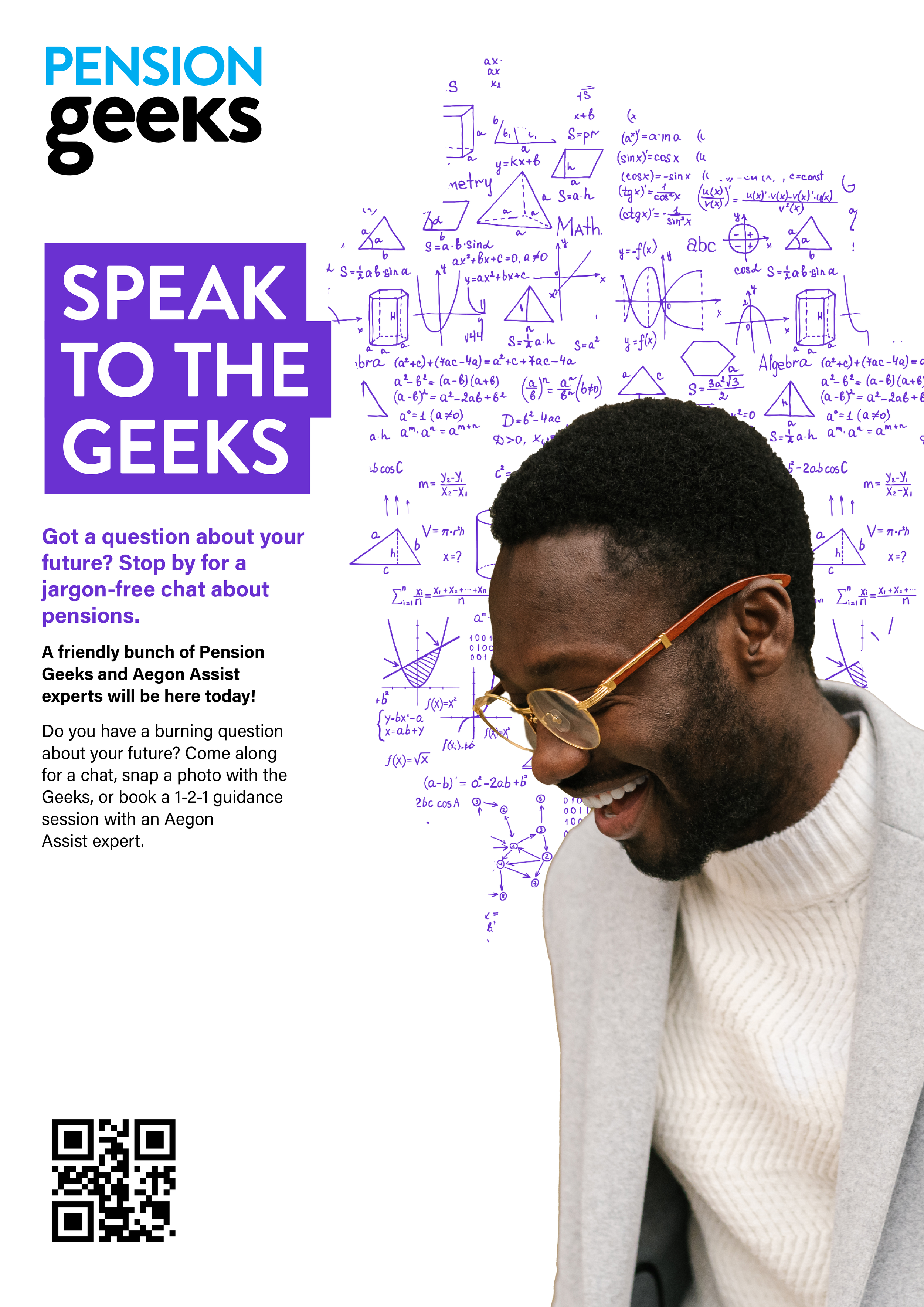
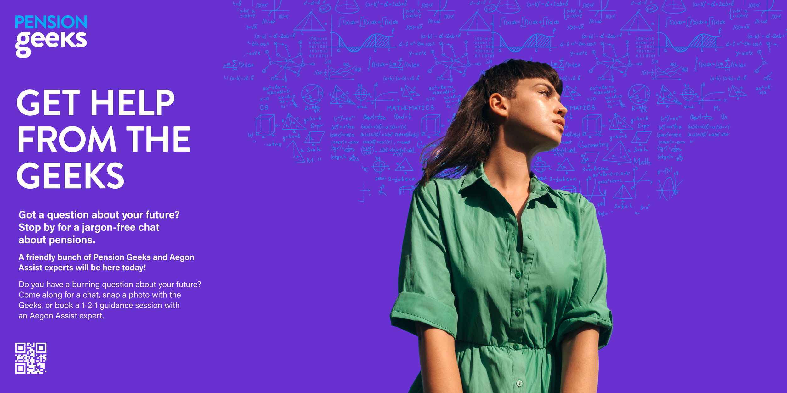
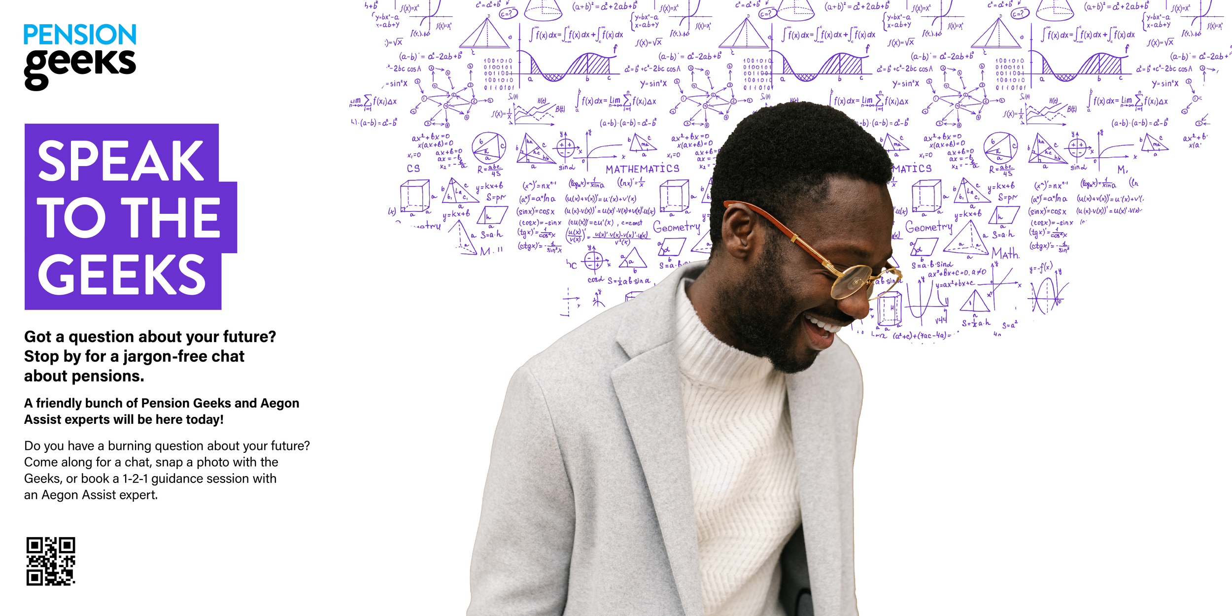
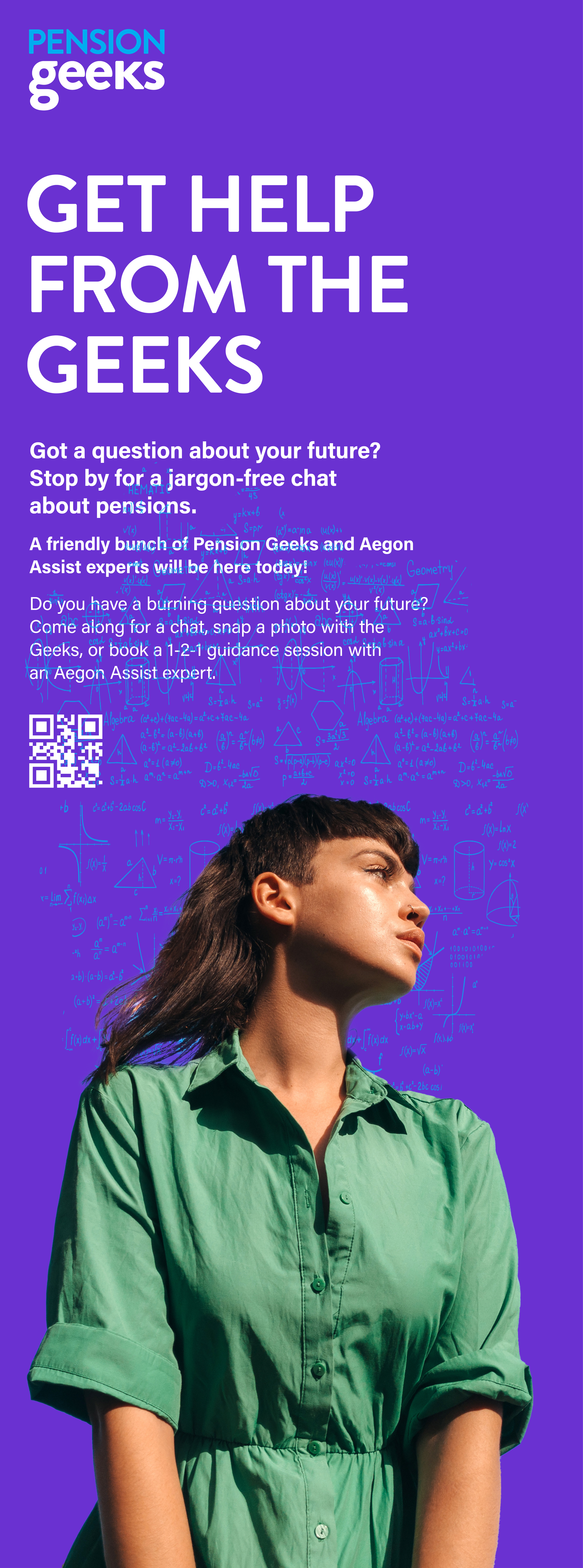
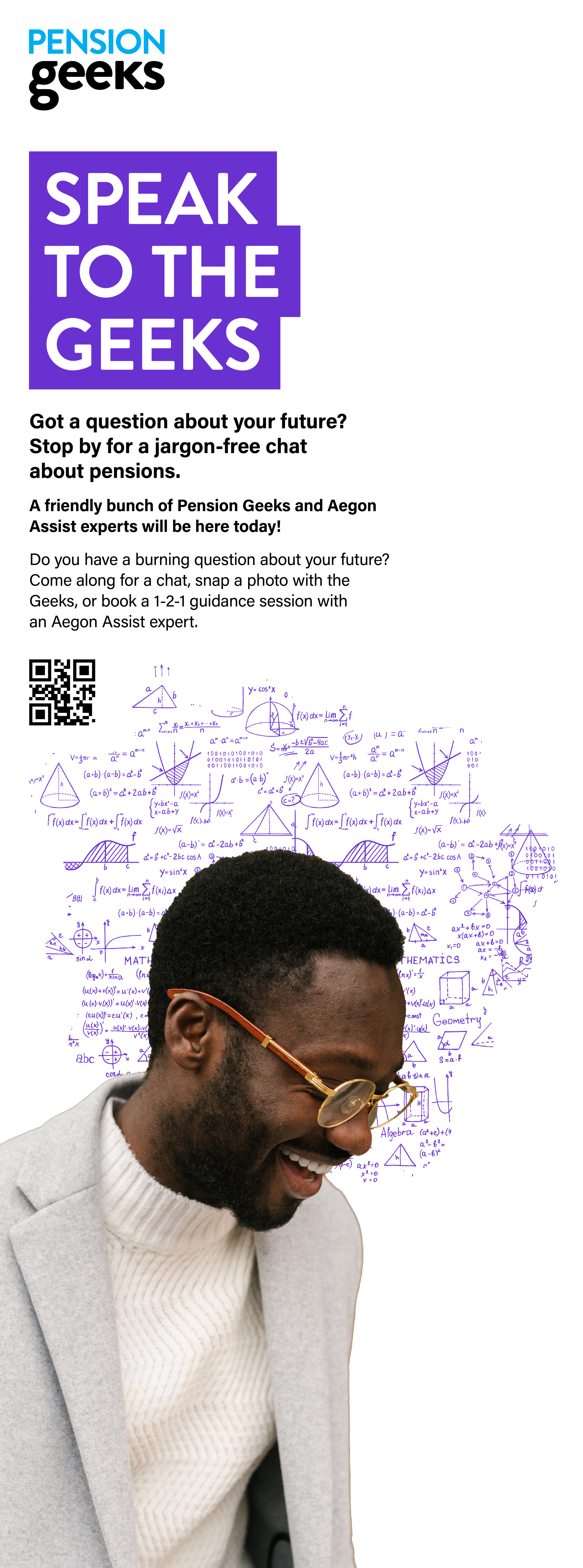
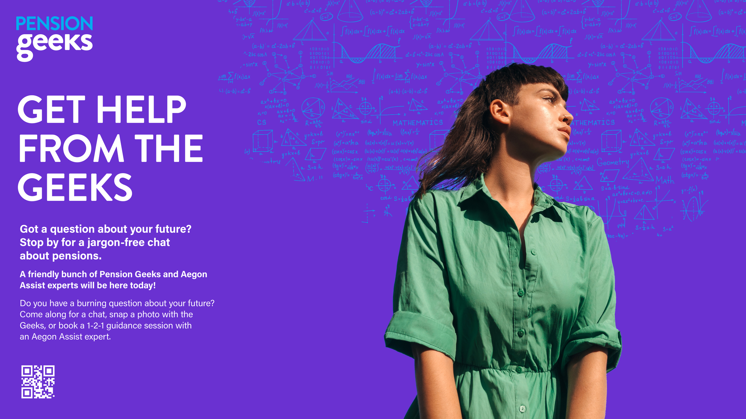
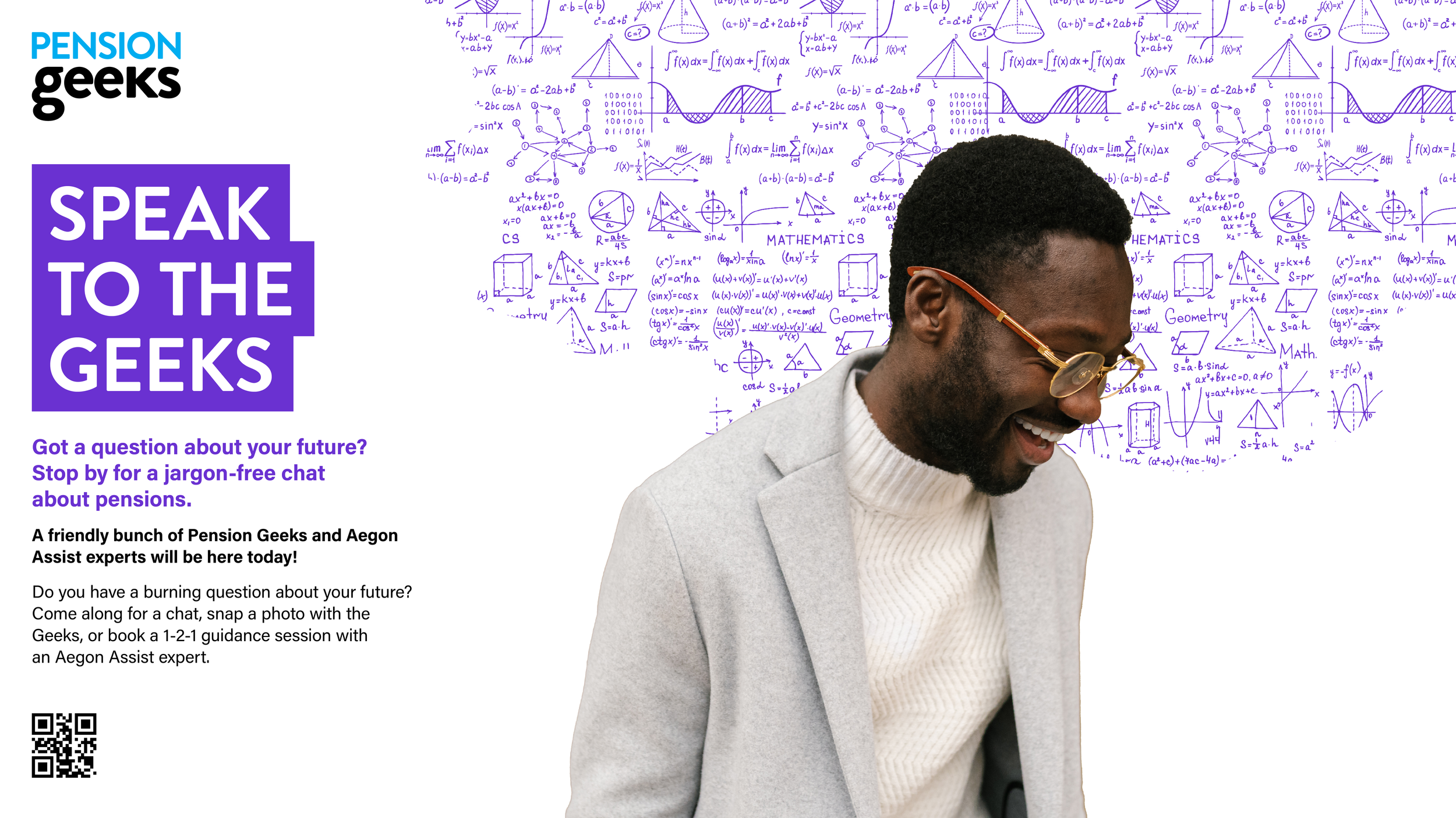
This concept focused on breaking down the complexity often associated with pensions and financial language. Visuals depicted people surrounded by clouds of confusing equations and abstract noise, representing the overwhelming nature of industry jargon. Clear, bold typography was then used to cut through the confusion, positioning Pension Geeks as a brand that simplifies complex information and provides clear, accessible answers.
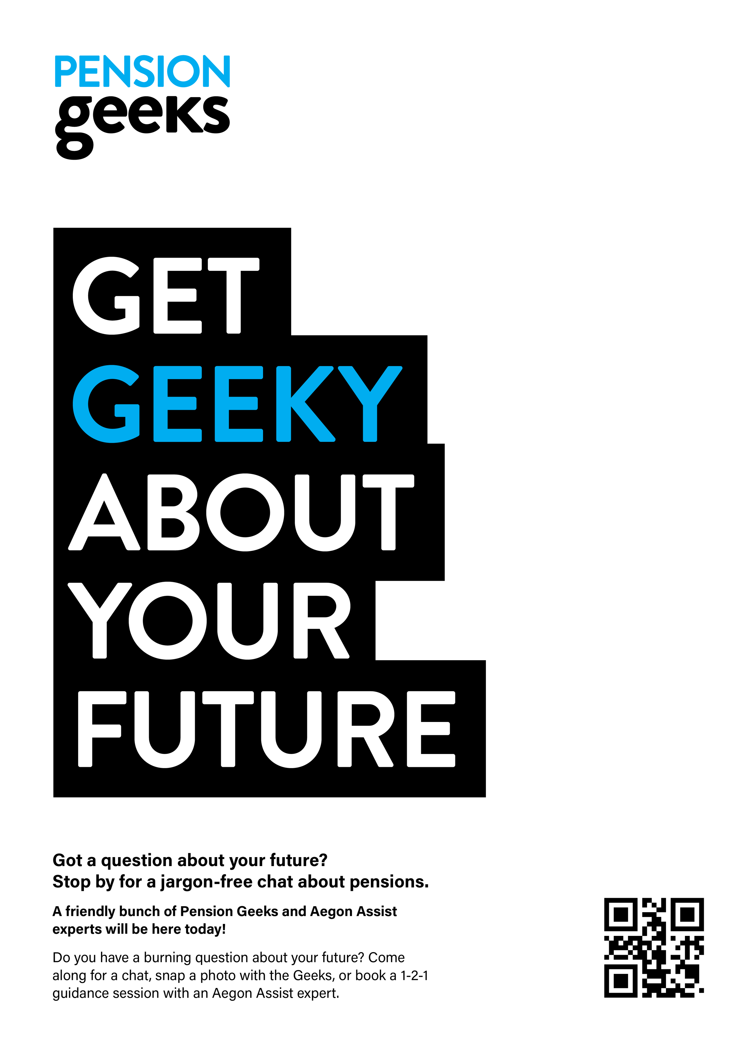
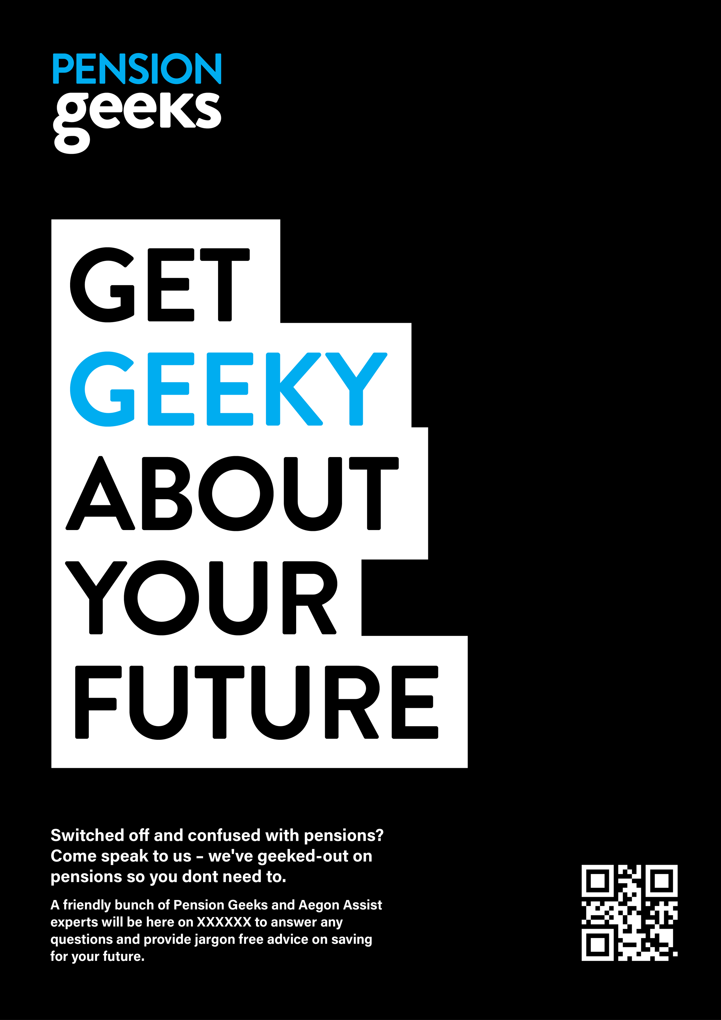
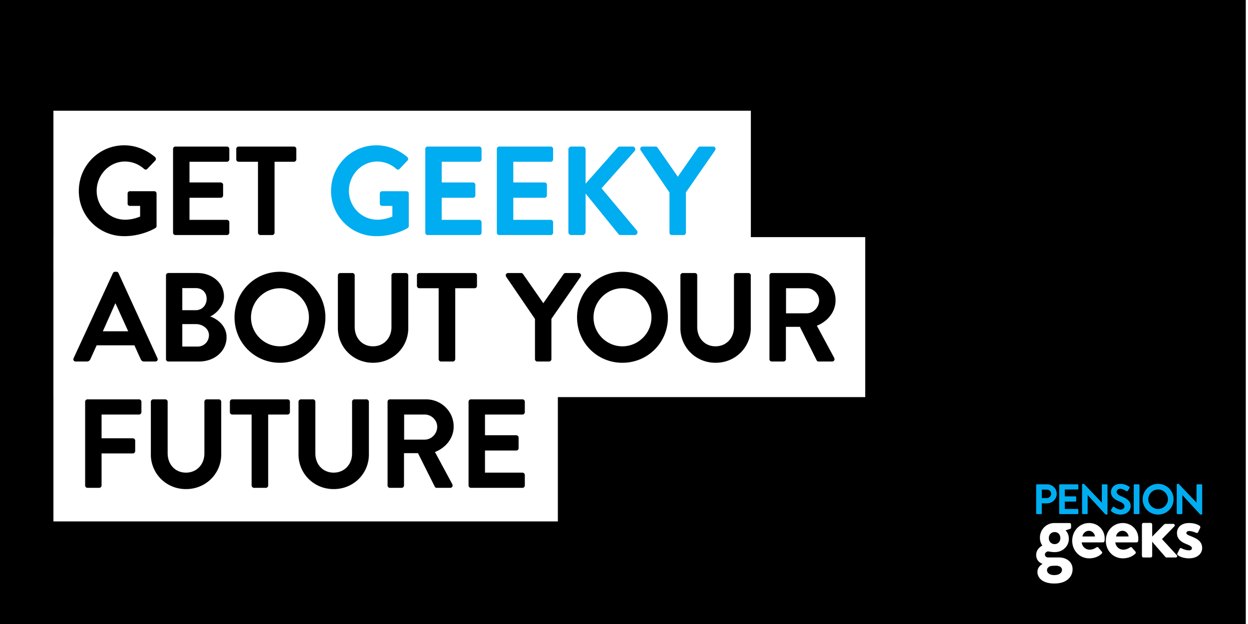
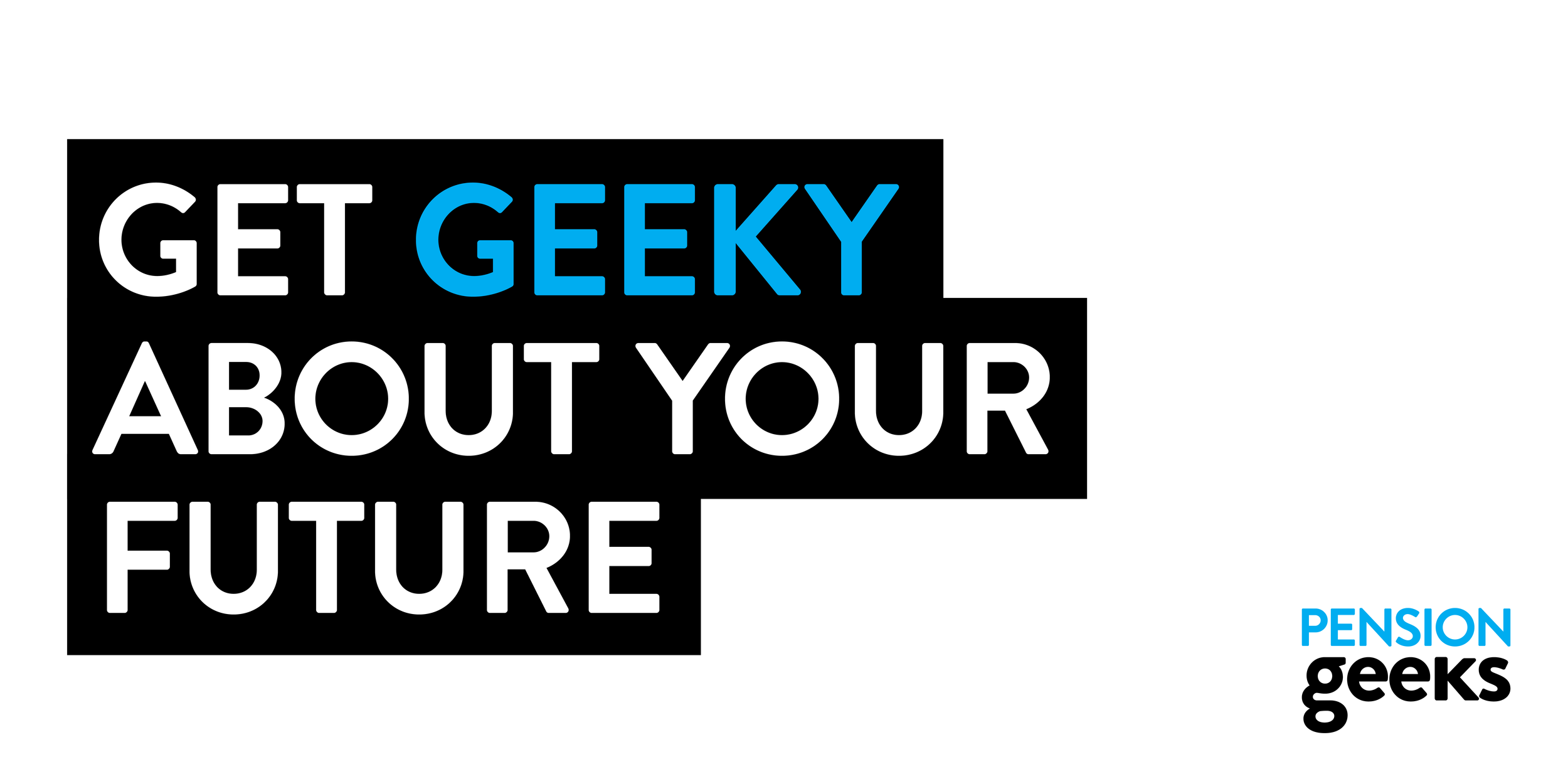
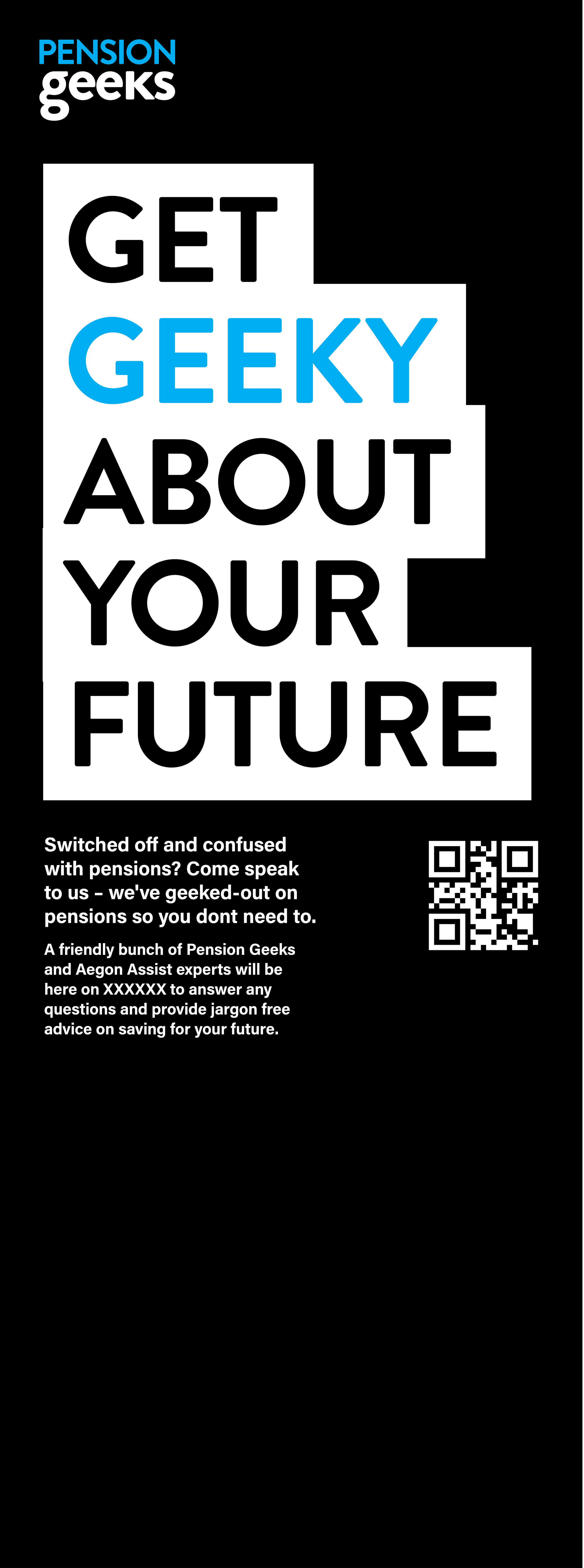
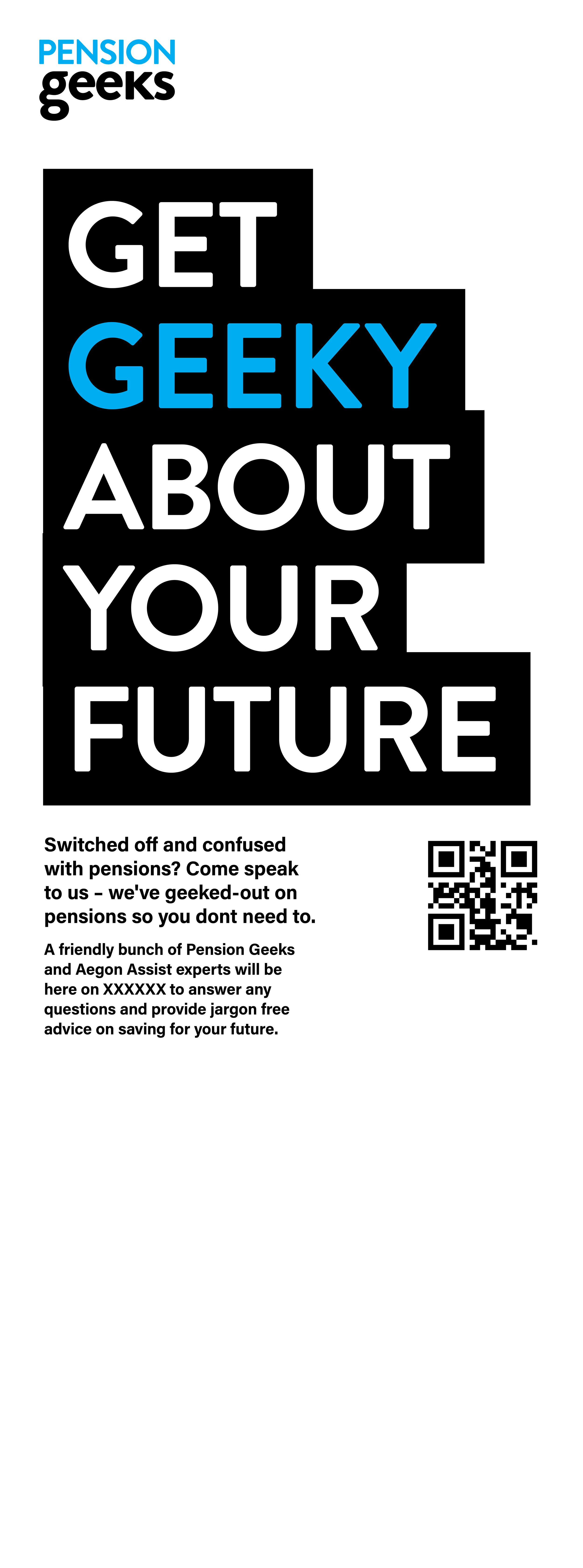
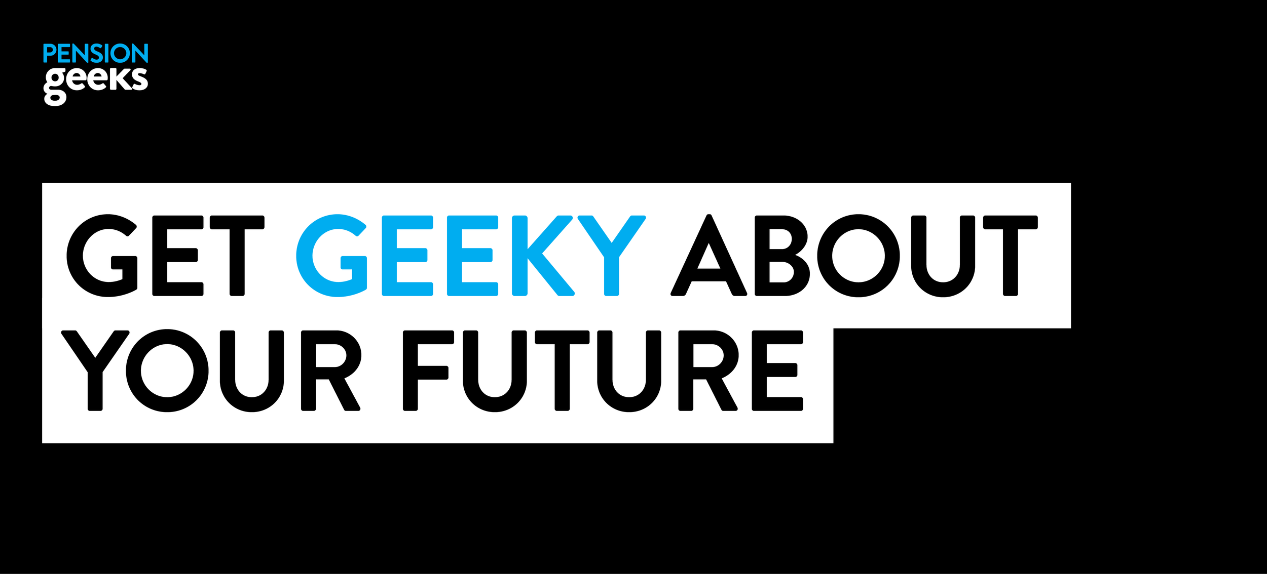
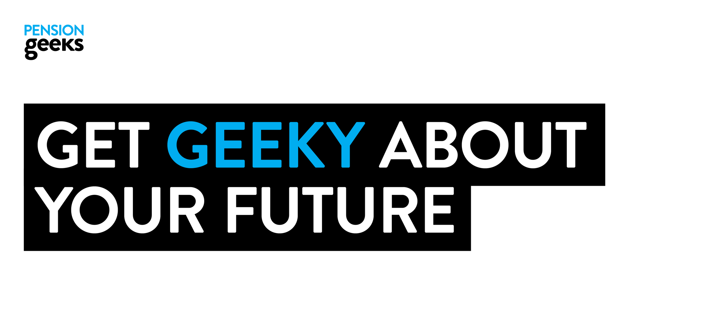
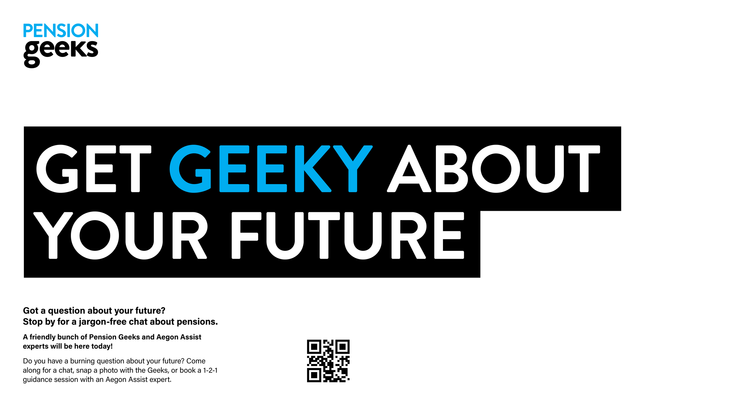
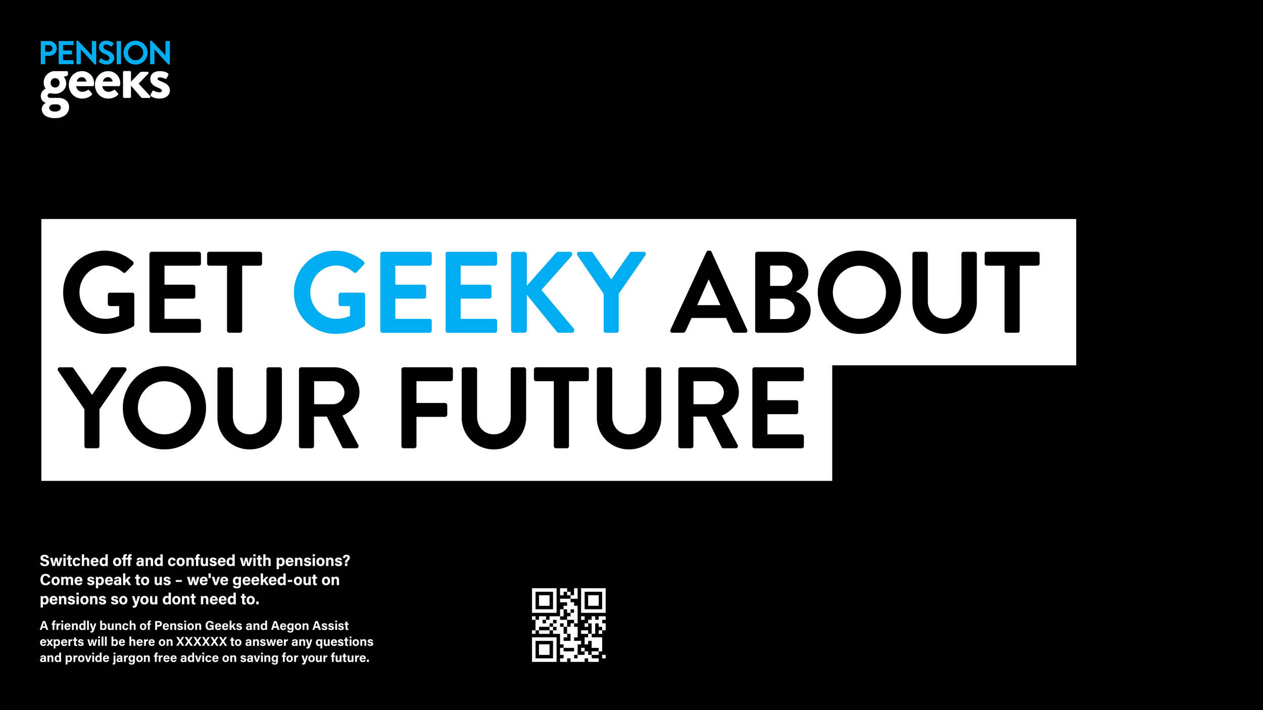
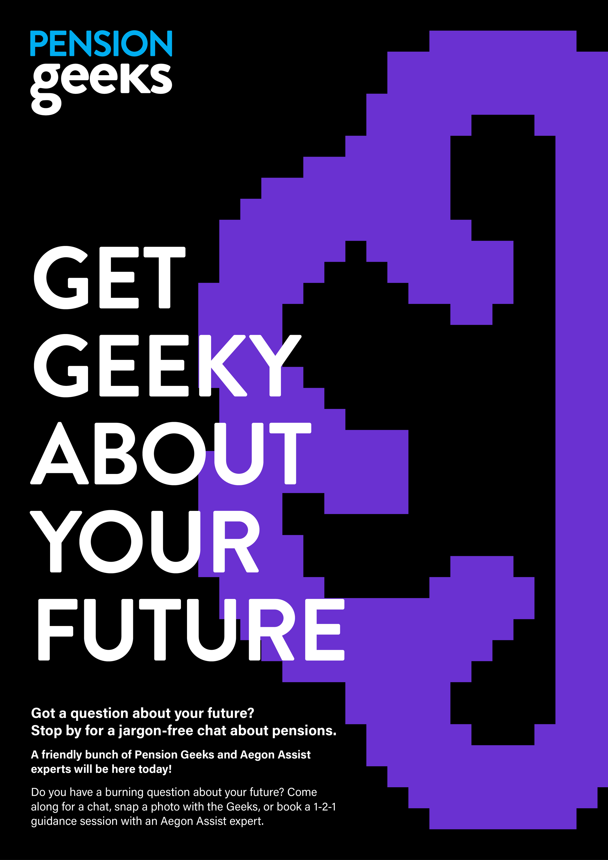
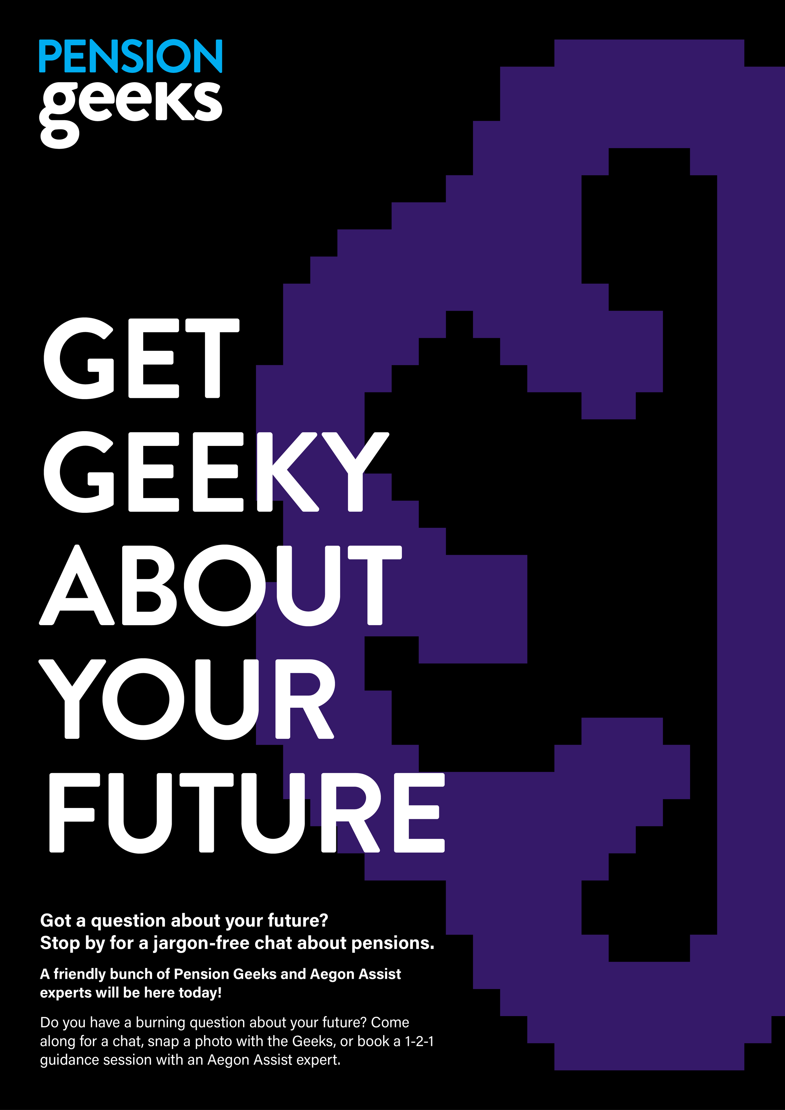
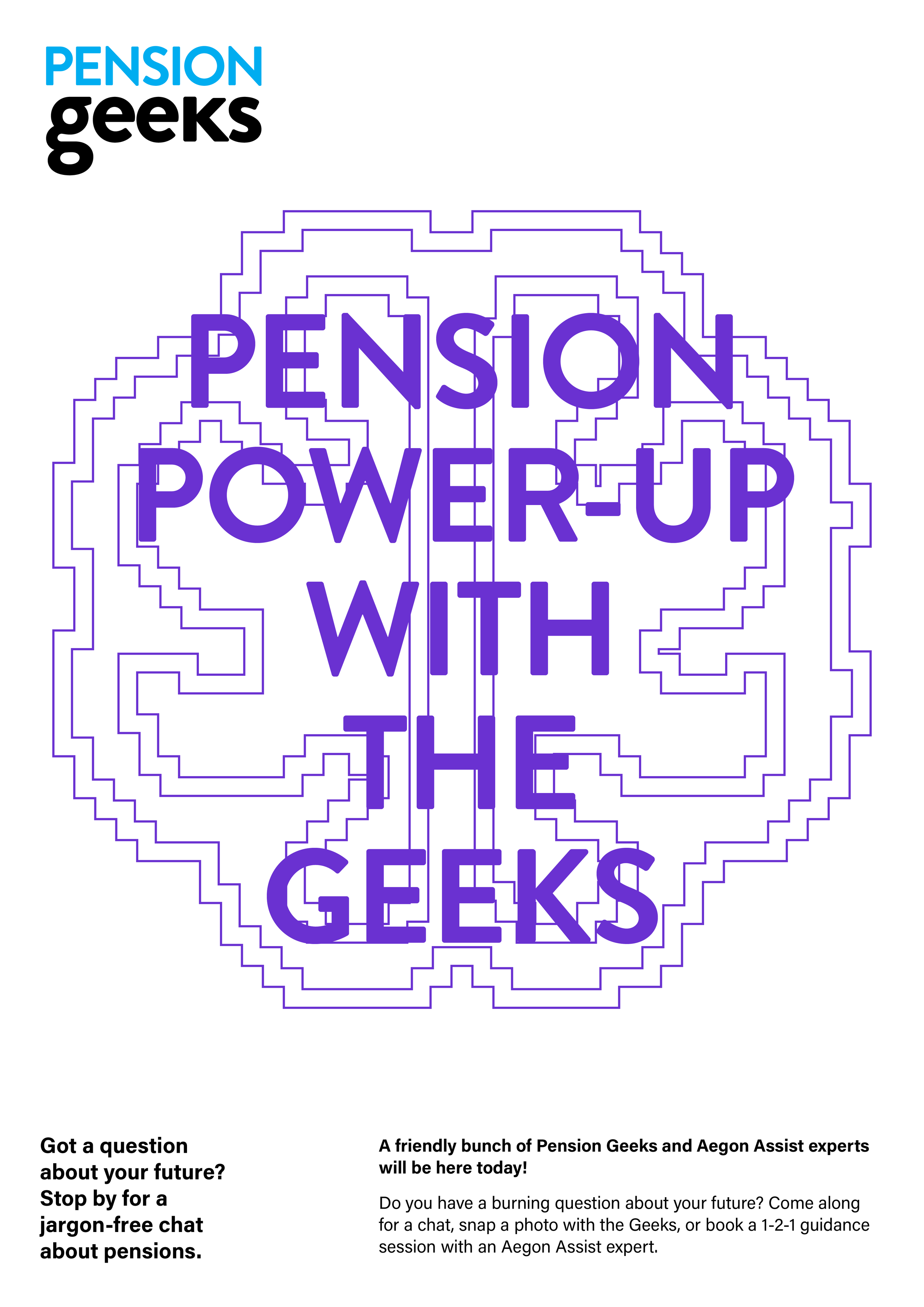
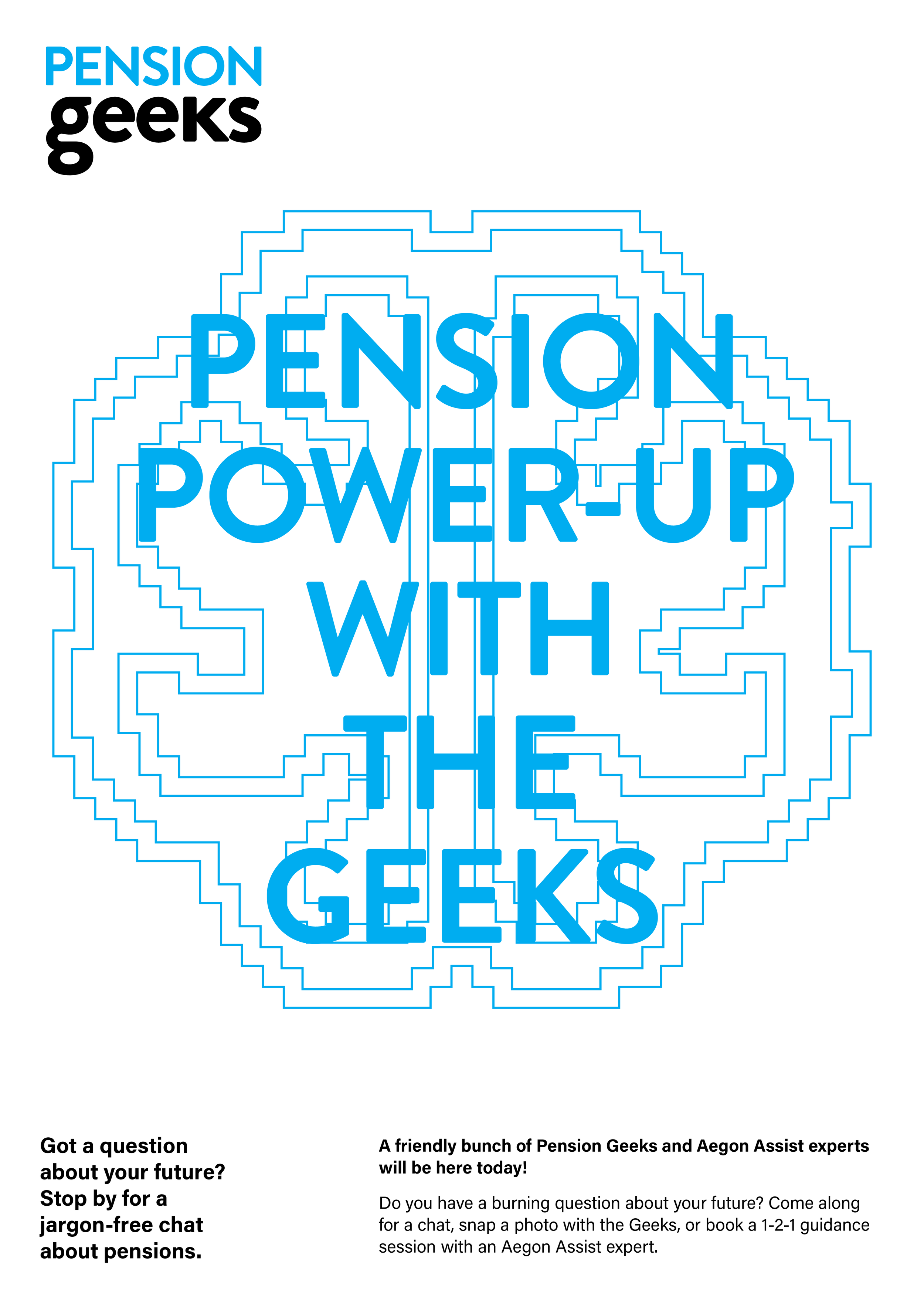
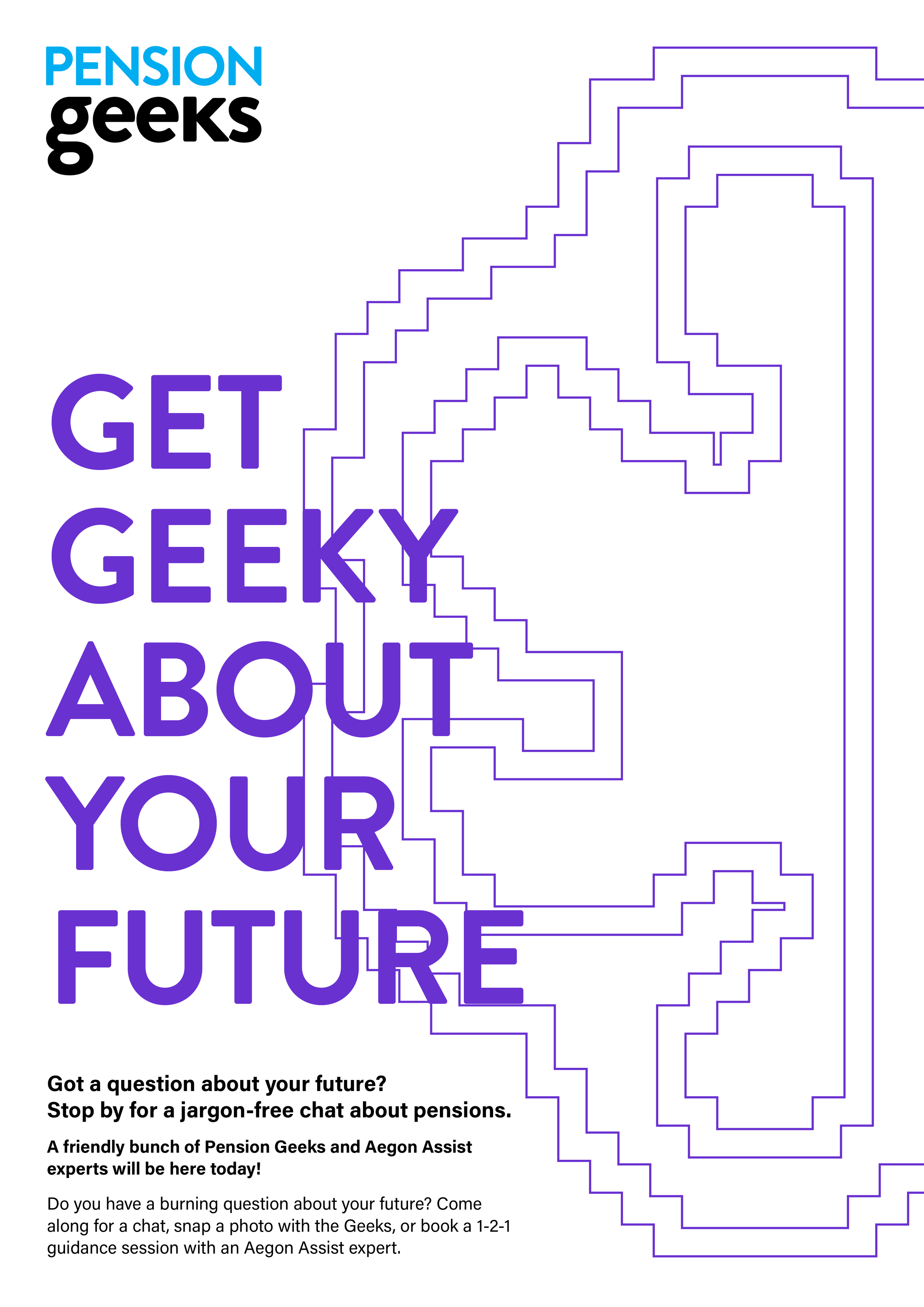
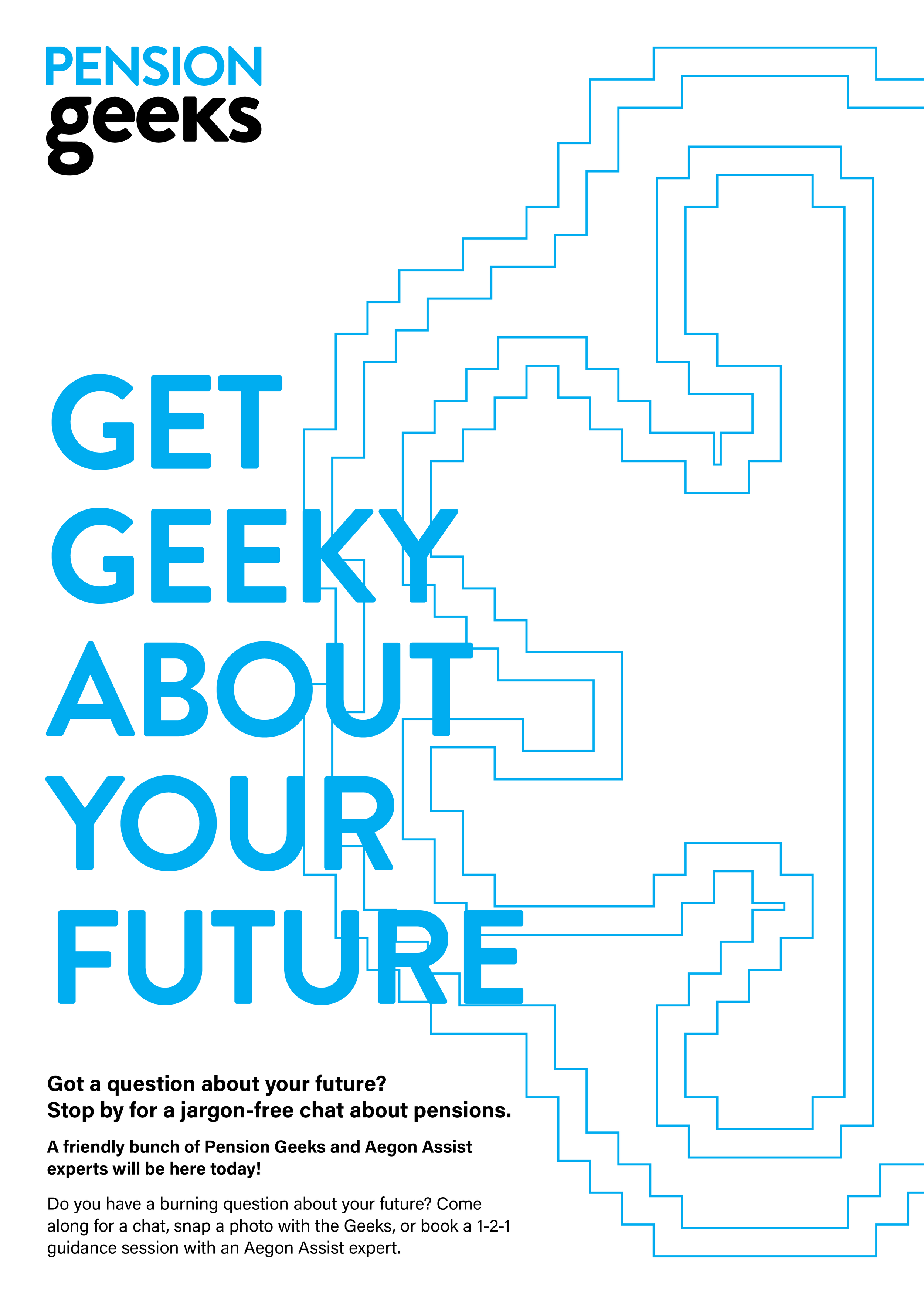
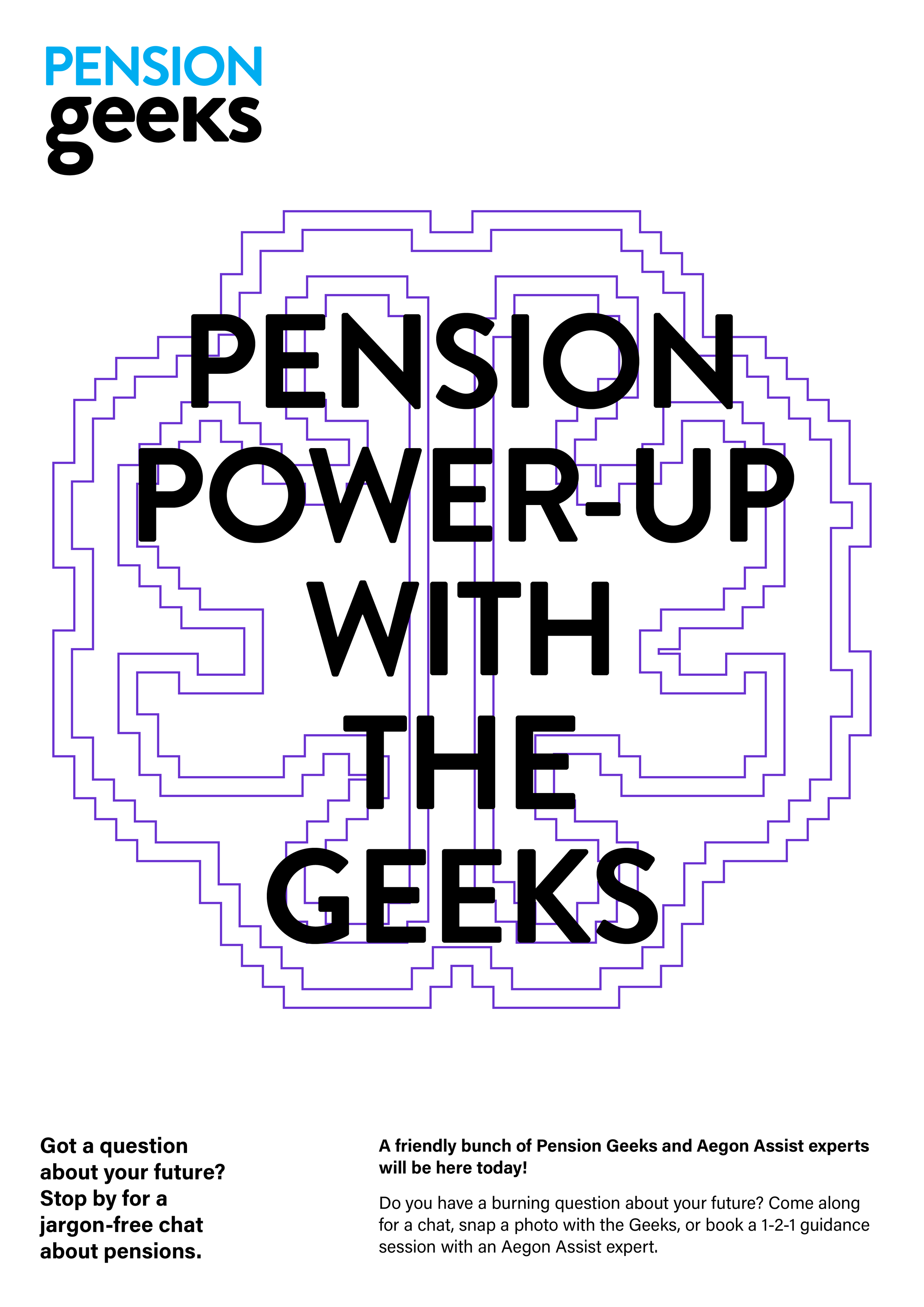
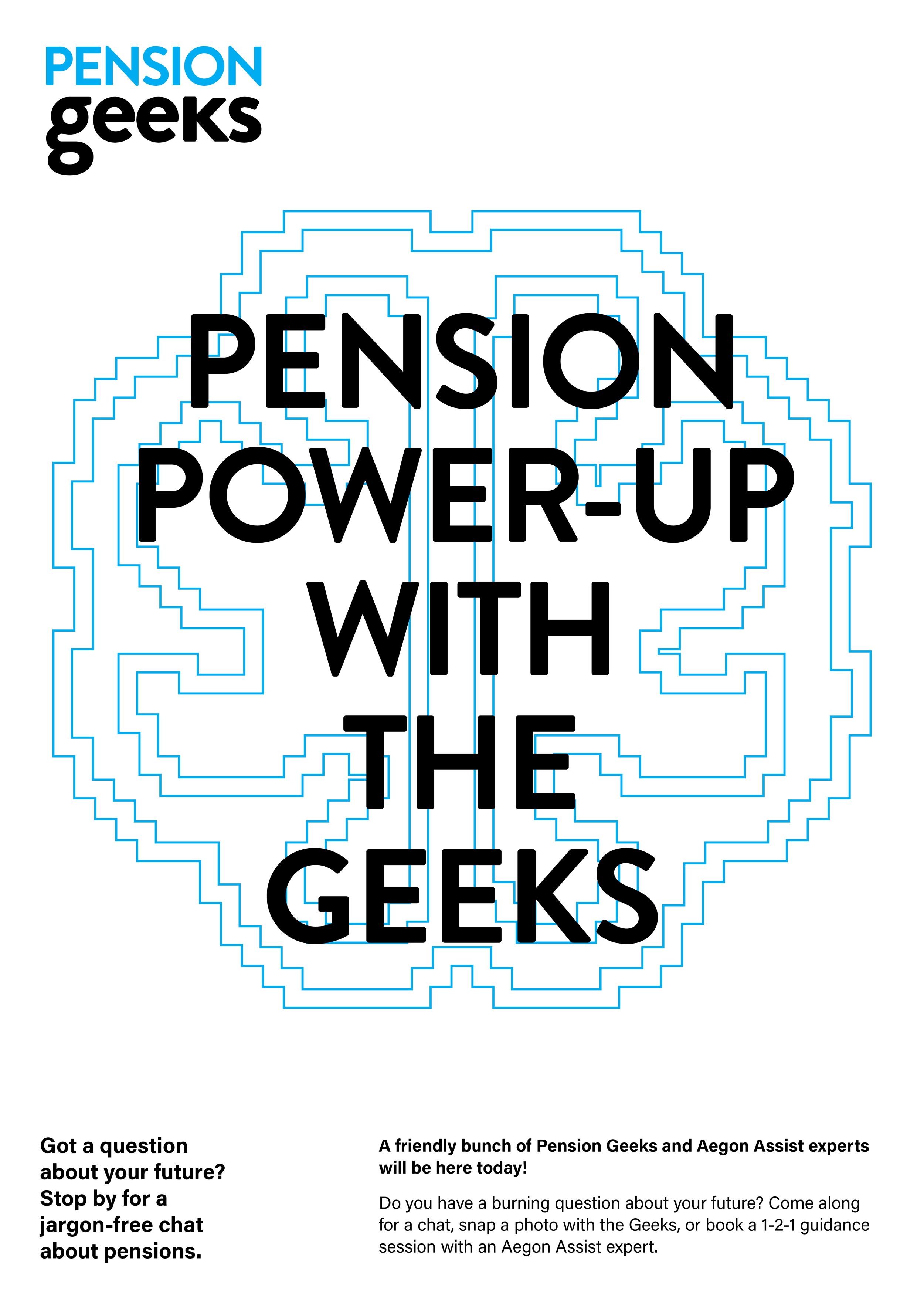
The final exploration moved toward a clean, purely typographic solution. A highlighted text treatment was used to draw focus to the core message, deliberately stripping away visual noise. This approach positioned clarity as the solution itself, guiding the viewer away from confusion and toward simple, direct communication, much like a lighthouse cutting through uncertainty.
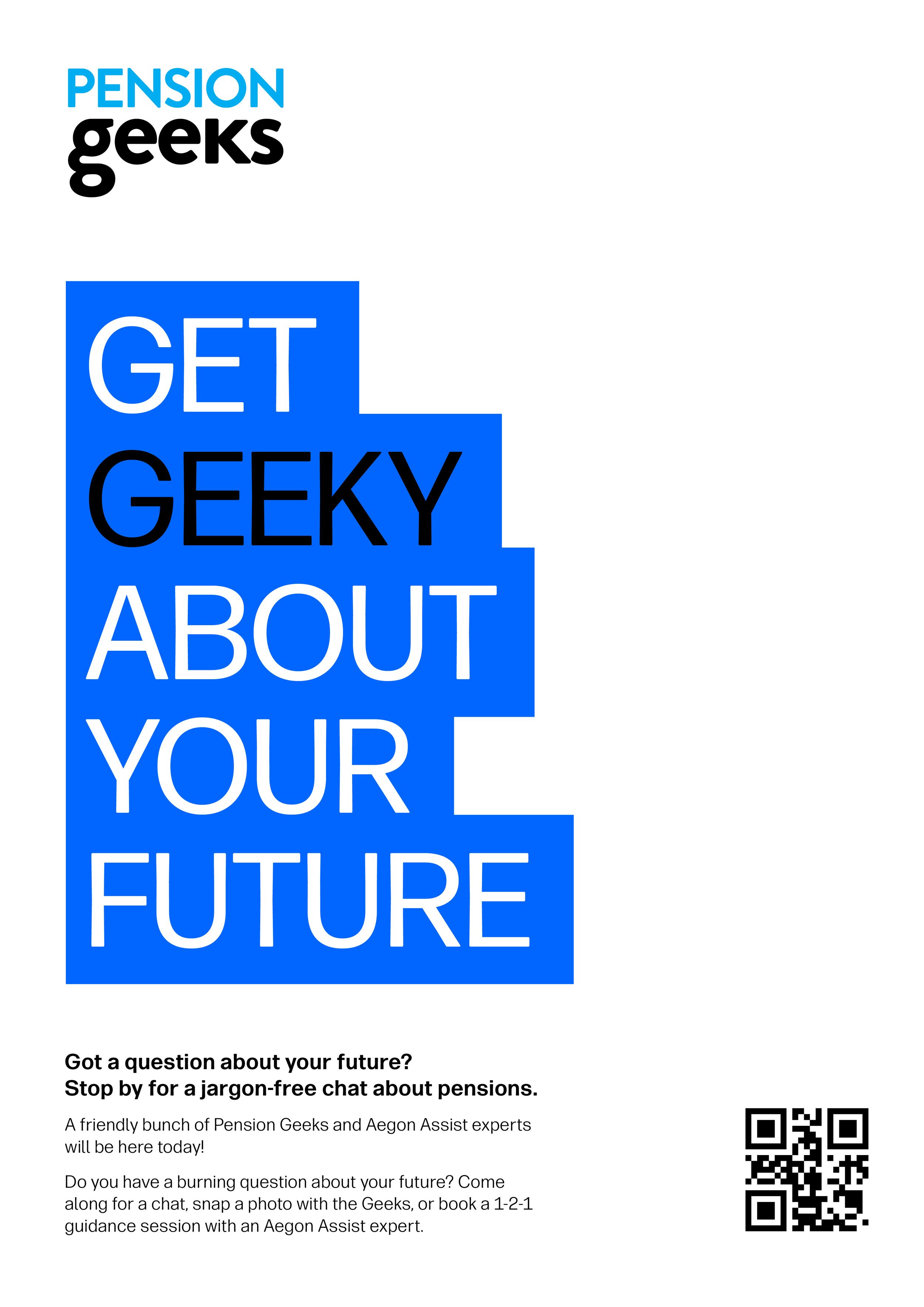
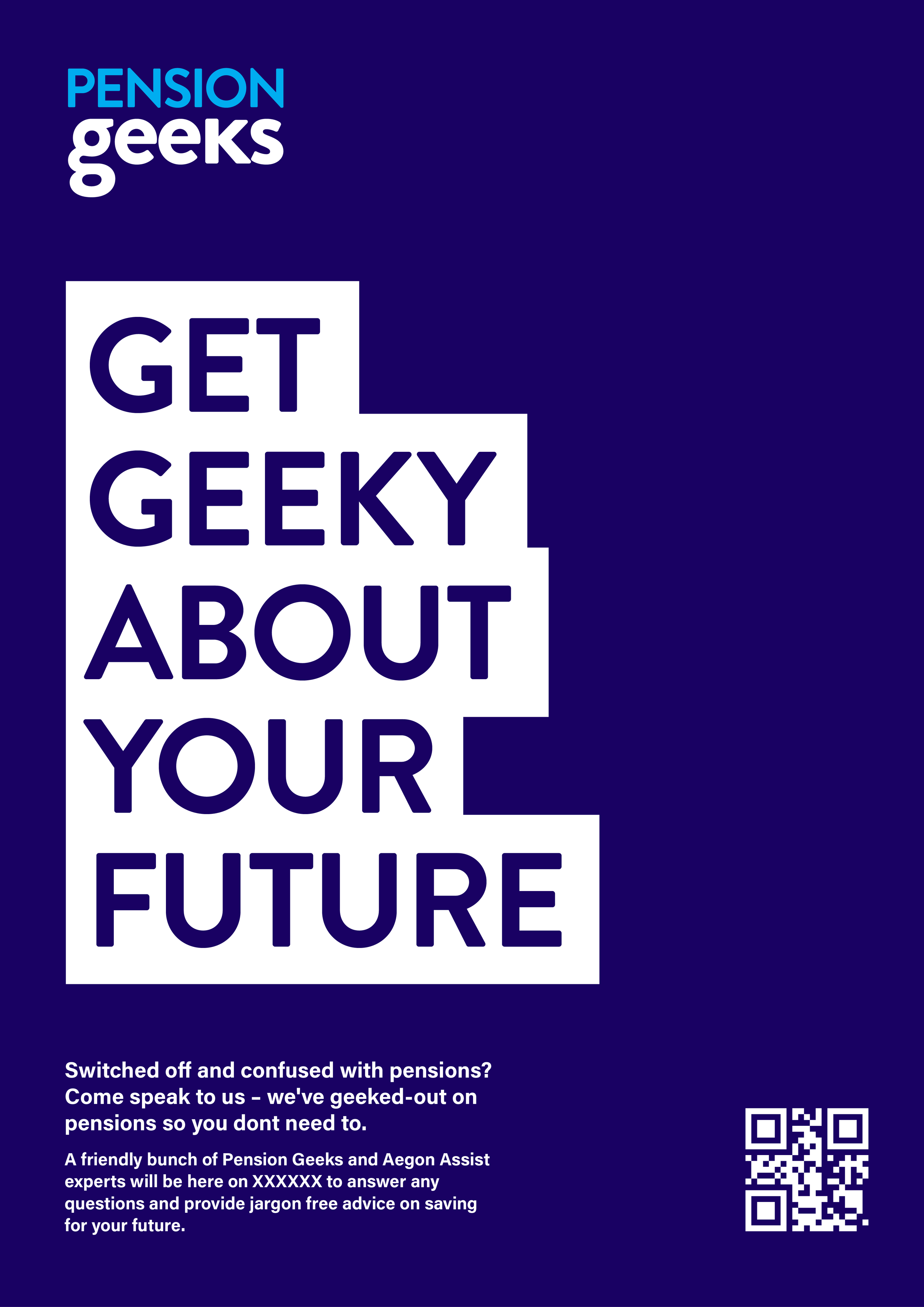
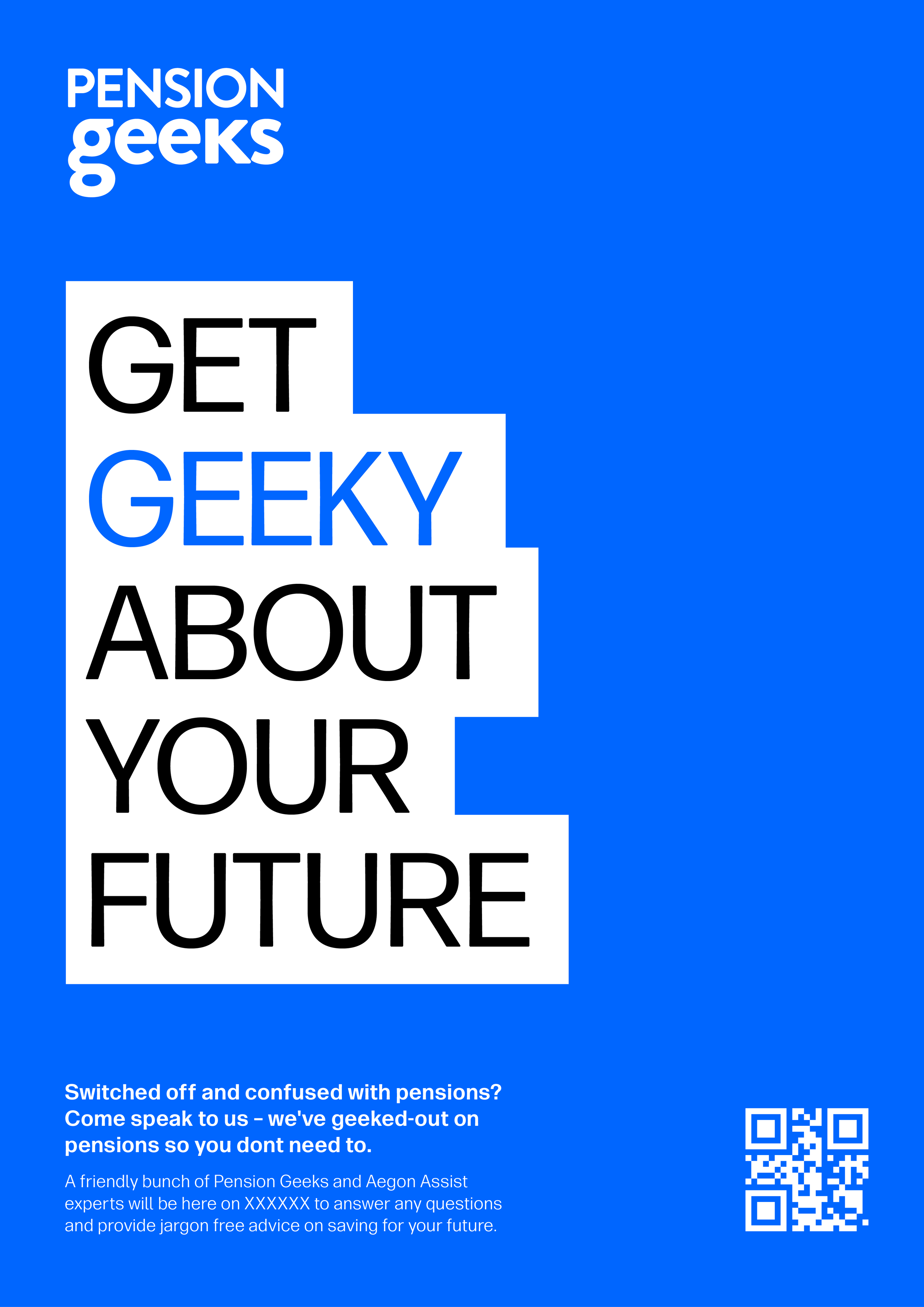
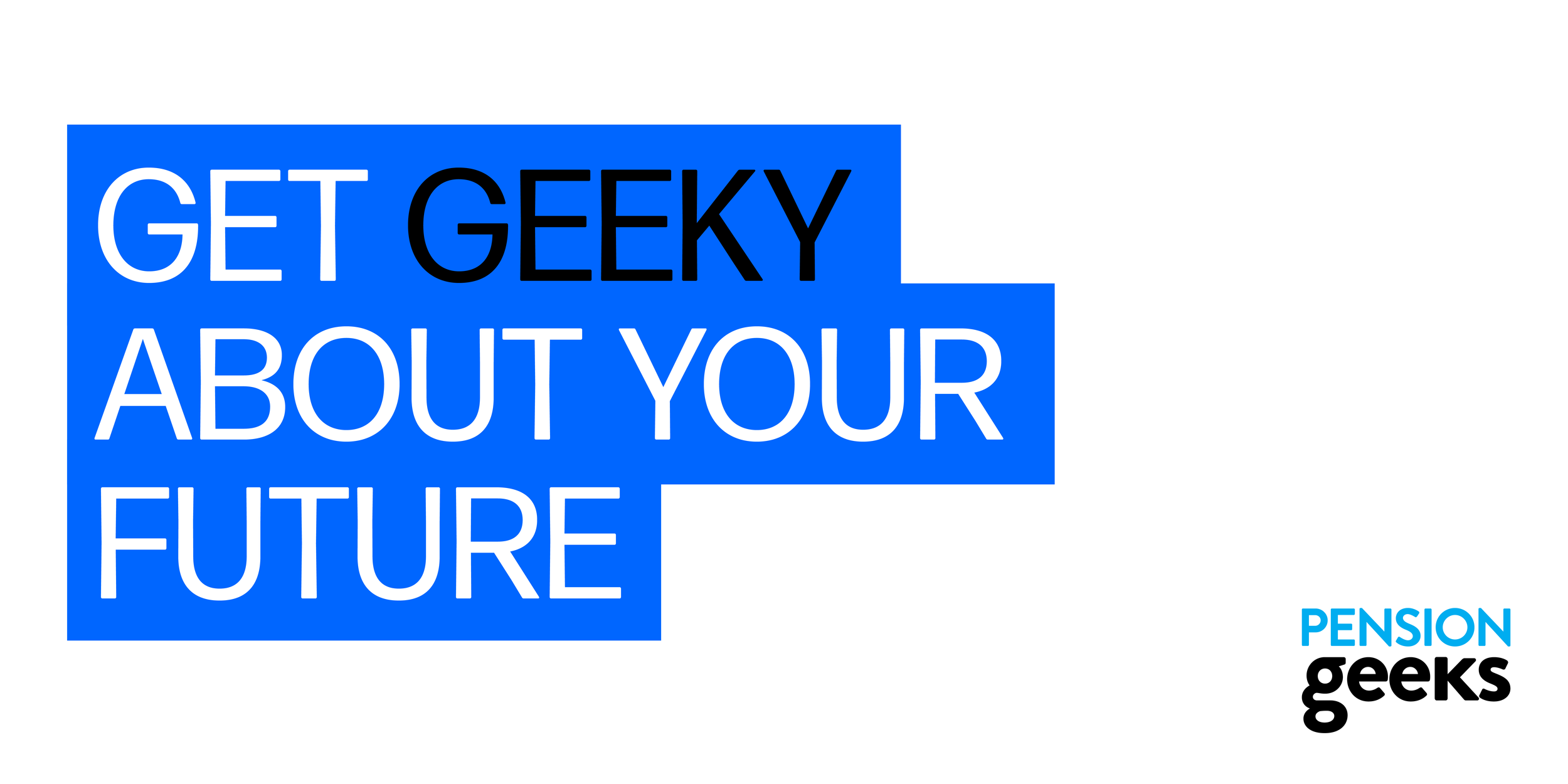
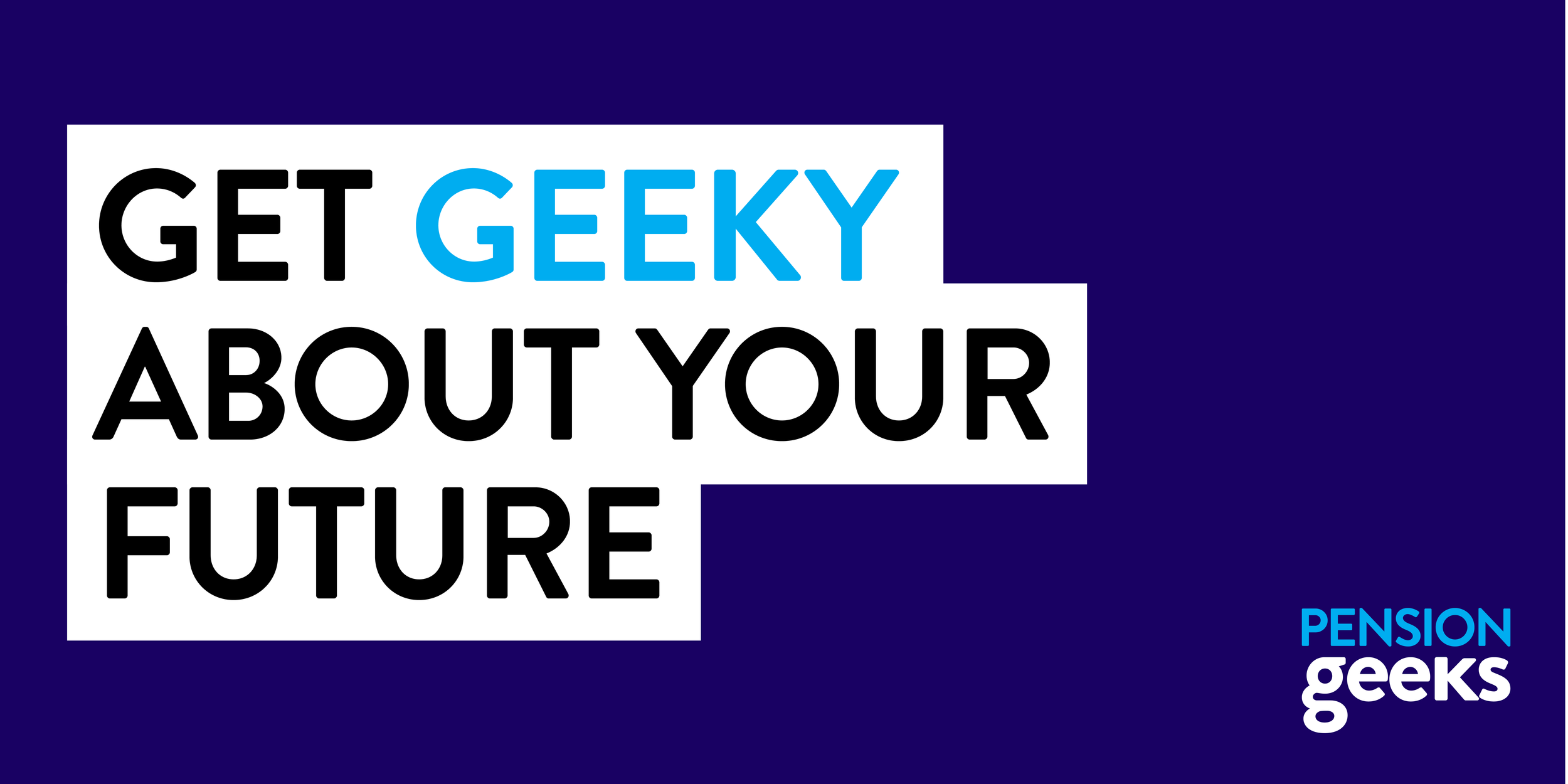
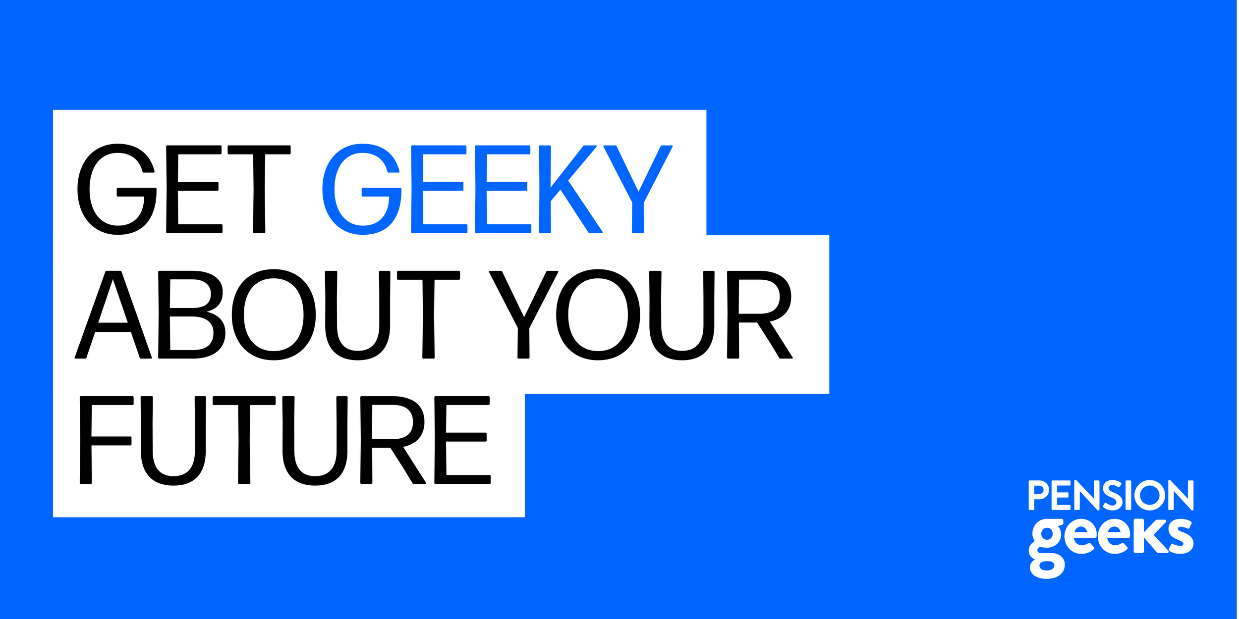
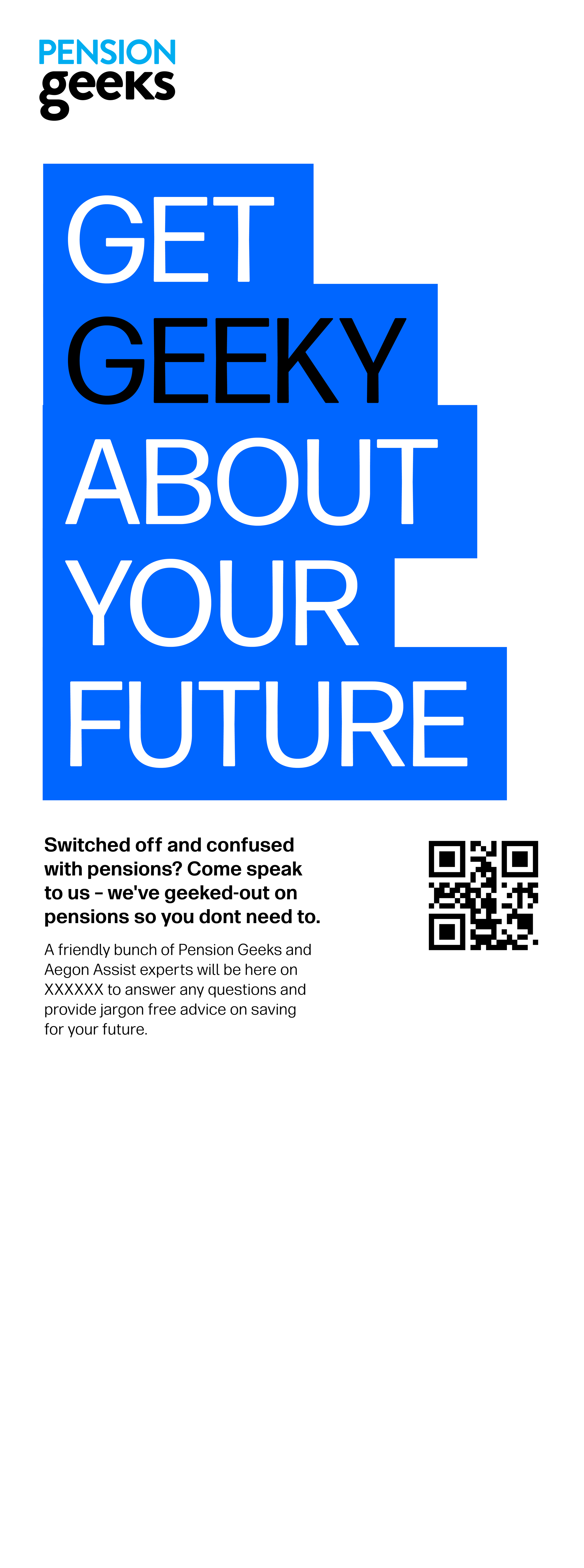
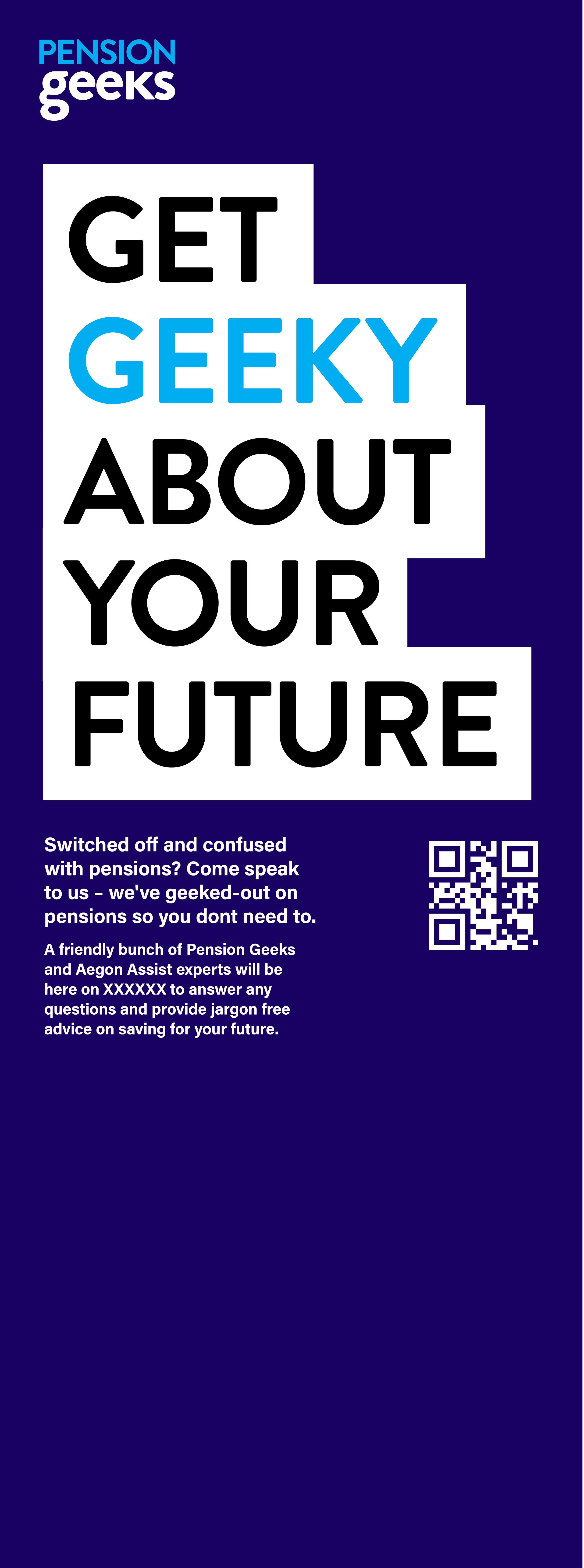
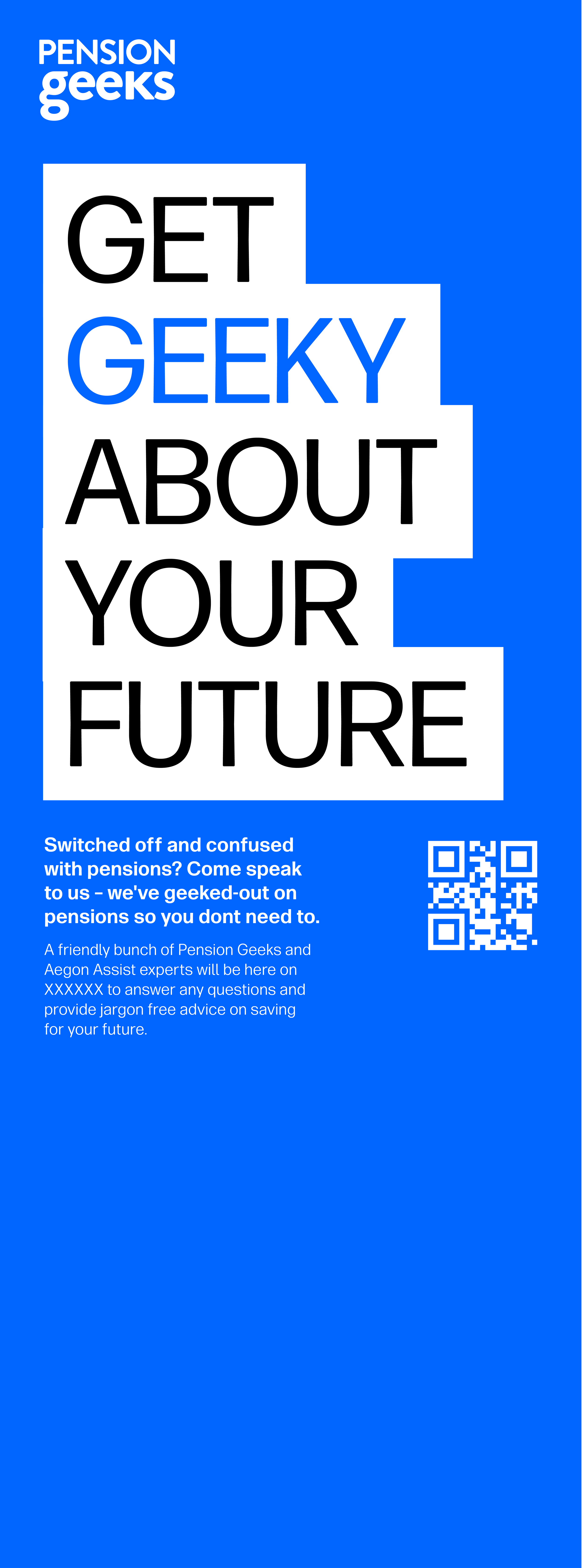
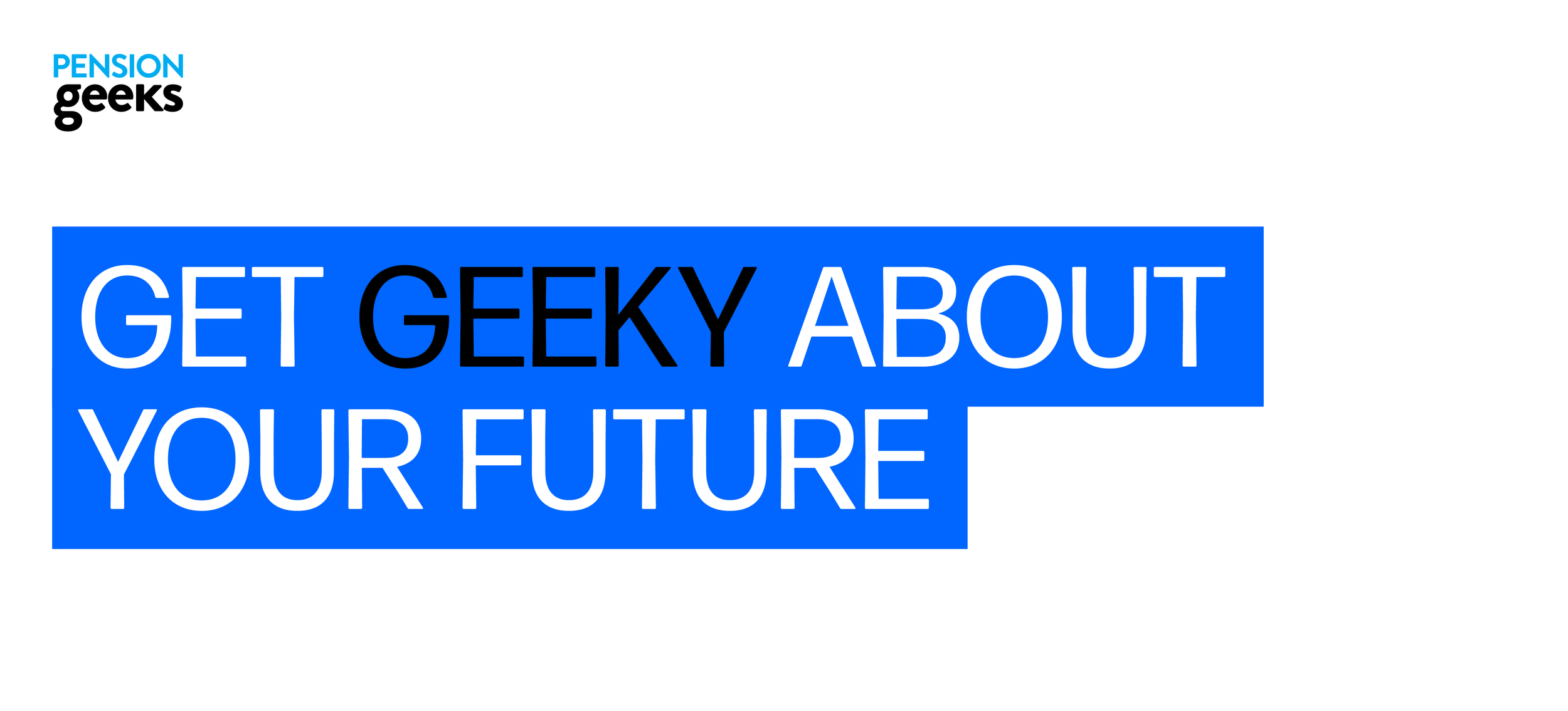
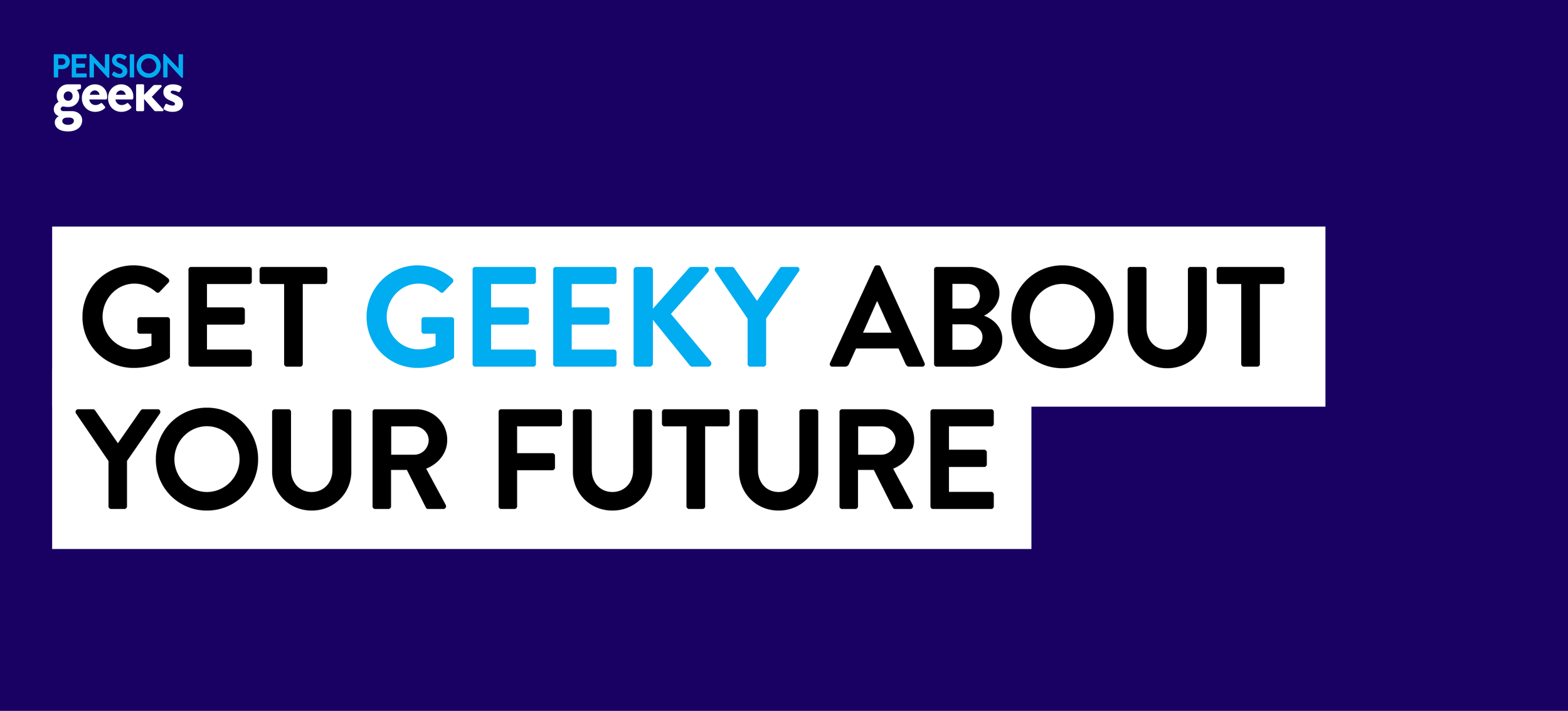
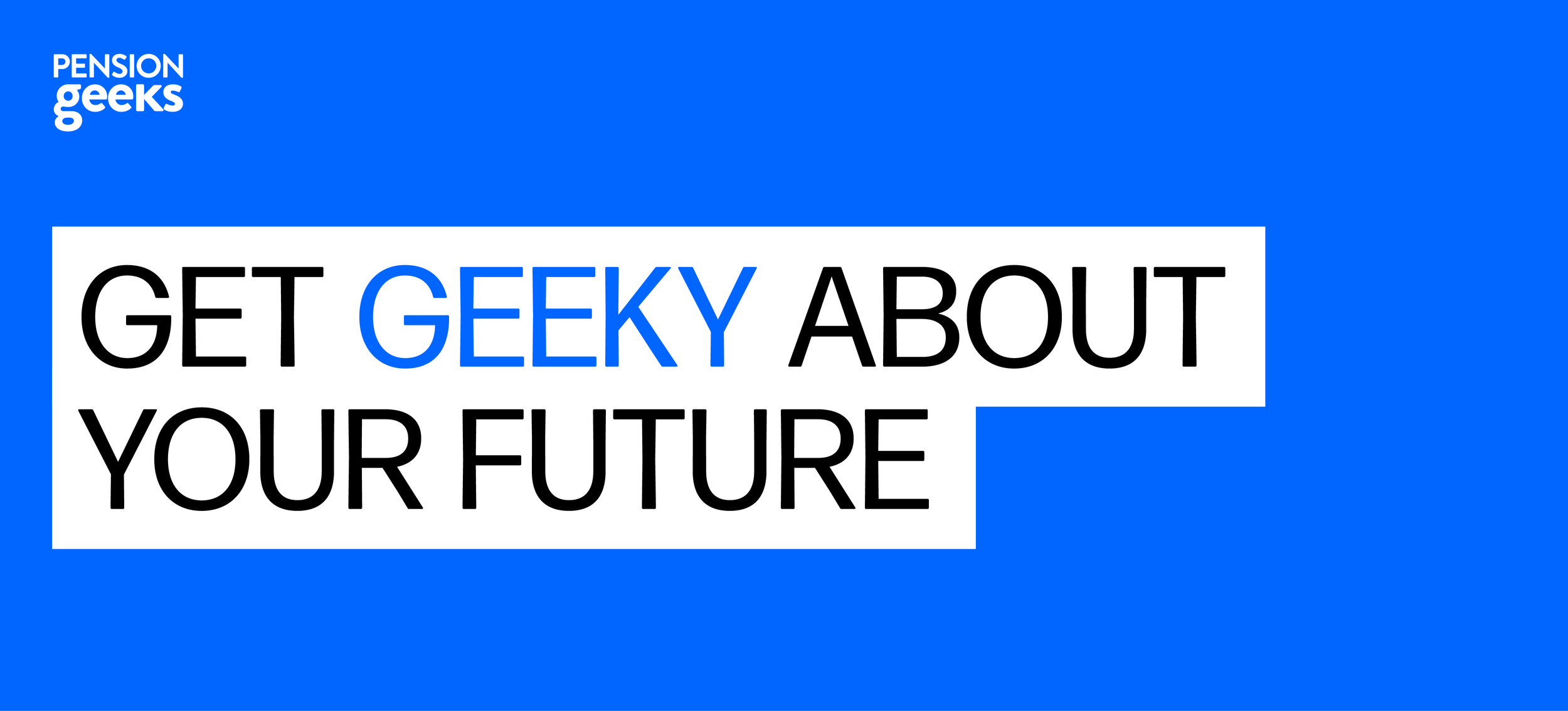
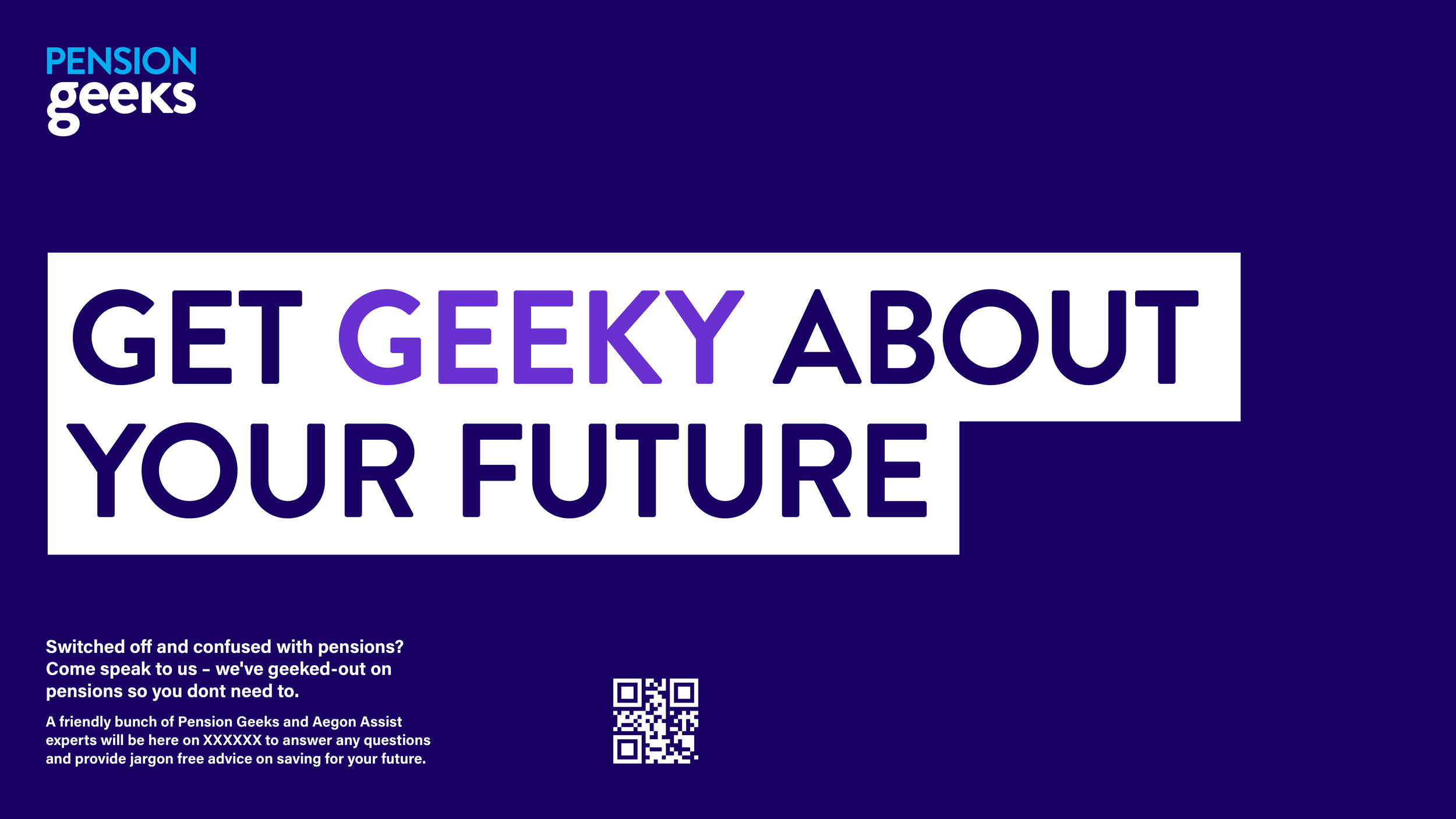
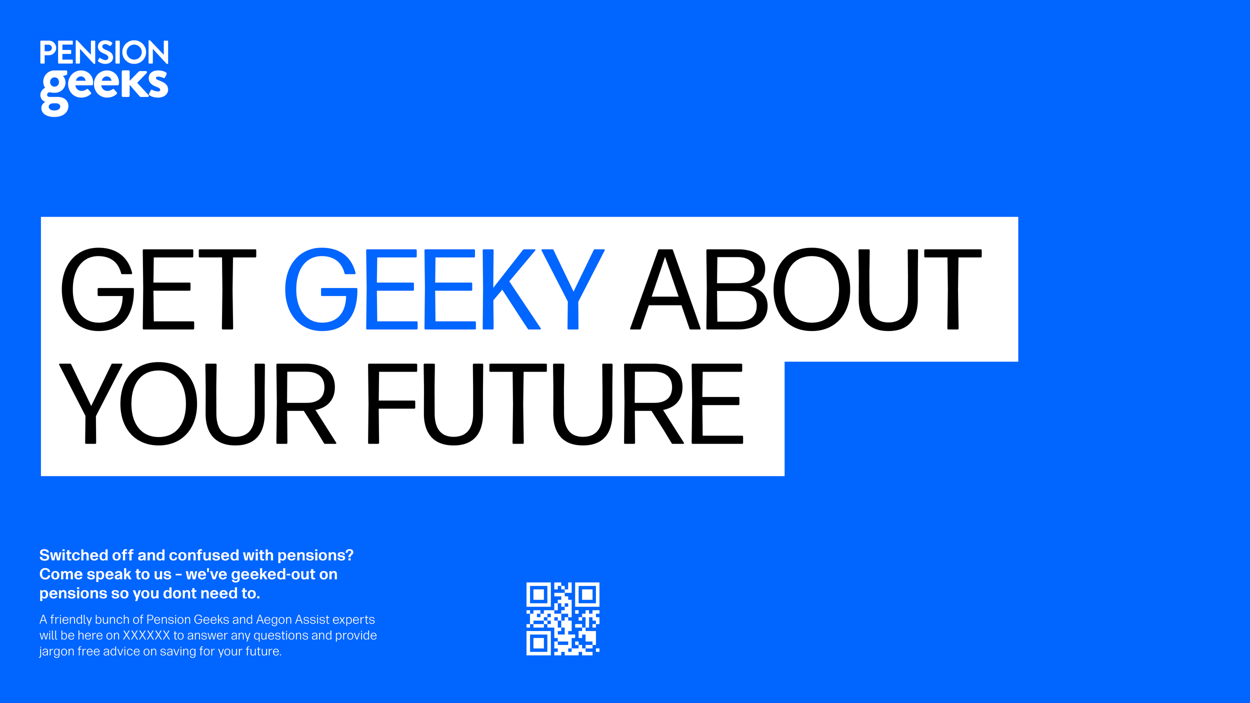
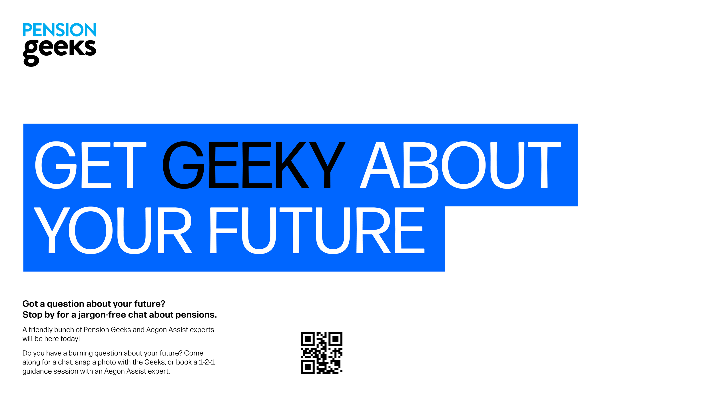
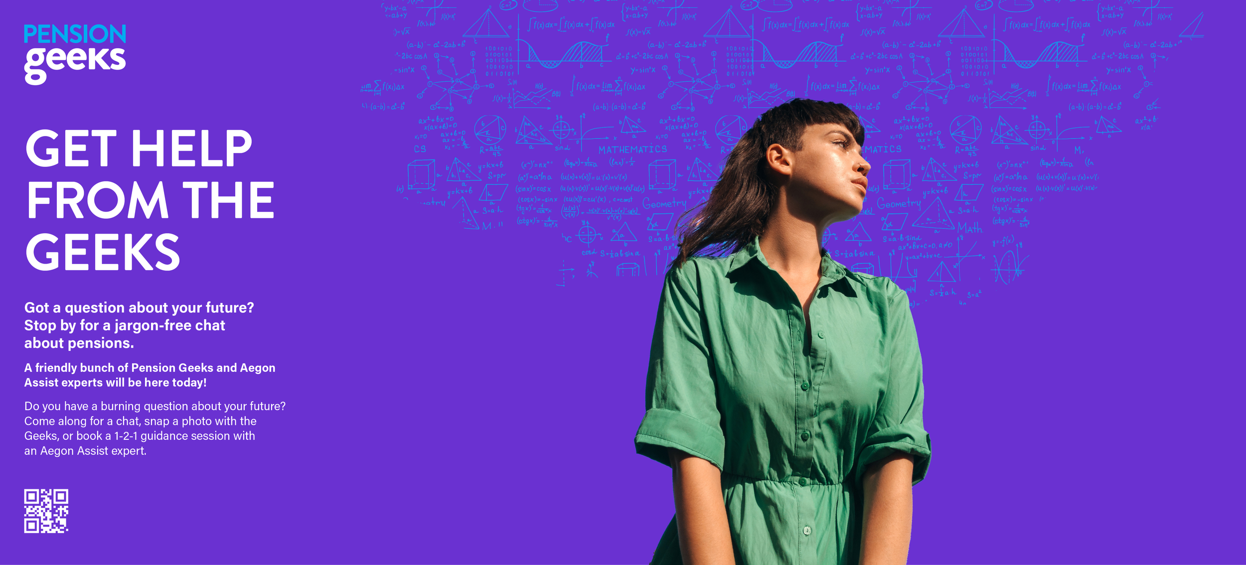
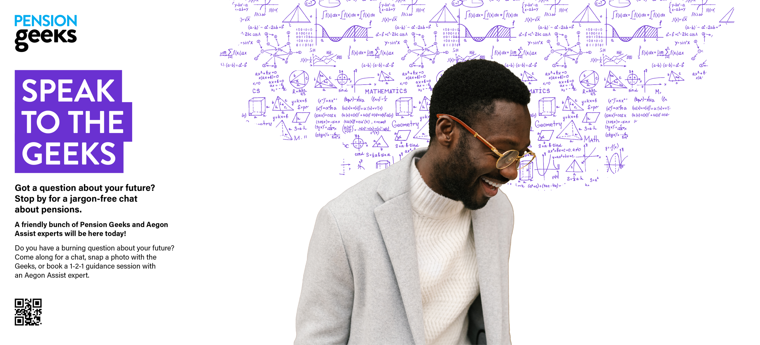
After several iterations, the chosen direction focused on a clean, typographic approach that integrated seamlessly with the existing brand. The highlighted text concept was refined using established brand colours and typography, allowing the system to feel both familiar and distinctive while maintaining clarity and consistency across event applications.