

Metroid: Ravenous
A fan-made title concept exploring the visual language of Metroid
A quick disclaimer:
This is an unofficial fan-made concept created as a personal branding and motion design exercise. METROID and all related intellectual property belong to NINTENDO. No affiliation or endorsement is implied.
After the Brazilian governments age ratings board accidentally (allegedly) leaked the name of the next Metroid game, rumours circulated quickly. As did my own imagination as to what this new game could look like from a branding and art direction perspective.
Rather than simply creating a logo, the aim was to develop a complete visual identity that felt rooted in Metroid’s dark design language while introducing an even more horror focused tone than it’s 2021 predecessor, Metroid Dread. This project explores logo design, title screen development, main menu concepts, box art direction and motion design.
Logo Design
Creating a new identity from an existing language
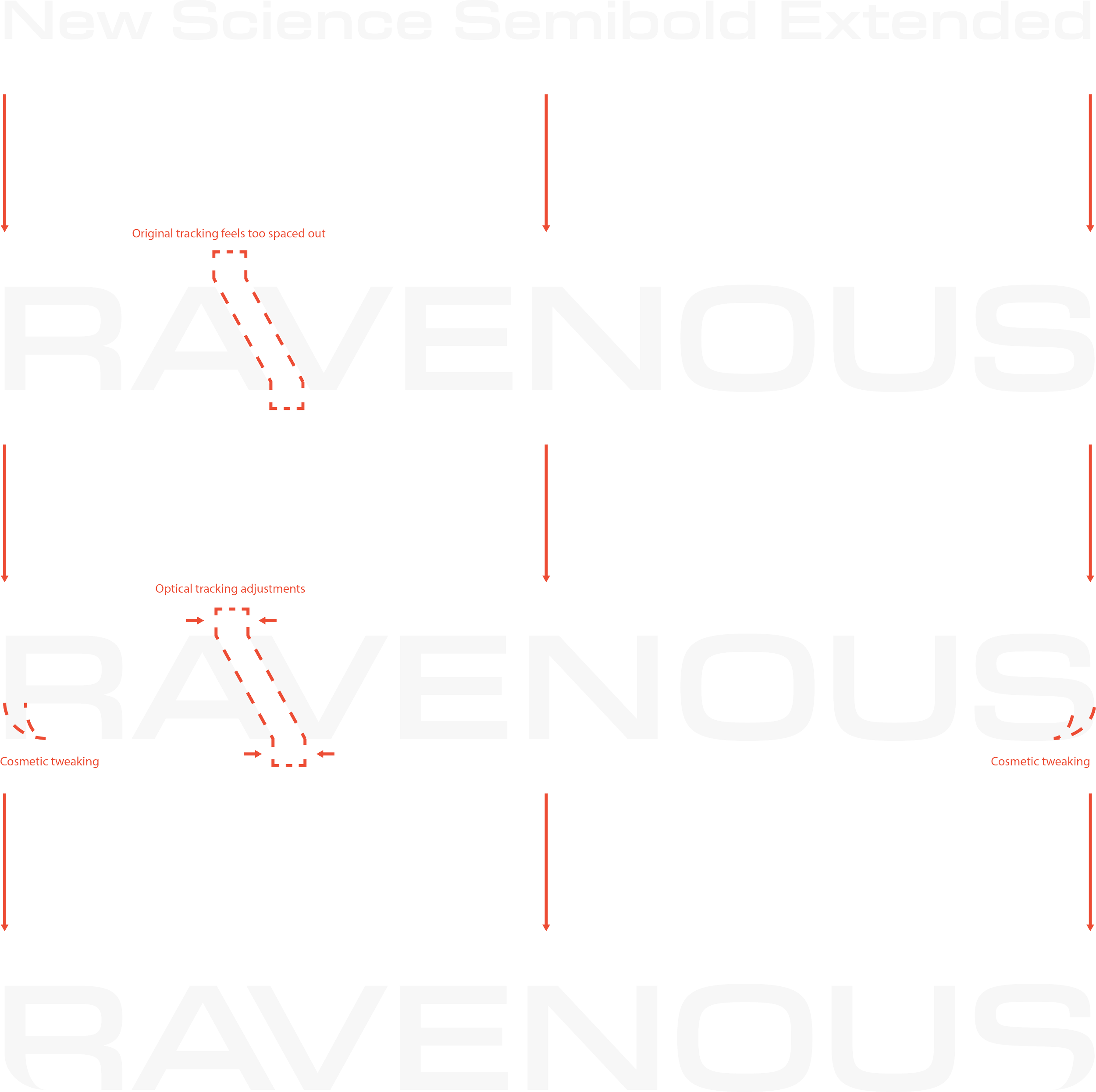
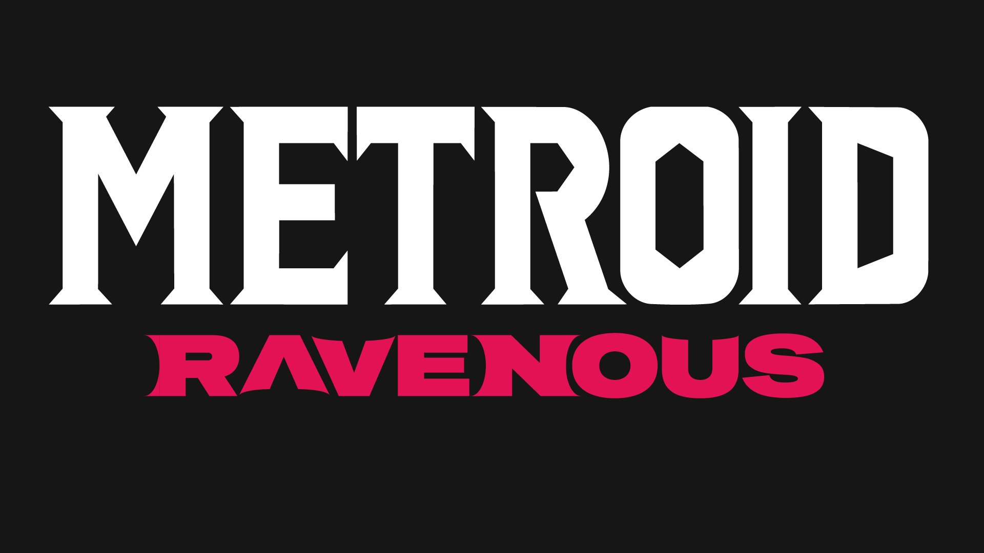
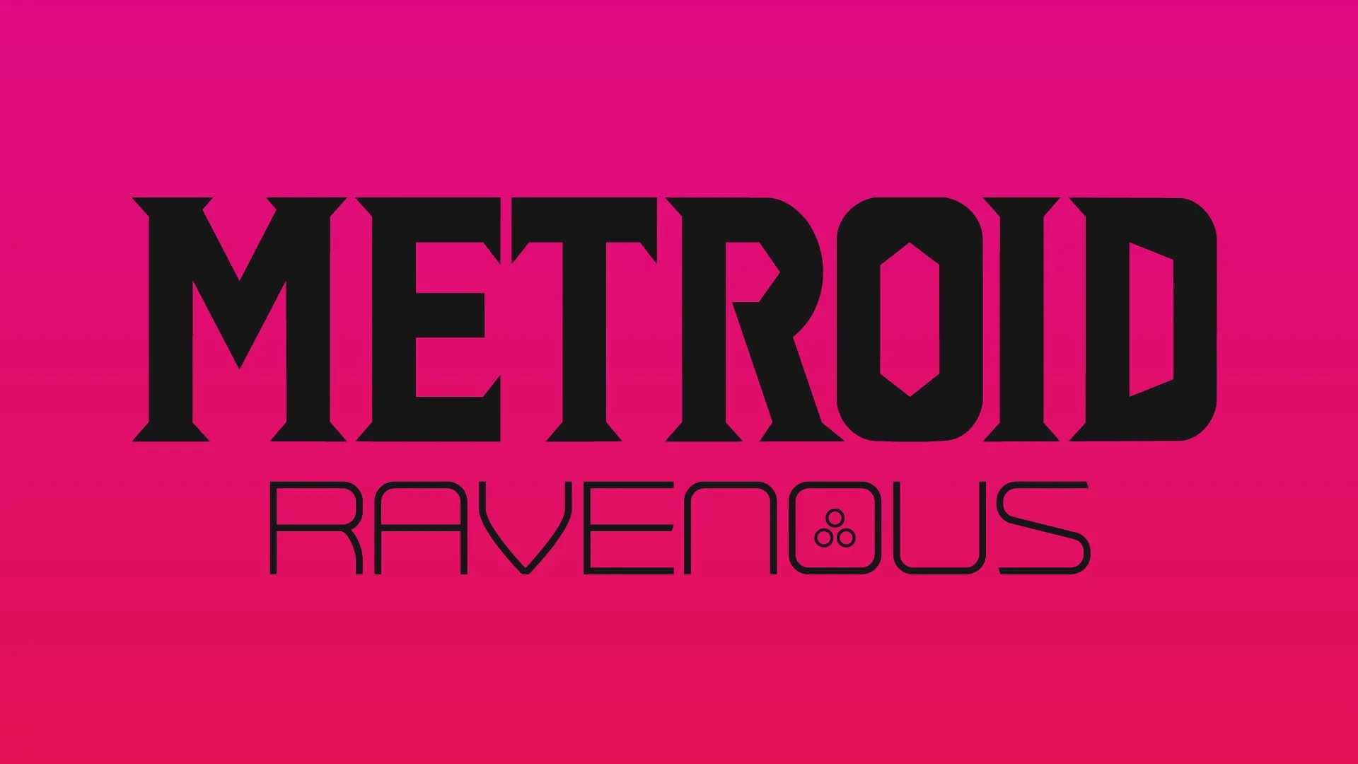
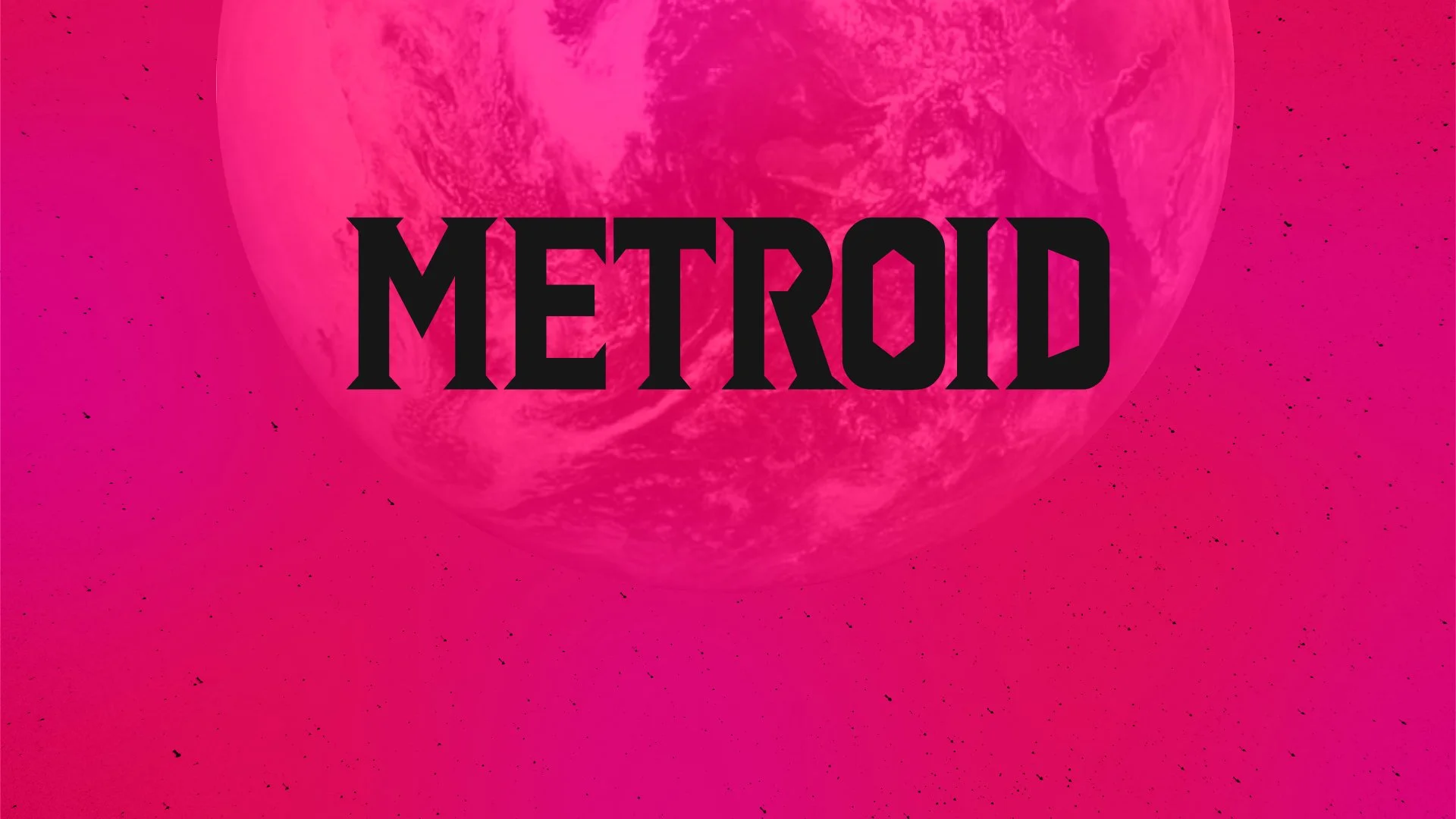
The logo was built by modifying New Science Semibold Extended rather than creating lettering completely from scratch.
The extended geometric structure helped maintain the futuristic qualities associated with the franchise, while custom alterations introduced a more aggressive personality.
Metroid-inspired details
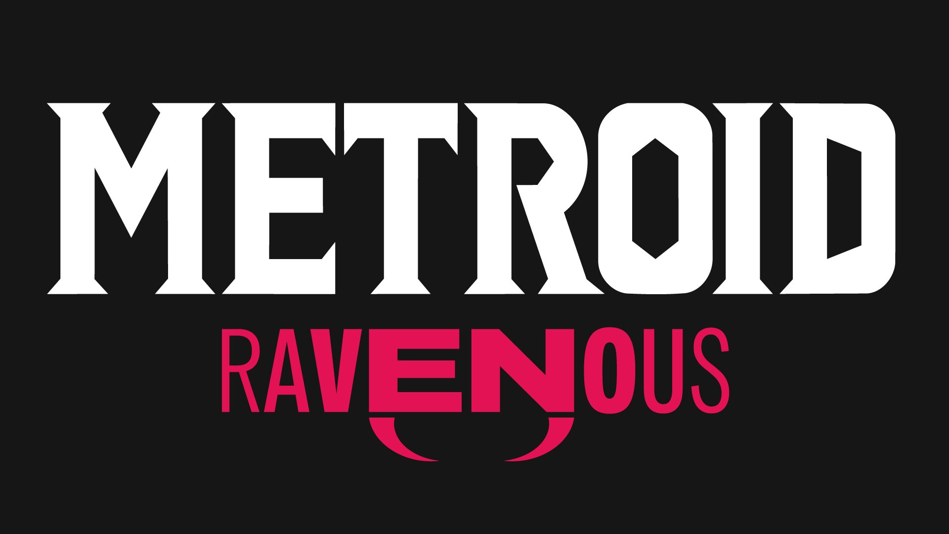
The descenders on the outer letters were modified to resemble the fangs of the franchise’s namesake creature, subtly introducing the organic threat behind the title.
Colour direction
The traditional Metroid palette was shifted towards deeper reds and purples to suggest danger, mutation and an unfamiliar alien environment.
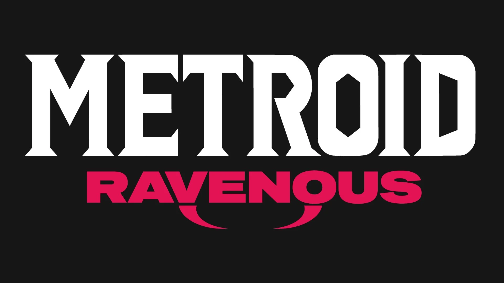
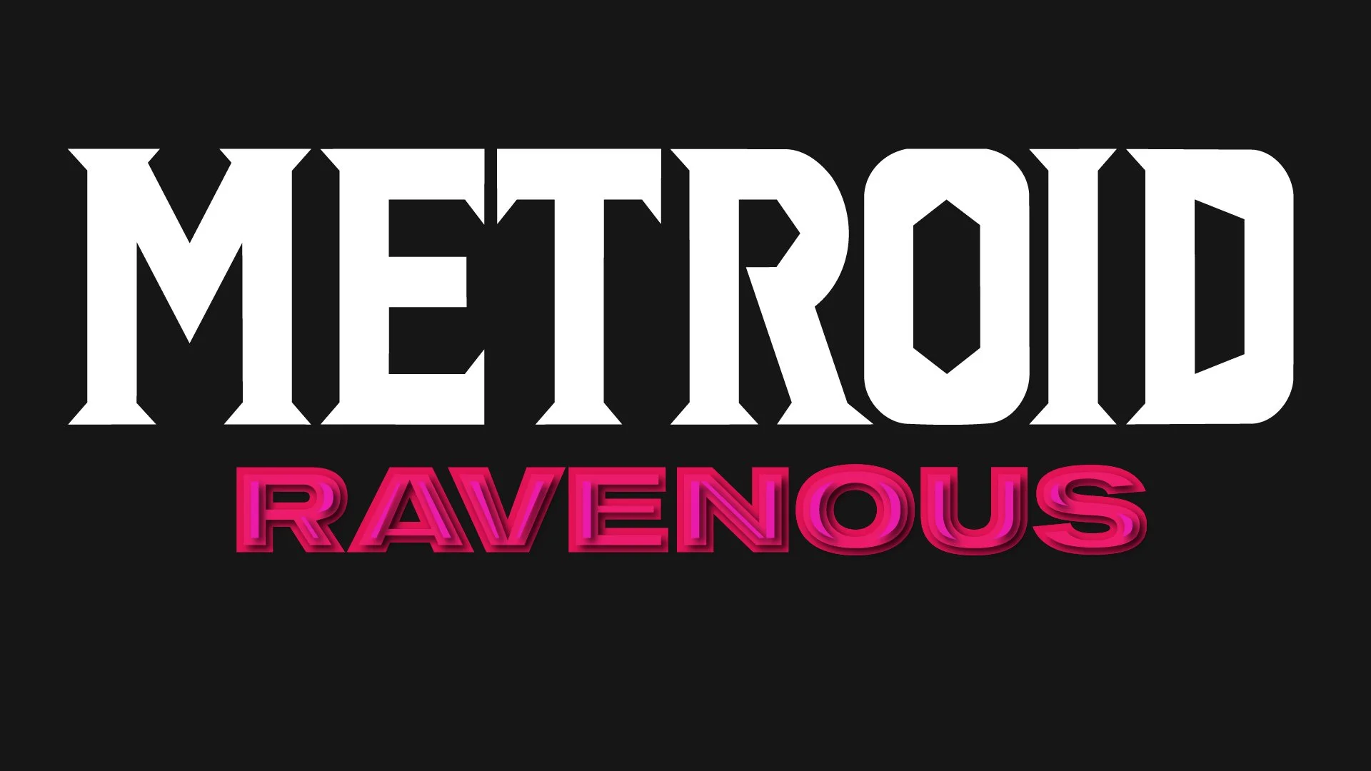
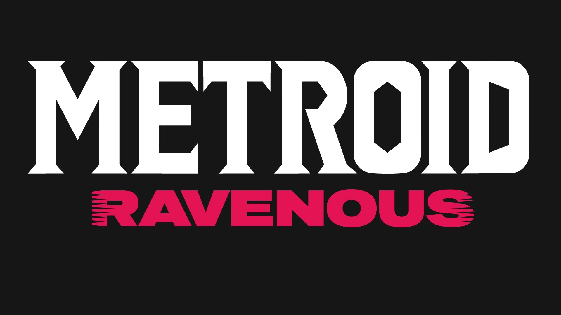
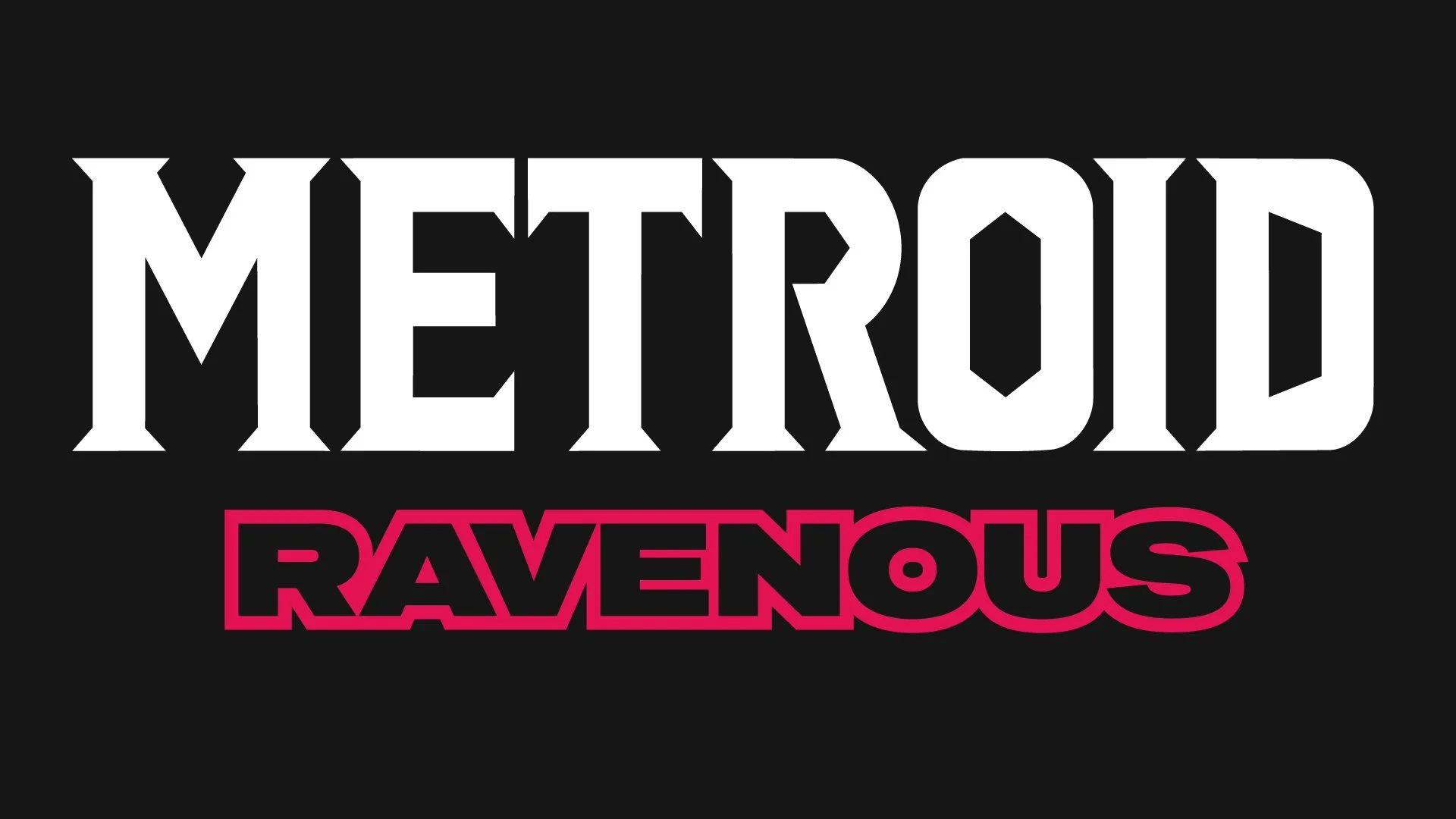
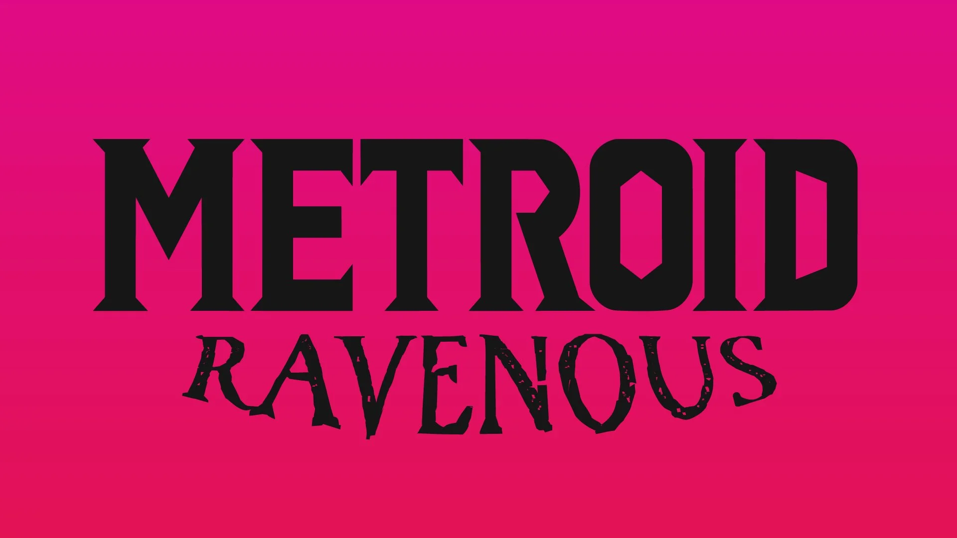
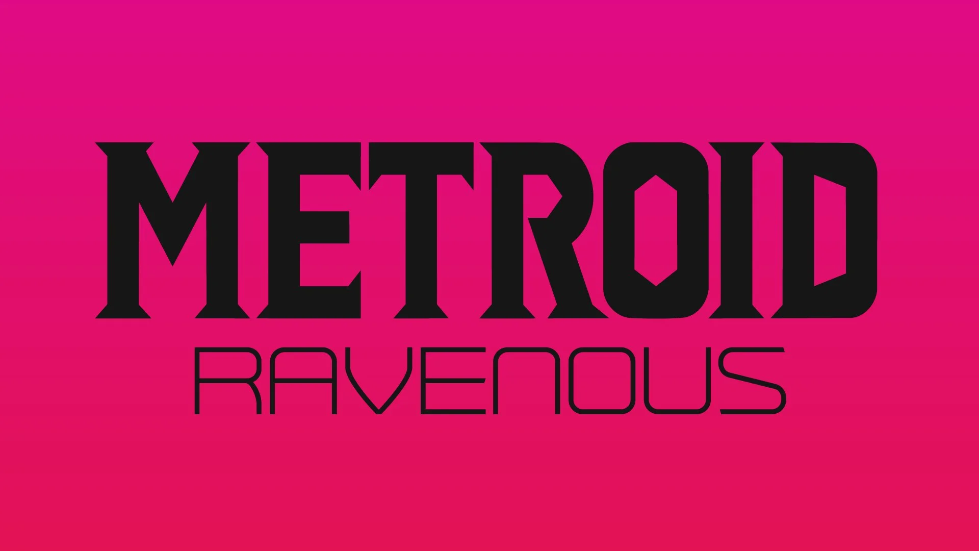
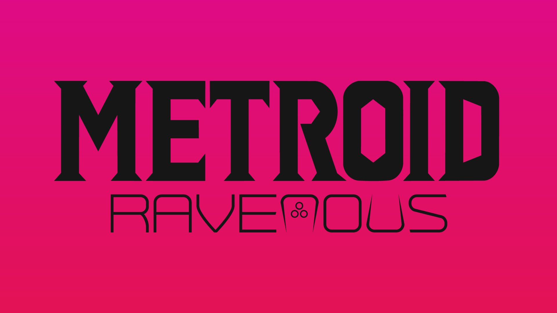
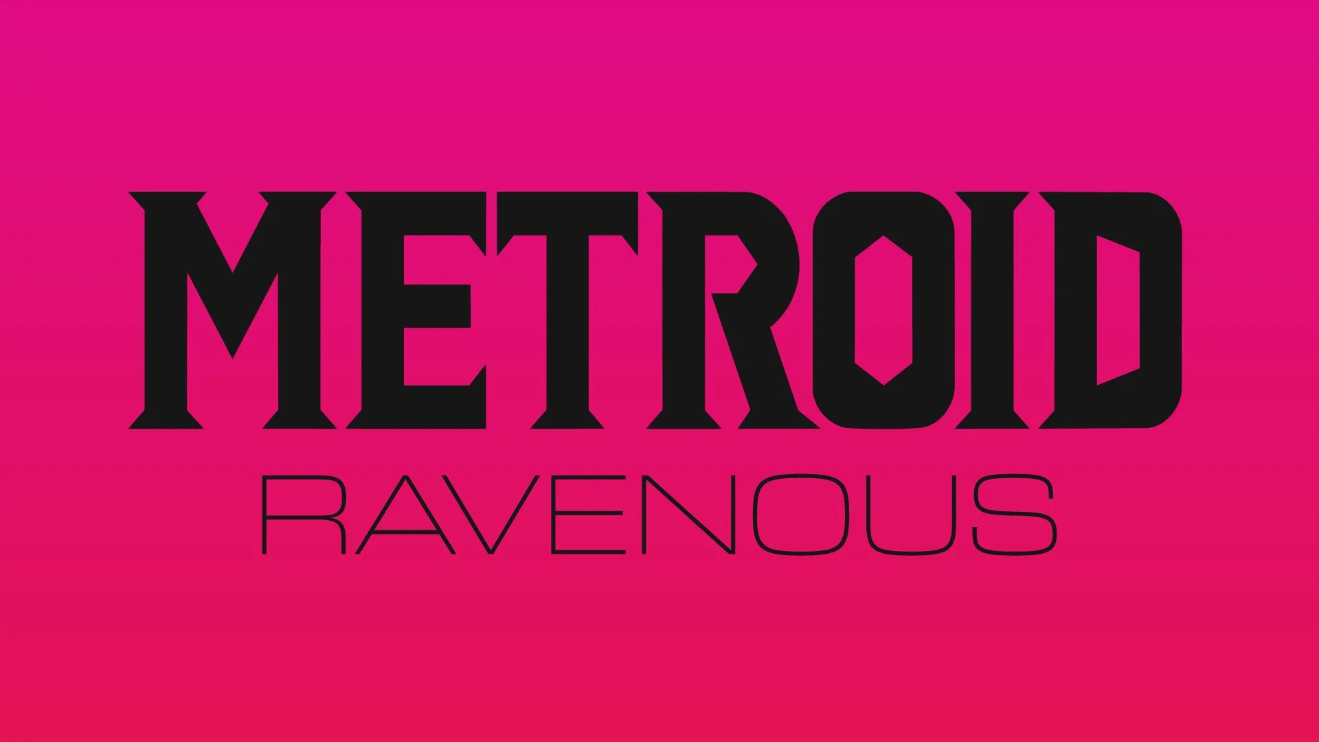
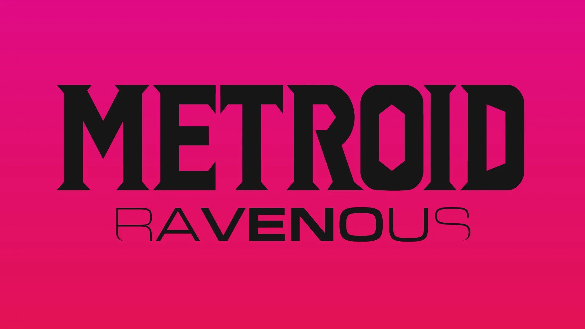
As with any process though, some times you gotta kill a few ideas…
Box Art Design
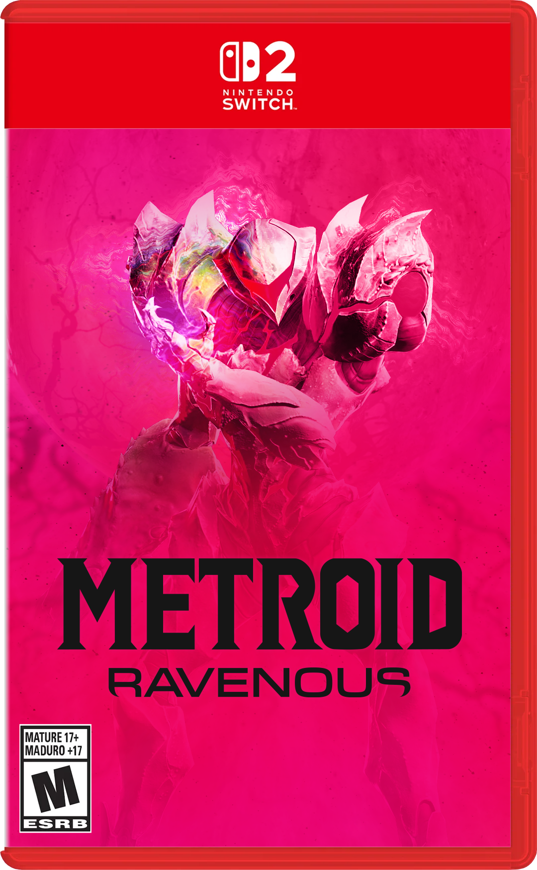
The cover artwork was focused on the concept of the player taking the role of both protagonist and antagonist.
A 3D character pose by Sanshiro IV on ArtStation was used as a base reference for composition, with lighting, colour grading and background treatments developed to create a darker cinematic tone. The red and purple still representing the blending of 2 beings fighting control of 1 form.
The final artwork focused on:
Ambiguity
Aggression
Loss of control
Horror
Storyboard Frames
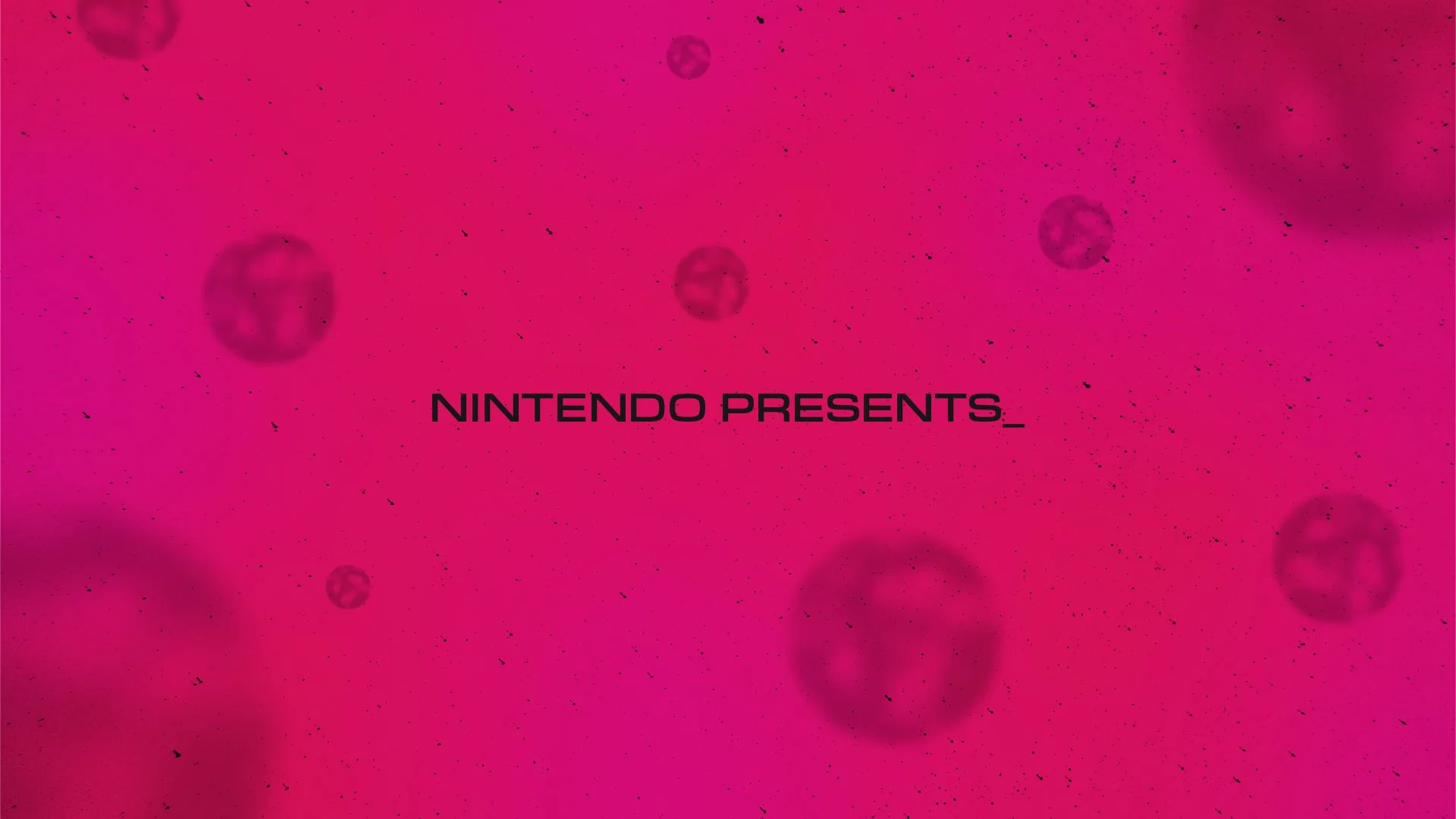
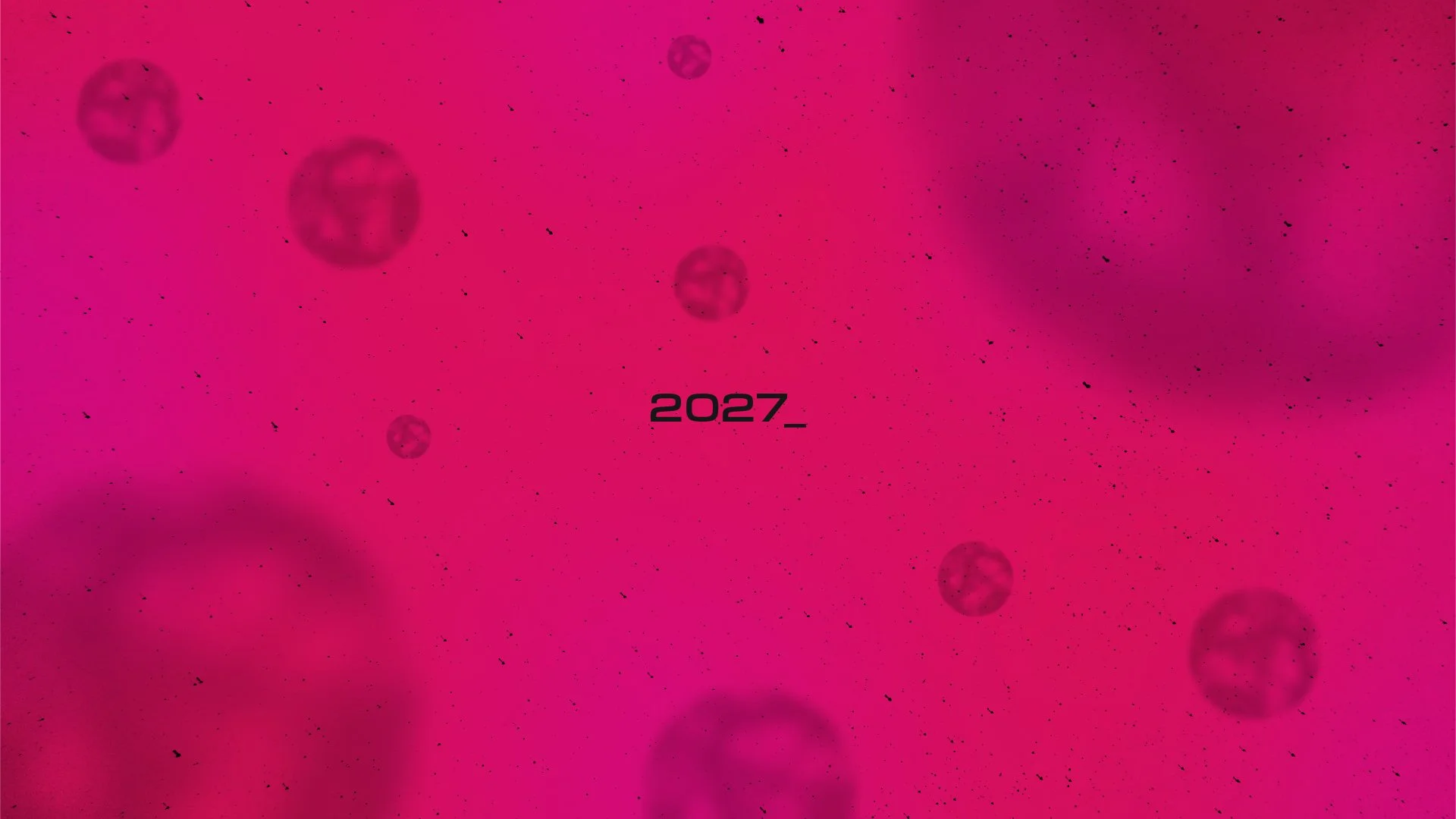
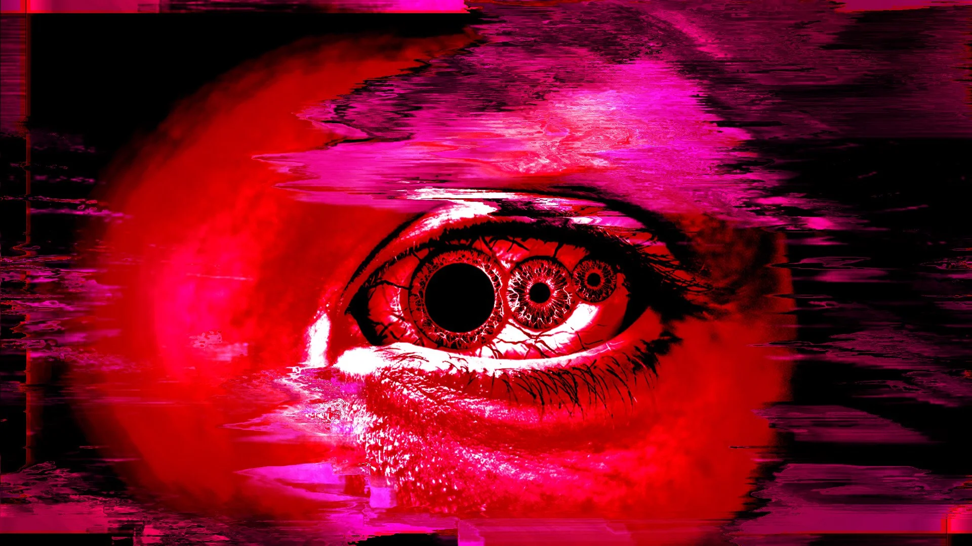
Before moving into animation, I created a storyboard in Adobe Illustrator with some extra cosmetic help in Adobe Photoshop for things like distortion effects to establish the pacing, composition and key visual moments of the sequence.
Rather than treating the storyboard as just a planning exercise, I designed each frame with the intention of reusing elements during production. This allowed key assets, compositions and visual effects to transition more efficiently from concept stage into the final animation.
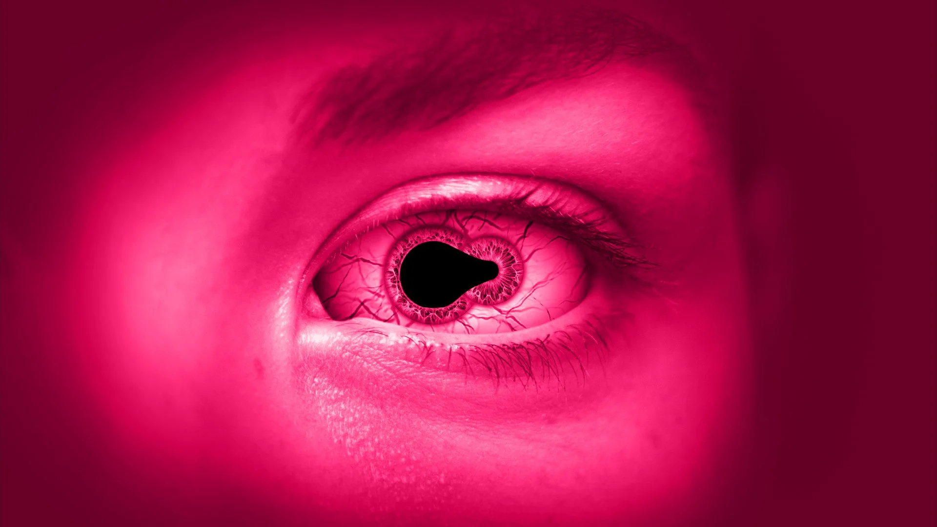
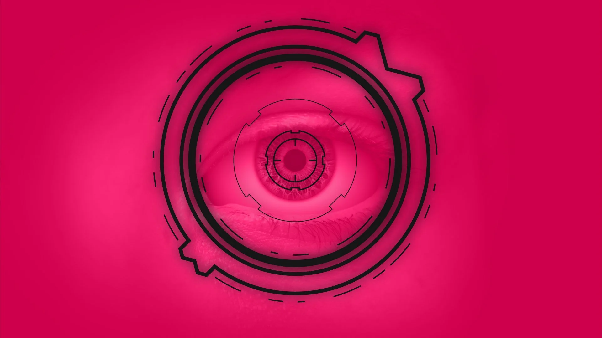
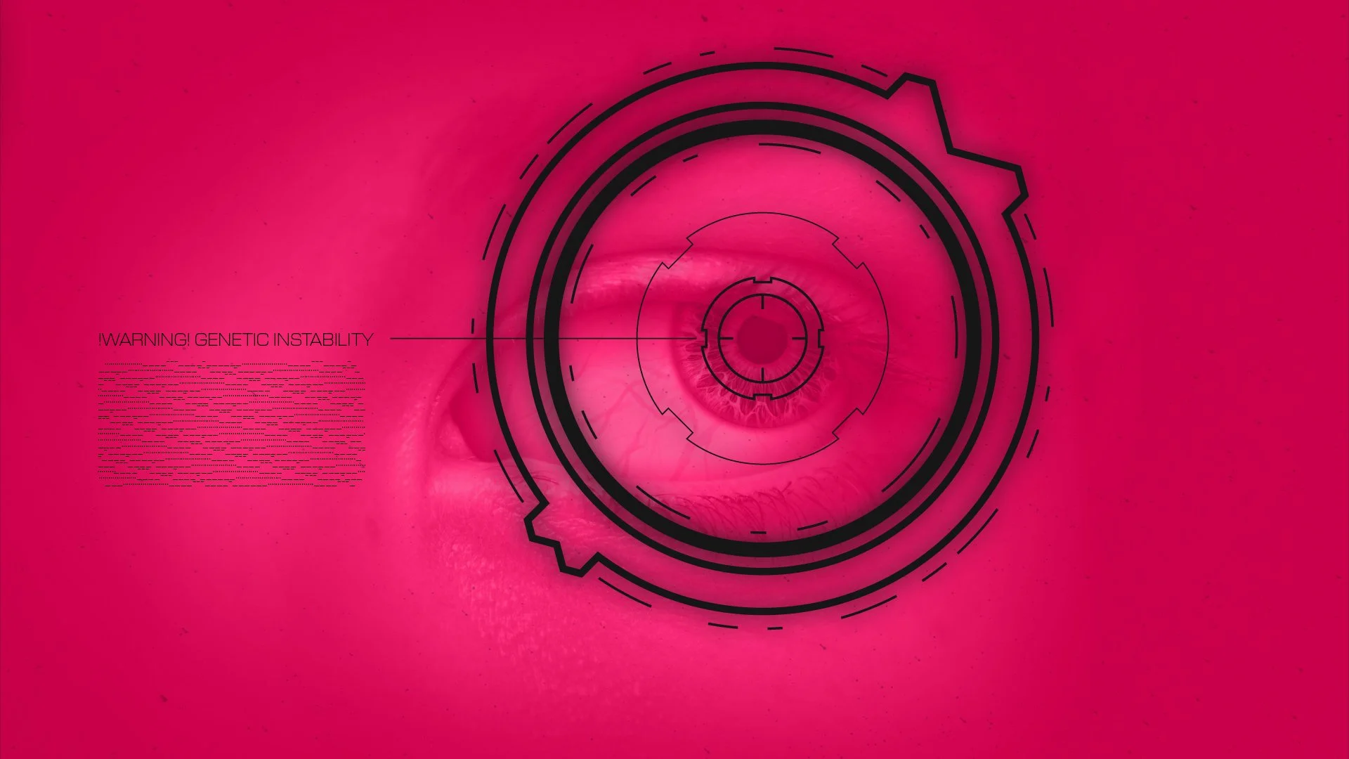
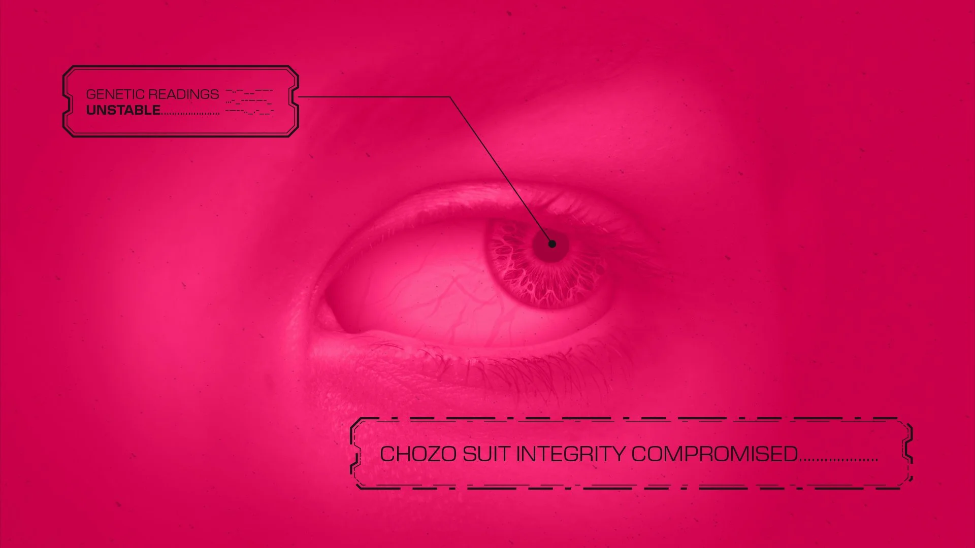
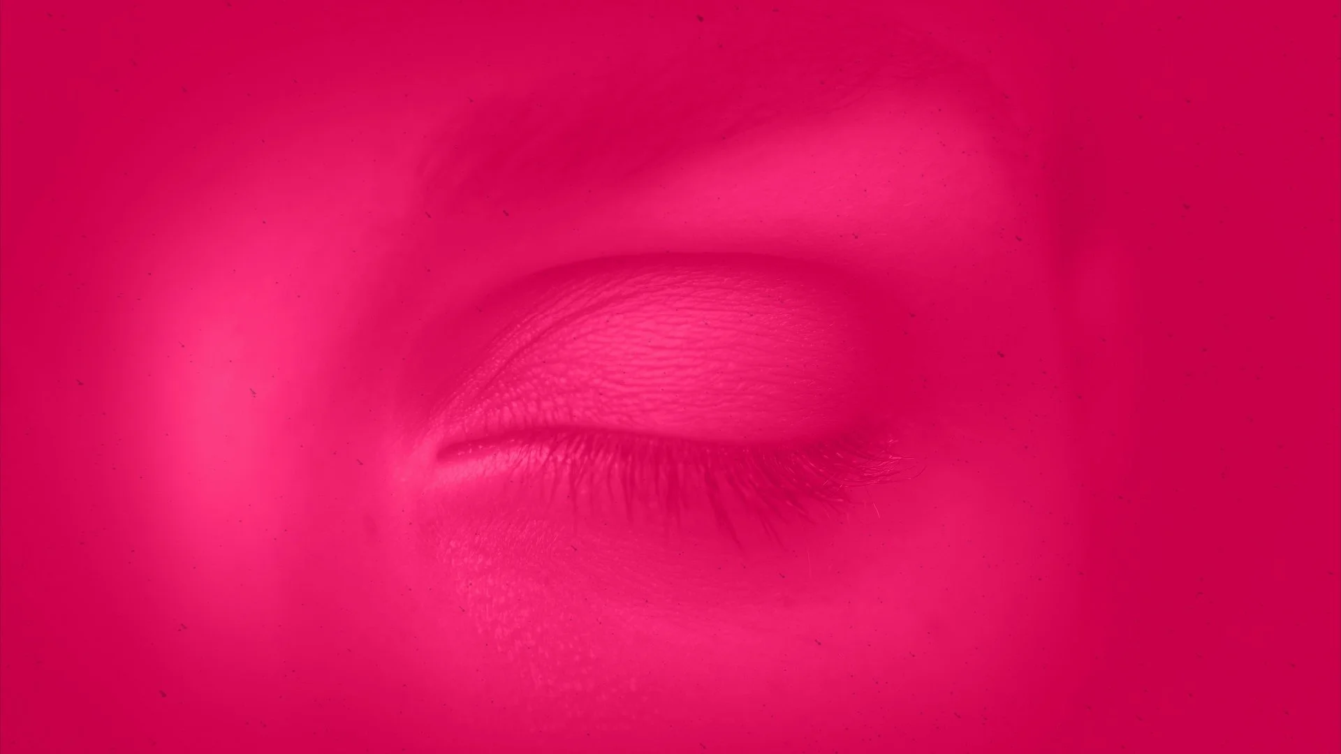
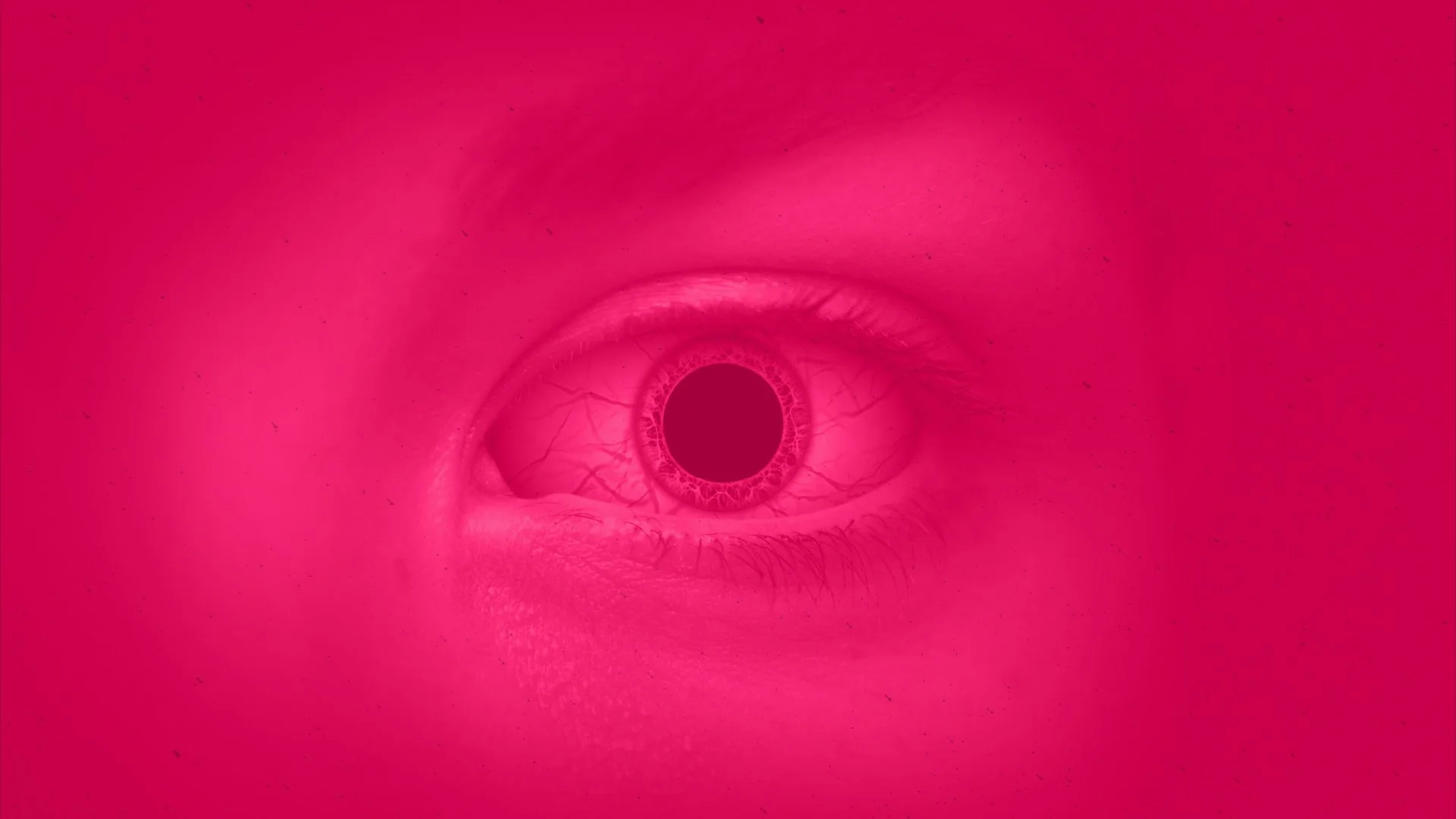
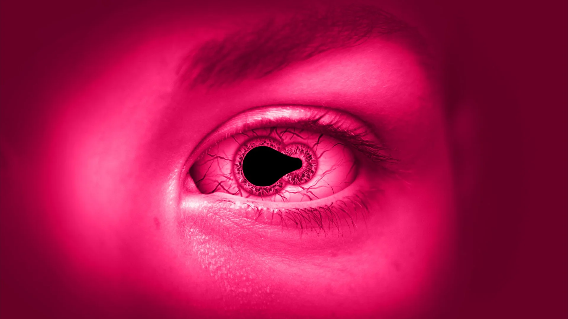
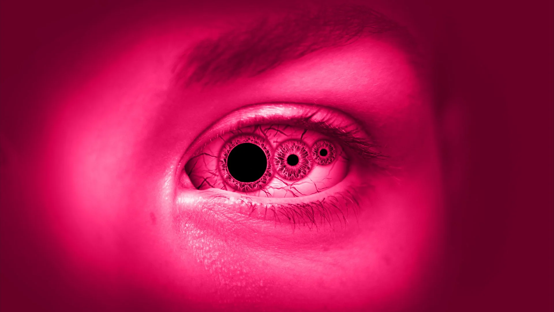
One example is the close-up shot of the Samus’ eye. The storyboard frame was built with the final animation in mind, allowing the individual elements to be developed into a moving sequence, including subtle organic movements of her skin when she looked around using Puppet Warping.
This not only served as a strong guide by which to sign post each step of the animation, but also made asset creation for the animation easier by doing it sooner rather than later during production.
It all adds up
No single effect is particularly complex on its own. The atmosphere comes from layering lots of small details together. From subtle particle movement and colour grading to animated masks, glows and lighting passes, each element contributes a little something to the final result. Remove one layer and you might not notice it immediately. Remove ten, and the sequence starts to lose its depth and impact.
Whilst some may only see a particular moment for a split second, every additional layer contributes to the final result. And when you're dealing with a fanbase that loves to dissect every trailer frame by frame, those subtle details become just as important as the obvious ones.
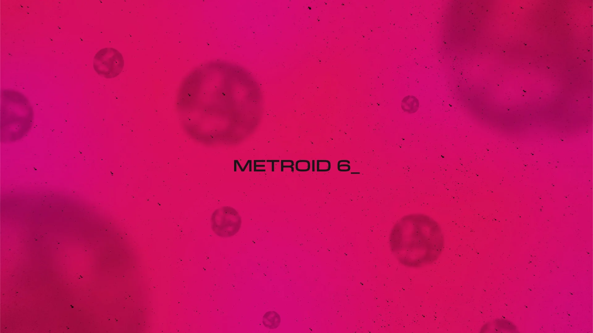
The Underwater Membranes
For the underwater membrane sequences, I wanted them to feel alien, unrecognisable, and just a little ethereal.
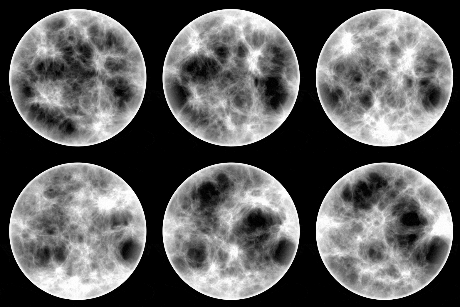
Most of that came from layering together turbulent displacements, fractal noise and gradients. The icing on the cake ended up being a touch of chromatic aberration (Best observed in the final animation shown at the end of this case study), which gave the larger globules this almost gelatinous quality that I wasn't expecting but absolutely loved.
Faking a Planet
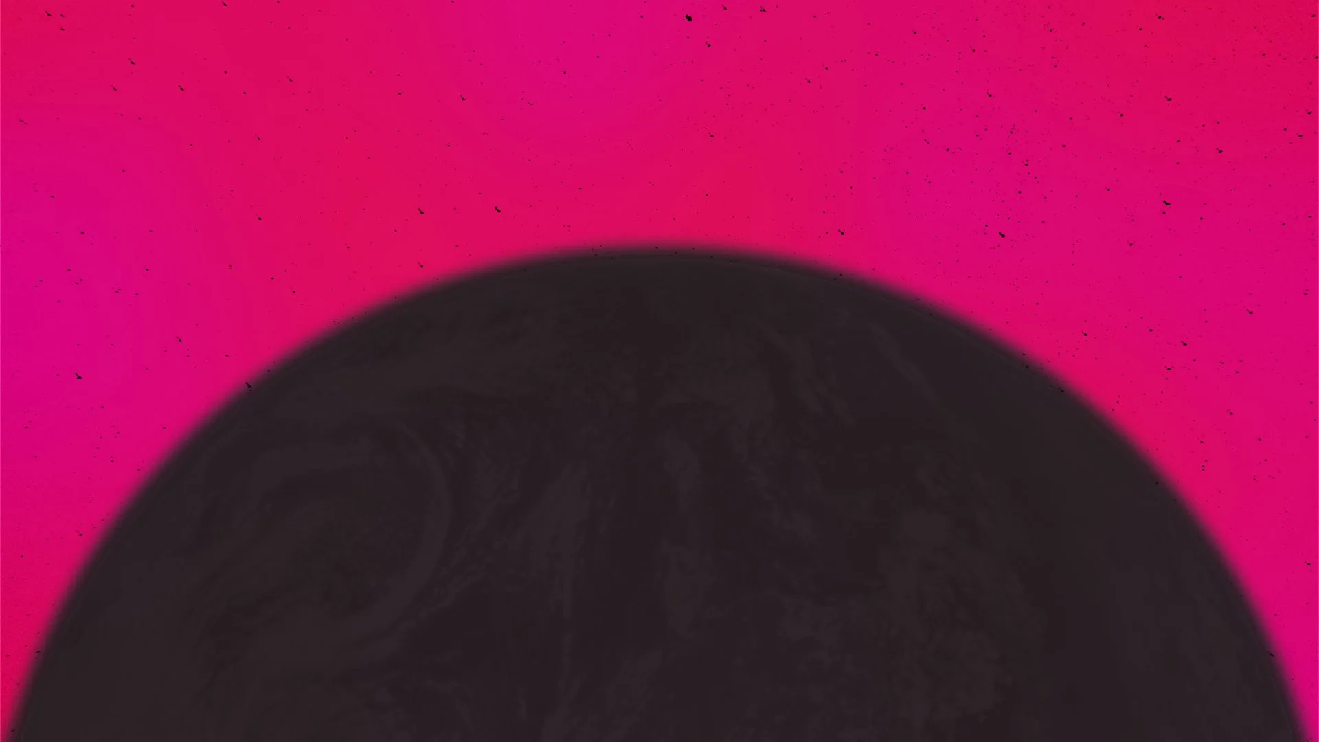
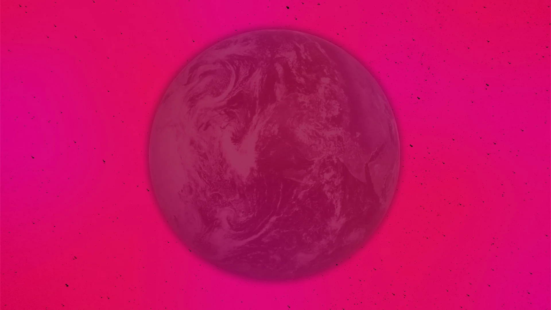
Despite appearances, the rolling planet isn't actually 3D.
It's simply a flattened map of Mars masked inside a circle, pre-composed, and given a bulge effect to fake the curvature. From there it was just a case of keyframing the terrain so it rolled convincingly as the whole pre-comp moved through the shot.
It's one of those little cheats that looks far more complicated than it really is.
Happy Accidents
The black particulate effect was originally supposed to be stars, still but twinkling. But when applying that, the whole animation started to feel very two dimensional, in the literal sense. I kept thinking back to the original title sequence from Metroid Prime on Gamecube. How every menu input caused a major shift in the location of this alien biological environment.
I spent far longer than I'd like to admit trying to generate convincing star fields inside After Effects, layering different systems together, tweaking settings, then inevitably breaking them again.
What I accidentally ended up with was something much better.
Instead of stars, it became this cloud of dark and dusty contaminants that drifted through the scene. It made the environment feel unsafe, as though Samus had wandered somewhere not meant for her, and, in the story building in my own head, was actively accelerating the growth of her Metroid DNA.
Organic Horror
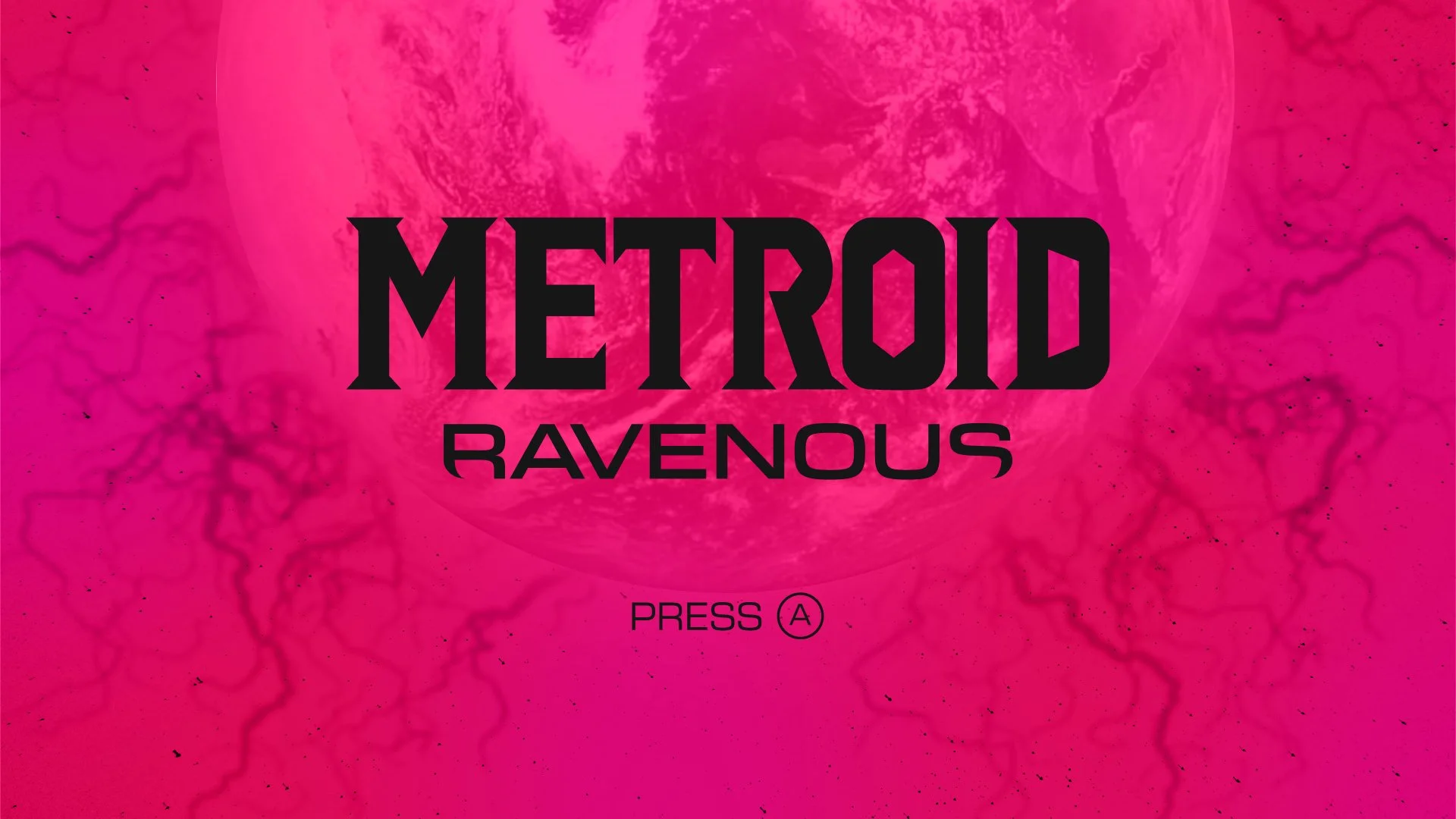
The veiny membrane was one of the last additions to the project. Up until that point, the red and purple freeform gradient looked... fine. But also a little too clean.
I kept thinking back to Scorn and the way it wraps your character in thin sheets of organic material. That inspired me to imagine these sequences less as an external environment, and more as peering into some strange microscopic biome inside Samus herself.
I still wanted to keep things relatively restrained. As much as I prefer Metroid when it leans into horror, I never wanted this to cross the line into outright gore.
The Suit's Interface
One of the shots I spent the most time iterating on was the close-up of Samus's eye. From the outset, I knew I wanted her visor's interface to react to her eye movements, with the targeting reticule shifting subtly as she looked around.
Originally, every interface
element was designed in black.
The more I developed the sequence, though, the more I realised those darker overlays were working against me. They obscured the eye too much, which was supposed to be the focal point of the shot.
I went back to the official Metroid Prime games and studied how the visor interfaces are presented. Many of the interface elements use a slightly translucent geometric forms with subtle glow effects and gently blurred edges, allowing them to feel like part of the visor rather than something simply placed on top of it. These served as great goalposts for the final designs.
The targeting reticule was adjusted in the main composition using a layer style to apply the glow, and a blending mode to mask out the black, and I introduced a couple of small diagnostic pop-ups showing unstable genetic readings.
More importantly, the colour shift became part of the storytelling. The darker tones throughout the sequence are reserved for the alien environment and the threat growing inside Samus. The visor, on the other hand, represents the part of her that's still fighting back. Giving those interface elements a luminous glow not only improved readability, but also created a subtle visual distinction between the corruption and the technology trying to contain it.
Bringing the Eye to Life
The close-up eye shots began with a fantastic photograph by Amanda Halbjørn on Unsplash.
To make it usable, I had to separate the individual components so they could move independently. In other words...
I had to channel a little serial killer energy and carefully cut the eye apart in Photoshop.
This was where reusing assets from the storyboard really paid off. I'd already proven I could build a convincing eye for the planning stage, so bringing it into After Effects and refining it further felt like a natural progression rather than starting again.
Once the pieces were in place, the focus shifted to the tiny details.
How much does an eyeball actually move? Does it jitter? How quickly do pupils react? They're the sort of details most people never consciously notice, but they absolutely notice when they're wrong.
Revealing the Logo
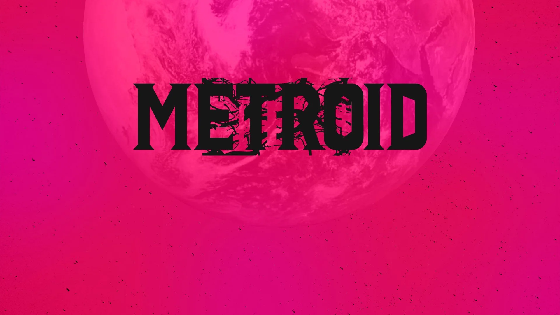
Whilst I can't take any credit for the METROID portion of the logo, I'll happily take credit for RAVENOUS because I'm genuinely chuffed with how it turned out.
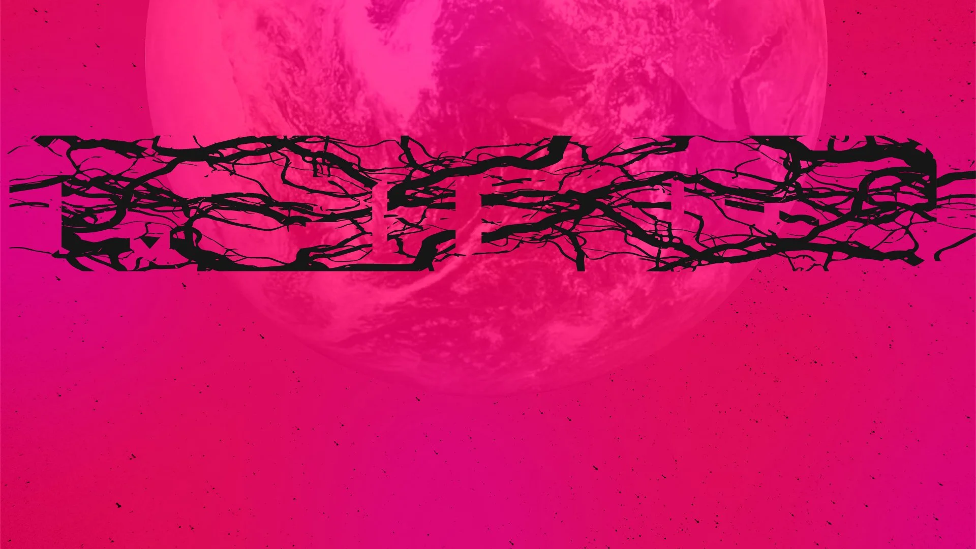
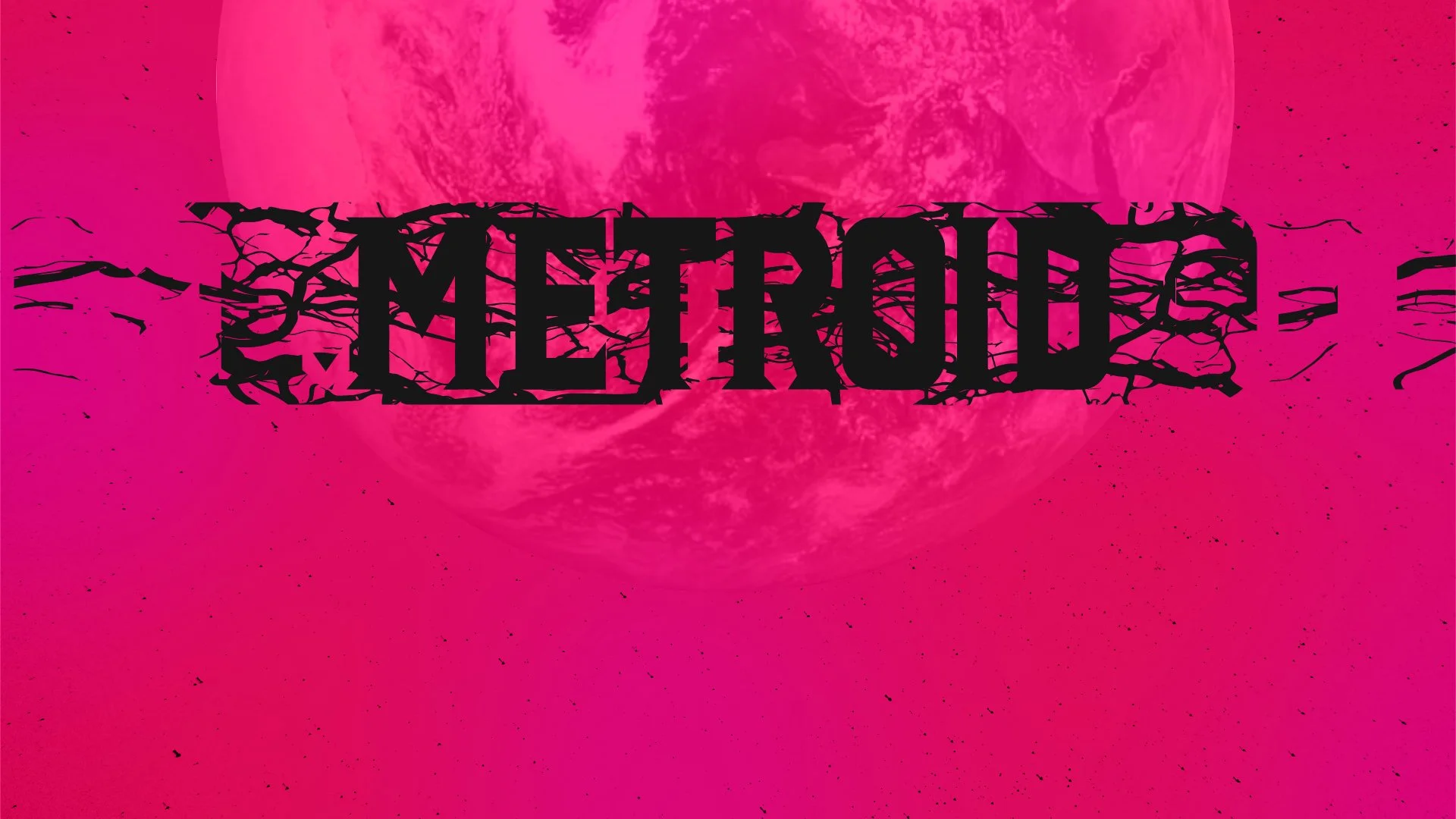
The corrupting tendrils that is slowly introduced throughout the length of the animation became a final hurrah at the end, it made sense for this to be the way the logo unveils itself.
The tendrils are in the background treatment, they’re in the eye Samus as the DNA begins to overwhelm her, it’s behind and on the planet as it settles into view. The tricky party was how to reveal a solid geometric logo in stages using natural forms.
The solution? Displacement warps and a lot of masking, all layered over one another.
As for how RAVENOUS reveals itself, I wanted to avoid over complicating it. Having it stabilise and focus into view like it’s emerging from water felt very on theme with the rest of the animation.
Finding the Sound
There was never any chance this piece was staying silent.
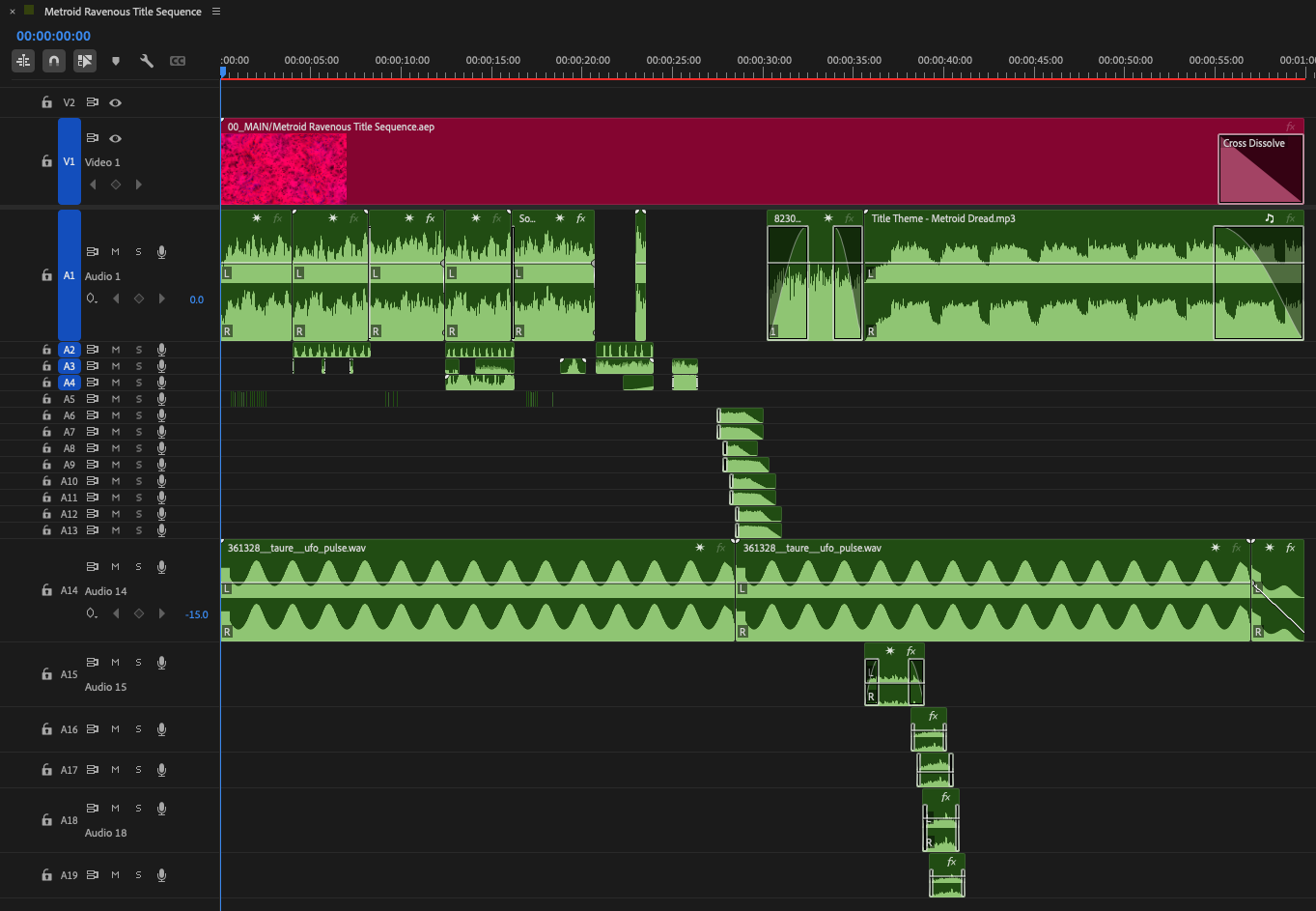
Sound design isn't my strongest discipline, but I knew exactly how I wanted it to feel. So I metaphorically went dumpster diving through sound libraries, pitching, stretching, layering and mangling anything that sounded remotely interesting.
Anything I didn't know how to do in Adobe Audition became an excuse to learn.
There were plenty of happy accidents along the way, along with several occasions where I nearly blew my own headphones apart because I'd forgotten just how many layers I'd stacked together.
Occupational hazard.
My only real regret is that I couldn't compose the music myself. Thankfully, the title theme from Metroid Dread fit the tone almost perfectly.
The finished sequence is below.
Best enjoyed with headphones.
Bringing it all together
Because many of the storyboard frames were already constructed from production-ready assets, the transition into animation became an iterative process rather than starting from scratch. Not only did this help streamline production, it also helped solidify in my mind what was realistically achievable with the tools and assets I already had at my disposal.
Planning ahead like this meant the final title sequence remained faithful to the original vision, while still leaving room for the project to evolve naturally as it took shape. New ideas did emerge and found their way into the piece, but never growing beyond scope that they strayed from the original plan of action.